26
What exactly is GNOME? (programming.dev)

Dumb title but I didn't know how else to put this into words, bear with me for a sec - I am not just looking for the definition.

Years ago I tried Ubuntu which used GNOME and assumed that its desktop layout was "the default" GNOME. I later tried PopOS which also uses it and it was the same, and when eventually I installed Mint I saw that it's still fundamentally the same with some slight tweaks or different tools.

Well, few days ago I installed Bazzite (Fedora) which is also GNOME. It doesn't look anything like anything I've seen before, either in terms of mindset or technical layout. I've gone from an admittedly old-fashioned, but efficient and reliable!, layout and workflow to something that reminds me more of an apple product - its stylish, minimalist yet inefficient and utterly frustrating to get anything done with because of how opinionated it is.

When searching for common problems I often found comments saying stuff like "but try it out! it's in the spirit of gnome, it takes a while to get used to it but the philosophy is valid" and frankly I don't understand anymore what exactly gnome is and what are its design principles, if there even are any and every distro just does whatever the f it wants and call it "a gnome experience".
top 11 comments
sorted by: hot top controversial new old
[-] lime@feddit.nu 7 points 2 months ago

gnome 2 was a traditional desktop. gnome 3 tried something new, and has stuck with it. people who didn't like that thing made MATE, which is a lot like gnome 2.

gnome is extremely opinionated, yes. personally i like how it's set up, but the way they build it rubs me the wrong way.

[-] Cyno@programming.dev 3 points 2 months ago* (last edited 2 months ago)

Is gnome 3 the one without a desktop? The only thing I can figure out with gnome-shell --version is that bazzite uses 46.4

There is a KDE variant of bazzite I might try but I dont know what can of worms is that going to open

[-] Ephera@lemmy.ml 7 points 2 months ago* (last edited 2 months ago)

GNOME 3 doesn't have desktop icons, if that's what you mean. And yeah, that version number sounds about right. They used to version it as "3.38”, but then instead of "3.40", they decided to call that version "40" and continue from there.

KDE is very much the opposite of opinionated. It comes with a Windows-like layout by default, but you can do pretty much any layout you want with it. People rather complain that it has too many options.
I would definitely recommend giving it a try, or at least checking out some videos. It happens a lot that people who dislike GNOME, then try KDE and are completely flabbergasted why that's not the default.

[-] Vittelius@feddit.org 6 points 2 months ago

Years ago I tried Ubuntu which used GNOME and assumed that its desktop layout was “the default” GNOME.

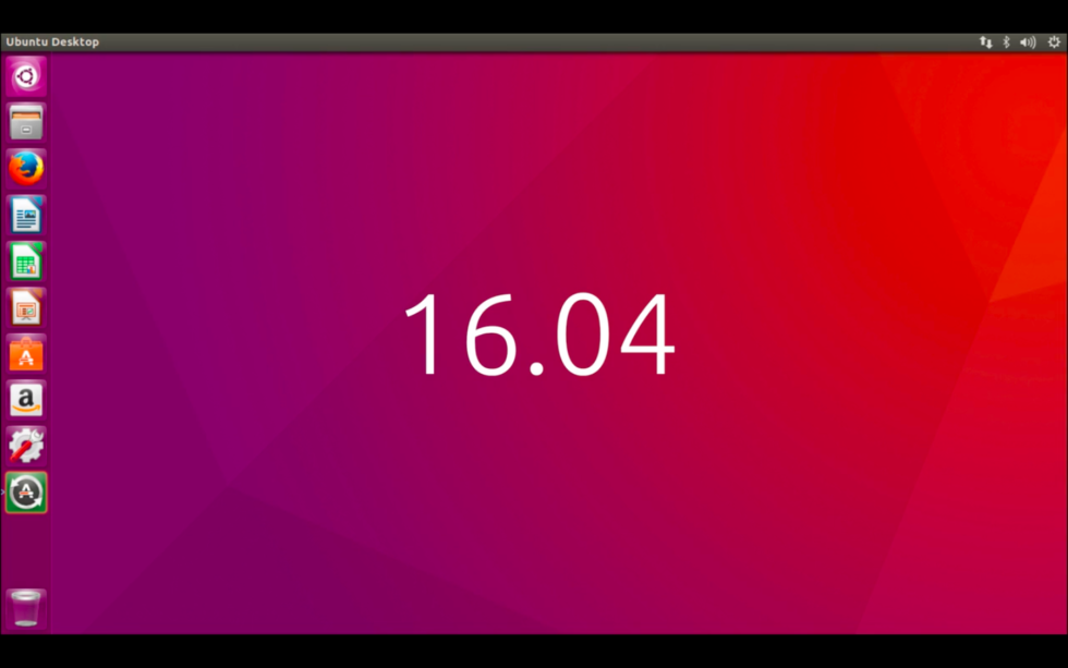
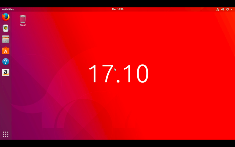
Ubuntu never provided a "default" GNOME experience, or at least not since the early 2000s. At one point Ubuntu had it's own desktop environment, unity, and when they abandoned the project and switched to gnome shell, they modified it to look similar to that. So we went from this:

to this:

I later tried PopOS which also uses it and it was the same

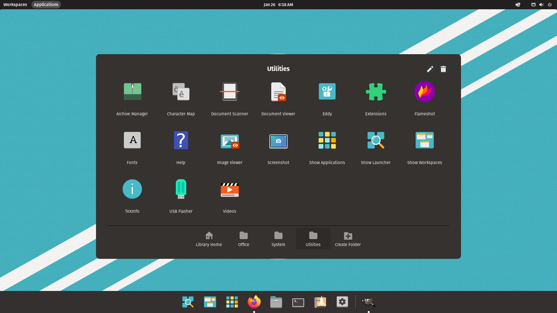
I doubt that. Pop_OS was never the same as Ubuntu. In the beginning it provided an experience that was arguably much closer to vanilla gnome than Ubuntu:

later they started to add their own flare customising the desktop a lot and rebranding all of this as Cosmic Shell:

I installed Mint I saw that it’s still fundamentally the same

Mint never used Gnome. They have their own desktop environment called Cinnamon, which uses some of the same underlying technology, manly the GTK toolkit but is it's own independent project.

Well, few days ago I installed Bazzite (Fedora) which is also GNOME. It doesn’t look anything like anything I’ve seen before

It still should be familiar in some aspects. The grid-view of all apps for example should be something that you know from Ubuntu (Pop replaces that part in more modern iterations - kinda). Bazzite still does modifications, they're just a lot more subtle than the ones from Pop and Ubuntu. But I agree with you: Gnomes workflow doesn't agree with many users. There are those who like it and they tend to really like it. Gnome wants you to heavily use keyboard shortcuts and virtual desktops and I found that casual users aren't really a friend of either.

So what is the default Gnome experience? try it out. There is an extension manger installed that ships with bazzite (and if not use the software store to install it). In it you can disable all the modifications. You can also install extensions to fix some of the usability problems. "Dash to Dock" tends to solve like 90% of them (It's also what Ubuntu uses for their modifications)

[-] Cyno@programming.dev 2 points 2 months ago* (last edited 2 months ago)

It's been a while since I used ubuntu and popOS was only for a few days so maybe I was just mistaken, I remember it being somewhat comparable to a classic desktop at the time but it could have been that cosmic shell thing. And tbh until so far I thought cinnamon is gnome so it seems like I was just outright wrong about that one, thanks for clarifying

I'm definitely willing to try bazzite's gnome3 for a while, i just wasn't sure what's the default anymore and if it's bazzite doing something out of the norm or if the ubuntu based distros did.

[-] gila@lemm.ee 3 points 2 months ago

What were the problems or areas where you identified inefficiency? I'd agree the "settings" app is overly minimal. Personally I'd rather use the terminal for most things that wouldn't necessarily have an obvious specific location in the GUI. In general, customisation outside the terminal leaves something to be desired, but I don't mind how it looks by default. In rare cases I do logout and switch DE's to Plasma but usually it's to figure out how some function is named so that I can search up a way to do it efficiently in GNOME, then I just do that moving forward.

I would guess that the main factors are 1. your machine and 2. your use cases. On my laptop for example, I've found that three-finger swiping up on the touchpad to get to the task switcher is about as efficient as possible for almost all of my use cases. From there, I'm either clicking on a pinned app (including my terminal if I've identified I need it), clicking on one of my open tasks, or typing a few characters for the file, app or setting I want and hitting return. Including typing things like "word" to run Libreoffice Writer. In that way, my experience of GNOME's ethos is to enable the widest range of functions possible using the fewest inputs, with the caveat that this is only the case certain machines and for people that enjoy things like gestures and hotkeys. I have a bunch of shell extensions like a clipboard history/manager, an on-screen keyboard toggle, toggle to prevent auto-sleep etc. It's pretty much everything I want.

[-] Cyno@programming.dev 2 points 2 months ago* (last edited 2 months ago)

tl;dr KB+M and no touchpad here so that might have something to do with it, I prefer more compact and colorful UIs, and different behavior between LMB and RMB.

I'm not a big fan of the Nautilus file manager, all the rows seem too big and too padded. There is no compact mode and from what I've read changing the default file manager is a big no-no in linux since the OS depends on it (and I did try to install Dolphin just to compare but the theme was unusable with bazzite). I can't even pin other drives to the left navigation pane, only folders? The monochromatic theme is neat but just makes it more difficult to tell things apart, gimme some color please yellow folders.

I know the no desktop decision is "since they always get cluttered anyways", but making me use a folder instead will just force me to use a cluttered folder instead, or more likely keep stuff in Downloads. At least with the desktop I can visually arrange it.

I miss the taskbar for switching apps. I do agree pressing the win/command button is neat and practical but sometimes I just want to switch to a different app on my second monitor using mouse only (or see notifications from it) without moving my keyboard hand.

Then it's the small things - I did install the clipboard manager gnome extension (because copyq doesn't work with wayland apparently) but it always opens it in a corner, not on my mouse location.

Systray - left and right mouse buttons do the same thing and doubleclicking does nothing? For example to open the steam window from it I always have to click it, go down to library and click again, this is the default behavior of RMB in other OSes and here it's the only behavior.

Minimizing something and then immediately alt-tabbing doesn't bring that window back up, some focus issue? Two monitors issue? Dunno but annoying.

[-] gila@lemm.ee 3 points 2 months ago

Mostly on a conceptual level, those things aren't problems for me, because stuff like browsing for a file seems like an inefficient approach in most cases. I'm a simple man, I swipe up, I type a few characters, I receive. There's no wait time for my search term to be indexed, even if I don't know the filename I can search the filetype to get a quick filtered list. There's no "making me use a folder", I can access all files in all folders as well as apps or settings the same way. Hell, I can copy an emoji to my clipboard just by typing ":)" or similar. 4 inputs total including the swipe and hitting return. Definitive, repeatable, no visual identification necessary. Once you're acclimated it feels like the liberation of being able to type without looking at the keyboard all over again.

But then, these are the preferences of someone that used to uncheck "show desktop icons" even on Windows/GNOME 2.x. Not so much to avoid clutter, I just don't quite understand the point of the 'visual arrangement' as such. Either I would need to look at many things before I'm looking at the thing I want to be looking at, or I would have to memorise its location - and both of those seem like inefficient contrivances of Windows. Admittedly, my downloads folder is a pit of endlessly accumulating random useless junk. But who cares? It's no less functional to me than when it was empty.

A few other notes:

  • There's a Nautilus extension for individual folder colours, and global colours are set by your GTK theme.
  • gnome-shell-pano is the clipboard manager I'm using and I'm pretty happy with it. Opens in uh, GNOME-style I guess, a bottom bar.
  • As of GNOME 44, there's a list of background apps exposed by opening the shell menu, with each background app showing an X next to it to close without restoring the task.
  • In Debian I can also access the task switcher by simply mousing over to the top left corner of my display. Default behaviour, I'm sure you can replicate it.
  • The alt+tab behaviour is different. I can't think of a reason why I'd need to minimise a task only to restore it though (or even alt+tab really) when I can just swipe up.
  • If there's no difference in behaviour between LMB & RMB, it's because the function you're looking for is in a different castle.

Upon first use of 3.x I too felt that the lack of universal context menus implied less functionality as a whole. I don't think that's really the case though.

If I were using a mouse and also had an app/game fullscreened, then and only then would I have to shudder perform an extra keyboard input.

I guess the bottom line is, GNOME doesn't really aim to replicate Windows.

[-] Cyno@programming.dev 1 points 2 months ago* (last edited 2 months ago)

I guess I just don't trust myself (or the system) to keep stuff organized unless I do it meticulously myself from the start in a neat hierarchy. I'll try to use search more often since it does seem fast and sleek and see how it works out. The only annoying part about it is that it always defaults to my primary display for search even if im focused on the second monitor

Do you know of a good guide on how to use search better, like can I narrow so it only shows files and folders, or maybe match to a regex like *.js? it doesn't really find specific files when i search for them, is it supposed to work with other mounted drives as well?

gnome-shell-pano looks great but is it abandoned? It says my current (newest i assume) gnome shell version is not supported by the extension. Does it open the paste window where your mouse focus is (and on the correct monitor if you have more than one)? CH always opens it on the main display even if i'm focused on the secondary, its horrible...

I found I already have an installed gnome extension 'hot edge' that is supposed to do dock opening when hitting the edge, although i do have issues with it sometimes not triggering, it seems very focus sensitive but it's definitely better than nothing.

It's definitely an interesting experience and I don't want it to replicate windows, but i guess i need to come to terms with some design decisions that will feel unnatural after using windows for almost 20 years now.

[-] gila@lemm.ee 1 points 2 months ago

Looks like a new alpha for pano was released yesterday to support GNOME 47: https://github.com/oae/gnome-shell-pano/issues/315 . Otherwise you can hotfix your current build as described in the thread. I have no idea how it behaves in multi monitor setups though. On my setup it 'bumps up' your display and the clipboard entries display beneath, same like the on-screen keyboard or like a keyboard in Android. It isn't a floating window.

I'm not using any extension for the 'hot corner' functionality. It's at the top of 'multitasking' under GNOME settings for me.

Unfortunately I don't know much about manually adjusting the functionality of searching in the launcher. The extra functions I have found were just a result of experimentation, or happy accidents. I can teach it on-the-fly though. Once I've found a string which returns the function I want, but isn't the first result returned, I either click the result I want or use the arrow keys to navigate to it instead. Then the next time I use the same string, the result I wanted is returned as the first result. e.g. "sys" initially returned KDE System Settings as the first result, but I manually selected System Monitor. And now "sys" returns System Monitor as the first result.

[-] cyborganism@lemmy.ca 3 points 1 month ago

So, GNOME, KDE, XFCE, LXQT, Cinnamon, MATE, Budgie, Pantheon and a bunch more are what are called desktop environments.

They essentially provide a desktop experience through a framework and development guidelines. Most of the development teams provide a "default" desktop environment setup that should be pretty standard across all distributions. However, each of these distributions want to stand out by applying their own branding. They'll add customized icons and themes and as much as adding extensions to modify desktop functionalities.

Other than GNOME, most of the desktop environments will change minimally across distributions except for some theming and icons. But because GNOME is the standard default in most distributions, like Ubuntu, Fedora/RedHat, OpenSuse, and many more, they tend to spend more time and effort into making it look "their own special way".

The other issue with GNOME is that the pure vanilla desktop experience is practically unusable by many users' opinion. It's extremely minimalist and it's quite different from the standard desktop paradigm that most people are used to with Windows or even Mac OS. And it's easy for new users to get lost. So most distros add some quality of life extensions like application bars, menus, system trays (yes! because there is no system tray by default) and other things to make it easier to use. That's why your experience has been different across so many distros.

On top of that, GNOME's desktop environment has changed a lot throughout its iterations. The first version followed a more Win95 type desktop with an equivalent to a Start menu. Then version 2 changed to offer a different desktop with two bars by default: one at the top with the applications menu and system tray and one at the bottom as a task bar. This was customizable. Version 3 changed dramatically and became more minimalistic with a new paradigm and it made users very unhappy. Then finally v4 came out and pushed v3 a little further, minimalizing the desktop even further. And all of this came with major changes to the application frameworks and guidelines. You can see the differences in this video.

this post was submitted on 27 Sep 2024
26 points (100.0% liked)

linux4noobs

1356 readers
1 users here now

linux4noobs


Noob Friendly, Expert Enabling

Whether you're a seasoned pro or the noobiest of noobs, you've found the right place for Linux support and information. With a dedication to supporting free and open source software, this community aims to ensure Linux fits your needs and works for you. From troubleshooting to tutorials, practical tips, news and more, all aspects of Linux are warmly welcomed. Join a community of like-minded enthusiasts and professionals driving Linux's ongoing evolution.


Seeking Support?

Community Rules

founded 1 year ago
MODERATORS