man i wish there was a retrofuturism lemmysphere. maybe that's another thing i'll have to create eventually
this is really cool - it looks like one of those old soviet designs, although the background doesn't look like soviet architecture
thank you for reminding me of this; it's so great and i'd completely forgotten about it
i'm still subscribed to him on youtube, even though it's been 7 years
i mean, i could be jumping the gun here. you may well be right. it's not listed on his page (although he seems to have at least two, so maybe there's more). but i thought that as they claim it was for that magazine and it appeared on said magazine, it could be true
yeah i honestly thought it was at first; especially with an uncredited artist
it works flawlessly in eternity, although there's no thumbnail
i did like the original holmes, although i must admit i haven't read them since i was very young. i didn't know it was similar to holmes though, that does bump it up the list (although i am currently watching through star trek, and there's a lot of that)
I had to look up Fitts’s law, and I’m not sure I get it. Could you explain what you mean?
basically; the speed that it takes to click a button is dependant on the size of the button and the distance from the cursor. however, buttons at the edge of the screen have effectively infinite size, as they can't be overshot. the most used actions should be placed there, as they are the easiest to click by muscle memory (particularly the corners, as they have infinite size in both dimensions)
on windows, kde, cinnamon, etc.; by default the bottom left is start, the bottom right is show desktop (this one i can't explain), and the top right is close maximised window. the top of the screen is also used for other window-related actions like minimise, restore, change csd tabs, etc.
gnome flouts this by having most of the top of the screen doing nothing (most of it is completely empty) apart from rarely used actions like calendar and power. and the bottom right and left doing nothing[^1]
did i explain well?
ETA: I kinda feel like mine was about KDE not being a fit for me personally, and yours was a slam on Gnome rather than a statement of personal preference.
nah it was very much a personal thing: some people like having a minimal and clutter-free feature set; i like having as many features as possible, because then i find features i didn't even know i liked.[^2]
as for the top bar: this one confuses me - it just seems objectively bad. but obviously it's not as some people clearly like it. i haven't had anyone actually explain to me why, though
[^1]: i mean they also ignore it in other ways, too
[^2]: i didn't know how useful a terminal embedded in the file manager would be until i started using dolphin, now i can't do without it
^i'm^ ^sorry^
it's that it's not currently inhabited by the society that built it
i've been a bit inconsistent with the theme of this 'sphere - my first plan was specifically this kind of depressing and rain-drenched mediæval hamlet sort of thing
(i.e. the degradation of the architecture and society in general, hence the original name & url),
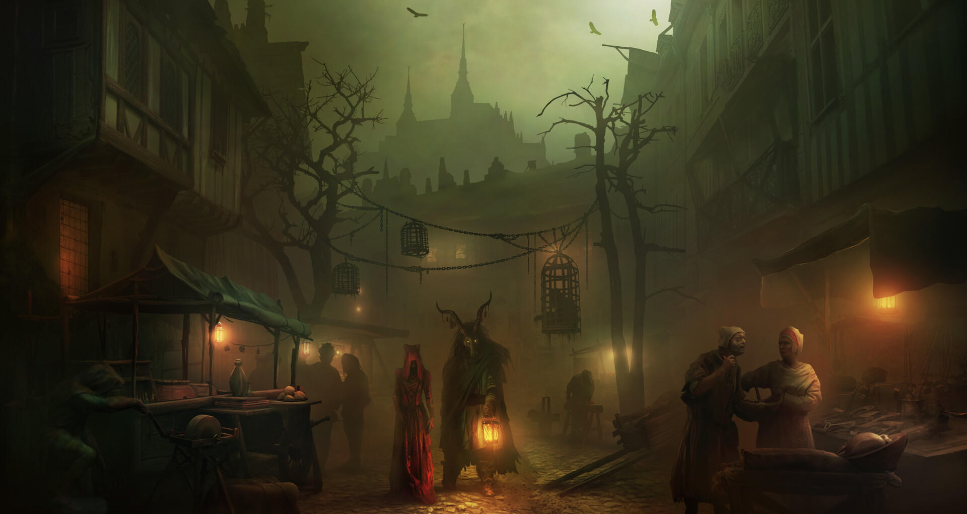
but then i realised that's probably a bit niche, considering the current population of lemmy so i expanded it to any type of dystopic village or city
but yeah, the idea is just any currently functioning municipality in which you wouldn't want to live; as opposed to /c/wastelands where there may be a society, but it's collapsed and rebuilt itself (i.e. mad max 3). most likely if the buildings were built from scratch for their current function, it fits here, whereas if they're scratch-built from old vehicle carcasses or whatever, they'd fit better in wastelands.
i know i personally have a predilection toward mediæval and victoriana, but i would also welcome cyberpunk dystopiæ; or any sort of ill-repaired buildings or smog-filled overpopulated cities^[or any type of dystopia, but i have no idea how you'd find art depicting a huxleyan dystopia...]
(sorry that was rambly, i literally have no idea how to describe it..)
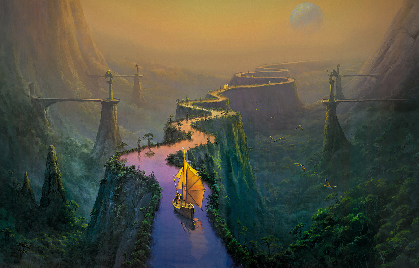


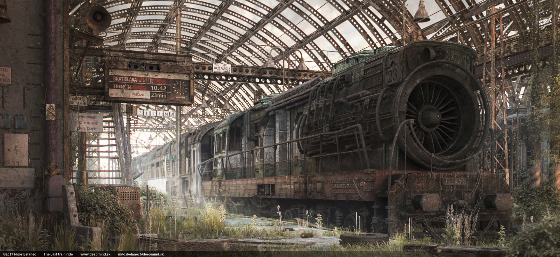


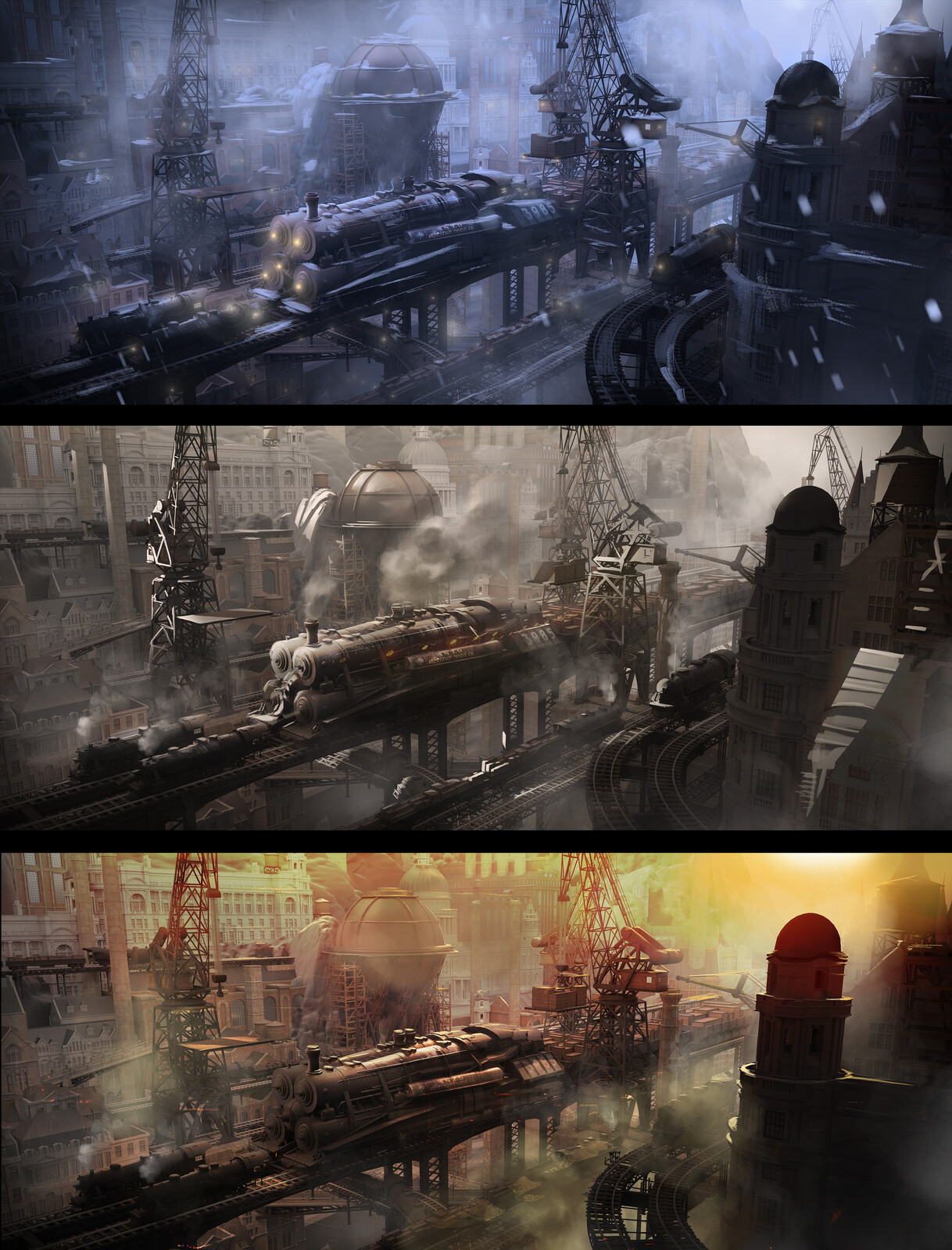
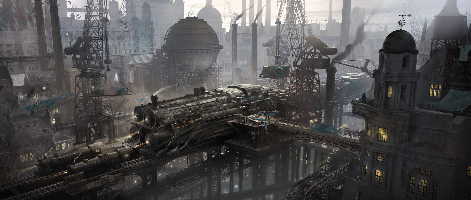


i haven't enough courage of my convictions. i also don't really know why i don't like it. maybe it's because it's not just the art, there's also a guy in it? or just because it feels so commercial^?^, which is also pretty inconsistent.. i'm not sure, i'll think about it