[-] erogenouswarzone@lemmy.ml 26 points 1 year ago

Data analyst here. It really do be like that. You can use stats to prove anything.

Yfw they say data doesn't lie. Looool

[-] erogenouswarzone@lemmy.ml 18 points 1 year ago

The place I work decided to name all tables in all caps. So now every day I have to decide if I want to be consistent or I want to have an easy life.

[-] erogenouswarzone@lemmy.ml 26 points 1 year ago

AutoHotKey AHK for short. Allows automation of nearly anything in Windows, and is better than most alternatives. The downside is it's VBScript, which I believe is going he way of the dodo, and it has quite a few gotchyas.

However, on day one you can start assigning keys and combos to do common tasks.

Don't like Caps Lock? Reassign it to open Chrome. Hate that you can't lock the screen with your left hand? Make Win+S a command that locks the screen.

It's free, has a huge community, and is truly amazing.

[-] erogenouswarzone@lemmy.ml 25 points 1 year ago

As a person who victimizes coworkers like this, I apologize. Thank you for pointing it out, and I will stop doing it.

[-] erogenouswarzone@lemmy.ml 27 points 1 year ago

Yeah, but that's some bullshit. I want to know what line in my file is causing the error.

And they know! They know what line in your file caused the error! They know the value of all the variables when the error hit. But do they show that? Fuck no.

[-] erogenouswarzone@lemmy.ml 25 points 1 year ago

I've lived in high urban, low urban, suburban, and rural. They all have pros and cons.

If you're dating tho, the city is way better, but good luck finding practice space - if you're into that sort of thing.

24

Here's what Halevy Street looks like today:


Here's a summary I found online:

https://www.sothebys.com/en/auctions/ecatalogue/2019/impressionist-modern-art-evening-n10067/lot.17.html

Caillebotte’s La Rue Halévy, vue du sixième étage is the embodiment of the new Paris that emerged in the middle of the nineteenth century. Inextricably linked to the moment it depicts, the present work contains a profound originality that demonstrates Caillebotte’s development of novel modes of representation commensurate with the experience of modern life in nineteenth-century France. As one of the most remarkable in the series of his urban landscapes La Rue Halévy, vue du sixième étage exemplifies the innovative pictorial inventions for which Caillebotte was celebrated. Caillebotte made his debut with the Impressionist group during their second organized exhibition in 1876. The works he chose to exhibit were praised for their ingenuity and their creator lauded. Critic Marius Chaumelin exclaimed: “Who knows Mr. Caillebotte? Where does Mr. Caillebotte come from? At what school did Mr. Caillebotte receive his training? Nobody could tell me…” He went on to say, “All I know is that Mr. Caillebotte is one of the most original painters to be revealed in several years, and I am not afraid of compromising myself by predicting that he will be famous before long. In his Floor Scrapers, Mr. Caillebotte proves to be a realist just as crude but more witty than Courbet, as violent but more precise than Manet…. If intransigence meant painting this way, I would advise our young school to become intransigent” (quoted in Gustave Caillebotte: The Painter’s Eye (exhibition catalogue), op. cit., p. 100). Caillebotte would go on to exhibit with the Impressionist group in the majority of their subsequent exhibitions including the Fourth Impressionist Exhibition in 1879 where Caillebotte submitted La Rue Halévy, vue du sixième étage.

From 1875 until 1882 Caillebotte made several paintings that thematized novel vantage points, exploring the confrontation between interior and exterior spaces in the new city (see figs. 1 & 2). Caillebotte’s scenes of urban realism would become his hallmark and these paintings were a testament to the transformation of the city of Paris in the middle of the nineteenth century. As part of the ambitious reforms Napoleon III introduced during the 1860s, Georges-Eugène Haussmann was charged with masterminding a radical reconfiguration of Paris. Many parts of the medieval city were razed to provide space for an extensive grid of straight roads, avenues and boulevards (see fig. 3). The "Haussmannisation" of Paris, which is celebrated today as the precursor to modern urban planning, set the tempo for modern life. Haussmann’s expansive boulevards were the landscape of Parisian modernity and the setting of the ever-changing, ephemeral moments which formed the essence of the renovated city. Whereas the pre-Haussmannian, essentially Medieval Paris was made up of buildings that held interior courtyards, the modern apartment buildings that characterized the architecture of the new city had grand balconies and large windows that faced toward the street, offering startling new views of the boulevards below. Impressionist painters Camille Pissarro and Claude Monet frequently chose views of the French capital that captured the grandeur and commotion of the modern city (see fig. 4). Caillebotte explored this theme as well, painting in the midst of the bustling streets and in innovative compositions from an elevated vantage point above.

In La Rue Halévy, vue du sixième étage the artist has adopted a viewpoint well above the lively city boulevards below. The plunging perspective is heightened by the embrasure of window visible along the left edge which further enhances the sense of a place, a window on the upper floors overlooking the urban environment. From his elevated vantage point Caillebotte is afforded the freedom to view and manipulate perspective, tilting the ground of the picture plane in a manner that has been considered characteristic of his work and one of his greatest contributions in the move towards Modernism. Much like his vision of life in modern Paris, Caillebotte’s style combines new and old in a thoroughly contemporary manner; he retained a clarity in his draftsmanship that is related more to the French realist tradition, and yet uses radical compositional and perspectival devices that are entirely avant-garde.

The first owner of La Rue Halévy, vue du sixième étage was Caillebotte’s life-long friend, Paul Hugot. Hugot was an early supporter of Caillebotte and owned the largest collection of his work outside the Caillebotte family, including a life-size portrait the artist painted of Hugot in 1878. La Rue Halévy, vue du sixième étage was later in the notable collection of prominent New York industrialist Chester Roth. The present work has been included in major retrospective exhibitions of Caillebotte’s work and in numerous publications as a supreme example of the artist’s pioneering urban naturalism.

18

You may remember him from Planers of a small apartment:

Caillebotte, like many of his contemporary impressionists, sought to depart from the rigid traditions of the Académie des Beaux-Arts (The Academy). The Academy upheld long-standing French artistic traditions of the Baroque and Renaissance including using dull colors and even finishing paintings with a gold tarnish to reduce the colors.

But in the age of industrialism, many new colors of paint were available to artists. Which lead to more vivid paintings, and the Academy largely rejected these. They could not get a spot in the yearly display of works until Napoleon saw their works and called for a Salon of the Rejected.

In this painting we see a still life of wilted roses. Believe it or not this was basically a slap in the face to traditional painters. They would never paint a still life of flowers, and expect it to be taken seriously, and even more insulting the flowers were wilted.

31

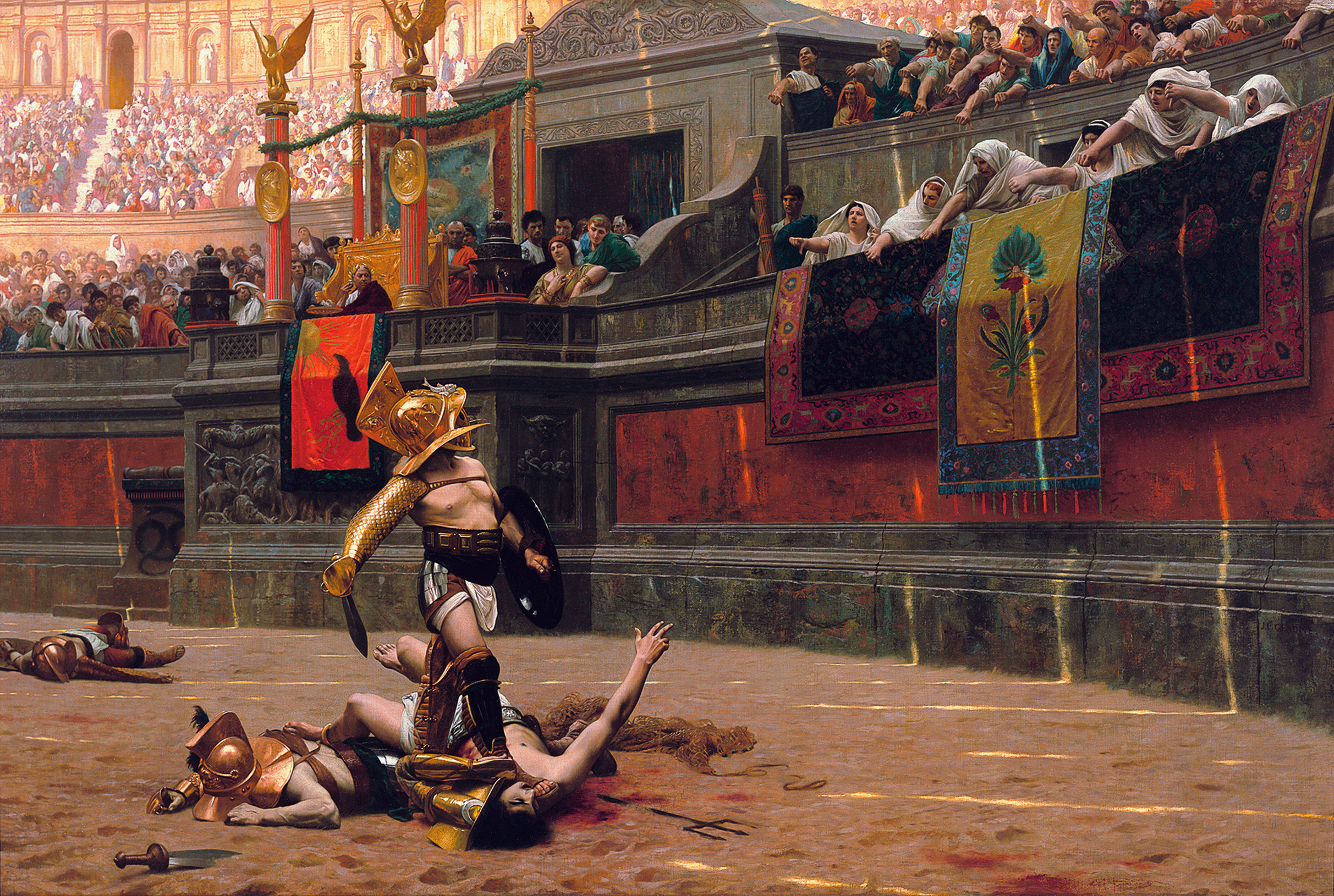
Pollice Verso is latin for "with a turned thumb".

[-] erogenouswarzone@lemmy.ml 21 points 1 year ago

Come gather round the stump young'ns, and I'll tell you a tale of when video games didn't need to be connected to the Internet.

41
submitted 1 year ago* (last edited 1 year ago) by erogenouswarzone@lemmy.ml to c/artporn@lemm.ee

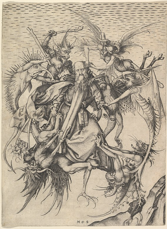
Believed to be Michelangelo's first easel painting, completed when he was 12 or 13. Based largely on an engraving by Martin Schongauer, down to the demon's whiskered asshole:

Michelangelo's Temptation is a mishmash of styles, particularly High Renaissance and Late Middle Ages. The foreground, ie St. Anthony being attacked by demons, is indicative of Late Middle Age art, whereas the intricate background is more on par with the Renaissance, which sought to improve on the classical art style (Ancient Greek and Roman) via realism. (https://en.wikipedia.org/wiki/High_Renaissance, https://en.wikipedia.org/wiki/Late_Middle_Ages)

From wikipedia:

The Torment of Saint Anthony (or The Temptation of Saint Anthony is attributed to Michelangelo, who painted a close copy of the famous engraving by Martin Schongauer when he was only 12 or 13 years old. Whether the painting is actually by Michelangelo is disputed. This painting is now in the Kimbell Art Museum in Fort Worth, Texas. It shows the common medieval subject, included in the Golden Legend (a big book of saints from mediaeval times) and other sources, of Saint Anthony (AD 251 – 356) being assailed in the desert by demons, whose temptations he resisted; the Temptation of St Anthony (or "Trial") is the more common name of the subject. But this composition apparently shows a later episode where St Anthony, normally flown about the desert supported by angels, was ambushed in mid-air by devils.

From the Kimbell:

The cleaning of Michelangelo’s Torment of Saint Anthony at the Metropolitan Museum of Art, New York, in 2009, revealed the quality of the small panel. Michael Gallagher, conservator in charge of paintings conservation, removed the layers of yellowed varnish and clumsy, discolored overpaint that obscured the artist’s distinctive palette and compromised the illusion of depth and sculptural form. The technical study accompanying the cleaning provided evidence of pentimenti, or artist’s changes, signifying that the painting is an original work of art and not a copy after another painting.

Comparison of Michelangelo’s work with Schongauer’s print reveals the many ways the novice artist distilled, edited, and expanded his northern source. Most obviously, unlike Schongauer, Michelangelo set the figures against a landscape, one that resembles the familiar Arno River Valley around Florence. In addition, following a trip to the fish market, Michelangelo heightened the naturalism of Schongauer’s demons by painting silvery scales onto the spiny, fishlike monster in the upper left. In translating Schongauer’s black-and-white print into color, Michelangelo also made the creatures more lifelike. (Keith Christiansen has noted that Michelangelo’s idiosyncratic use of shades of lavender, green, and orange invites comparison to his palette in the ceiling frescoes of the Sistine Chapel.)

The young artist introduced the element of fire, which does not appear in Schongauer’s print. A small fire appears in the crevice of the rocky outcrop, flames shoot from the mouth of the demon with squid-like wings at the lower right, and a wooden club wielded by the spiny, fishlike creature has been transformed into a firebrand.

Michelangelo increased the scale of the figures and made thoughtful, calibrated shifts in their placement and the ways they interconnect, which resulted in a complete rethinking of the negative spaces between them. He straightened the tilt of Saint Anthony’s head, altered his expression, added a halo, and simplified the saint’s drapery folds. The artist reframed the heads of the demons by refining the space around them, emphasizing their fantastic, bizarre features. He also intensified the drama by moving the horns of the long-necked demon in the lower left so that the demon below could bite one of them. Overall, these changes produce a more compelling and direct figural group.

While many of Michelangelo’s changes to Schongauer’s composition are obvious to the eye alone, technical analysis carried out during cleaning—which included X-radiography, pigment analysis, infrared reflectography, and close examination under the microscope—has shed light on many other aspects of the artist’s early working methods. Adopting the egg tempera technique still practiced in Ghirlandaio’s studio, Michelangelo covered the background with continuous, parallel, horizontal brushstrokes. He modeled the saint’s face with delicate hatched brushwork over a green underpaint. X-radiography confirmed that Michelangelo executed the painting on a poplar panel and that, in the process of laying in the background, he saved space for the figure of Saint Anthony and two of the demons. The work has survived in excellent condition with only minor flake losses and some wormholes.

The infrared reflectogram mosaic captured by Charlotte Hale at the Metropolitan Museum of Art reveals the character and extent of Michelangelo’s preparatory underdrawing. The artist used two types of underdrawing in The Torment of Saint Anthony: simple, broad, black-brush outlining for the figures and drapery and much finer, more detailed underdrawing in the landscape, perhaps in silverpoint. Since the artist invented the scenery, it likely required greater preparation than the figures, which were modeled after Schongauer. With its fine, curved, parallel hatching, Michelangelo’s underdrawing in the rocky outcrop of The Torment of Saint Anthony resembles the style of his early drawing after Giotto’s fresco The Ascension of Saint John, a copy he made as part of his artistic training.

The infrared reflectogram mosaic also recorded two areas of pentimenti where Michelangelo deviated from his initial underdrawing, confirming that he continued to make critical changes at the moment of painting. He shifted the wooden club held by the spiny, fishlike monster from the angle seen in Schongauer to a more vertical position and pulled in the arc of his long tail to encircle the head of the biting monster.

Examination of the paint surface of The Torment of Saint Anthony under the microscope shows an extraordinary assurance of execution and variety of paint application as well as the effort made by the young Michelangelo to perfect his composition. The heavy layering of paint in some of the demons suggests that the artist’s choice of color evolved as he transformed the black-and-white figures into colored beasts. Michelangelo applied pigment with brushes but then frequently attacked the surface with a sculptor’s tool. He scraped away paint along the back of the spiny, fishlike monster, exposing the underlying gesso and enhancing the sculptural form of the thick scales, which are painted in relief. The artist also sharpened the outlines of the demon with incisions. In a final stage of painting, Michelangelo made numerous adjustments to edges throughout the composition using the light background color. The exacting nature of these corrections suggests his obsession with the refinement of these contours.

The combined techniques of painting in relief, scraping, and incising have been previously noted in The Manchester Madonna and The Entombment, two unfinished works by the artist in the National Gallery, London. When considered together with the documentary evidence of Condivi and Vasari’s biographies as well as stylistic analysis, the technical examination of The Torment of Saint Anthony adds powerful evidence that the Kimbell panel is Michelangelo’s first easel painting.

https://kimbellart.org/content/michelangelo-torment-saint-anthony

61

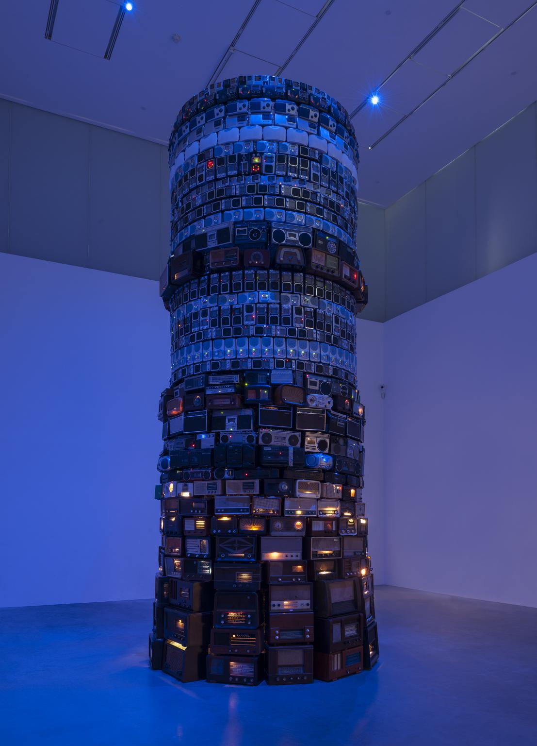
Here's the summary from the Tate Modern Art Museum (available here https://www.tate.org.uk/art/artworks/meireles-babel-t14041). I have modified some of it to read easier, and supply context.

Babel is a large-scale sculptural installation that takes the form of a circular tower made from hundreds of second-hand analogue radios that the artist has stacked in layers. The radios are tuned to a multitude of different stations and are adjusted to the minimum volume at which they are audible. Nevertheless, they compete with each other and create a cacophony of low, continuous sound, resulting in inaccessible information, voices or music.

In describing this work, Meireles refers to a tower of incomprehension. The installation manifests, quite literally, a Tower of Babel, relating it to the biblical story of a tower tall enough to reach the heavens, which, offending God, caused him to make the builders speak in different tongues. Their inability to communicate with one another caused them to become divided and scatter across the earth and, moreover, became the source of all of mankind’s conflicts. The room in which the tower is installed is bathed in an indigo blue light that, together with the sound, gives the whole structure an eerie effect and adds to the sense of phenomenological and perceptual confusion. The radios are all of different dates, the lower layers nearest the floor being composed of older radios, larger in scale and closer in kind to pieces of furniture, while the upper layers are assembled from more recent, mass-produced and smaller radios. This arrangement emphasises the sense of perspectival foreshortening and thus the impression of the tower’s height, which, like its biblical counterpart, might continue into the heavens.

The artist has explained that the work took over ten years to complete from initial conception to its realisation:

Babel began in 1990 on Canal Street, in New York. There were eleven years of notes before I finally realised the work in 2001, in Helsinki, at the Kiasma Museum of Contemporary Art. Upon observing the quantity and diversity of radios and all the different types of sound objects that were sold around Canal Street, I thought of making a work with radios. Radios are interesting because they are physically similar and at the same time each radio is unique.

The title and themes of Babel also relate to one of Meireles’s most important and ongoing influences, the Argentinean writer Jorge Luis Borges (1899–1986). Borges’s fiction also provides one of the key references for another major work by Meireles in Tate’s collection, Eureka/Blindhotland 1970–5 (Tate T12605),

which draws on Borges’s short story ‘Tlön, Uqbar, Orbis Tertius’,

Told in a first-person narrative, the story focuses on the author's discovery of the mysterious and possibly fictional country of Uqbar and its legend of Tlön, a mythical world whose inhabitants believe a form of subjective idealism, denying the reality of objects and nouns, as well as Orbis Tertius, the secret organization that created both fictional locations. Relatively long for Borges (approximately 5,600 words), the story is a work of speculative fiction. (https://en.wikipedia.org/wiki/Tl%C3%B6n,_Uqbar,_Orbis_Tertius)

first published in 1940. A further connection between the two works is their use of sound as a sculptural and perceptual element. Here, however, Meireles has borrowed a symbol that is central to Borges’s writing. In his story ‘The Library of Babel’, originally published in 1941, Borges described a universe in the form of a vast or conceptually complete library that has its centre everywhere and its limits nowhere. This corresponds to Meireles’s interest in expanded notions of space and of infinity, in an excess of perceivable information and the processes of cognition.

The curator and writer Moacir dos Anjos has also related Babel to another of Borges’s stories, ‘The Aleph’ (1945), which describes a point where all places in the universe can be seen from every angle. Dos Anjos makes links between Meireles’s work and Borges’s story, suggesting that both question the ‘rigid codes’ that govern our perception of the world and ‘that are unable to grasp the fluidity with which the body traverses and experiences it’ (Moacir dos Anjos, ‘Where All Places Are’, in Tate Modern 2008, p.170). Dos Anjos suggests that the presentation of informational overload in Babel can be seen as a metaphor ‘for the intricate relations between distinct nations and communities’ which insists on ‘recognising the existence of a territory with uncertain boundaries, one that accommodates multiple oppositions and produces the multiple contamination of cultural expressions previously separated by geographical and historical injunctions’ (dos Anjos 2008, p.173).

Tanya Barson May 2011

10
Untitled - Andrzej Piecha (scontent-mia3-1.xx.fbcdn.net)

A Polish artist and recluse, little is known about the painter. He also didn't seem to name any of his work. He died in 2013.

34

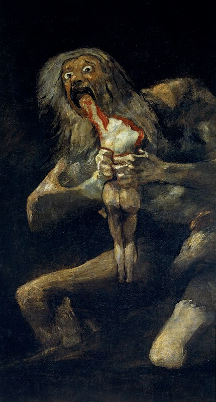
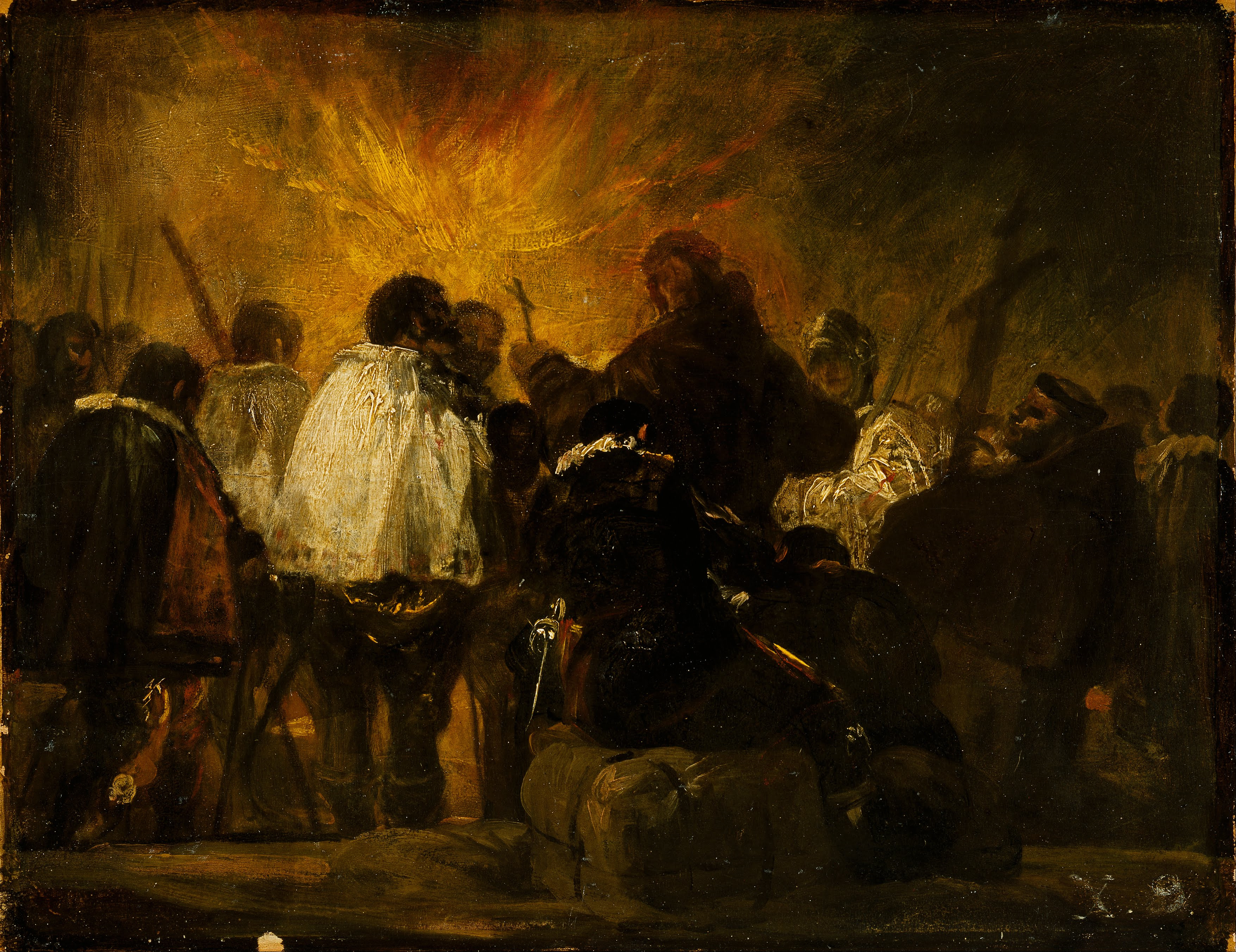
This painting by Goya (of Saturn Eating his Son fame) came from a group of smaller paintings that Goya executed - because the topic interested him rather than commissioned. Both as a visual narrative and as a painting per se it is influenced by Goya’s keen interest in the grim fate that befell many people during his lifetime. The painting shows monks, soldiers, and convicted prisoners in white robes, probably on their way to the site of their execution.

Summarized from: https://www.nasjonalmuseet.no/en/collection/object/NG.M.01347

66
In a Cafe - Edgar Degas (1883) (www.edgar-degas.net)

Unlike his Impressionist friends, Degas was an essentially urban painter, who liked to paint the enclosed spaces of stage shows, leisure activities and pleasure spots.

In a cafe, a fashionable meeting place, a man and a woman, although sitting side-by-side, are locked in silent isolation, their eyes empty and sad, with drooping features and a general air of desolation. The painting can be seen as a denunciation of the dangers of absinthe, a violent, harmful liquor which was later prohibited. Parallels have been drawn with Zola's novel L'Assommoir written a few years later and indeed the novelist told the painter: "I quite plainly described some of your pictures in more than one place in my pages." The realistic dimension is flagrant: the cafe has been identified - it is "La Nouvelle Athènes", in place Pigalle, a meeting place for modern artists and a hotbed of intellectual bohemians. The framing gives the impression of a snapshot taken by an onlooker at a nearby table. But this impression is deceptive because, in fact, the real life effect is carefully contrived. The picture was painted in the studio and not in the cafe.

Degas asked people he knew to pose for the figures: Ellen André was an actress, and an artist's model; Marcellin Desboutin was an engraver and artist. The painting cast a slur on their reputations and Degas had to state publicly that they were not alcoholics.

The off-centre framing, introducing empty spaces and slicing off the man's pipe and hand, was inspired by Japanese prints, but Degas uses it here to produce a drunken slewing. The presence of the shadow of the two figures painted as a silhouette reflected in the long mirror behind them is also expressive and significant.

https://www.edgar-degas.net/in-a-cafe.jsp

34

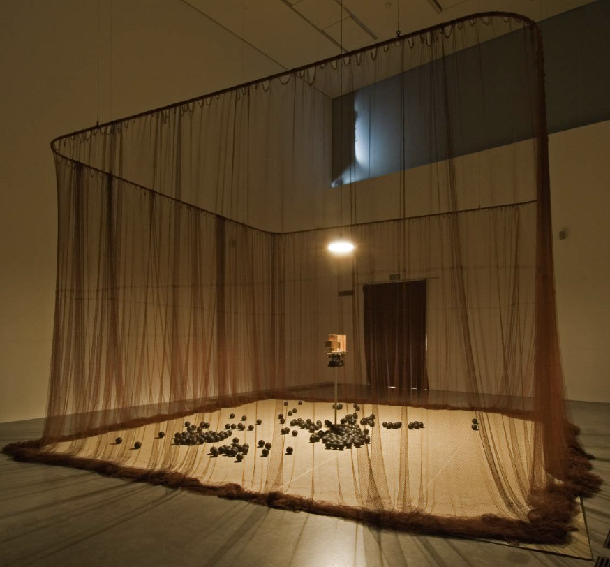
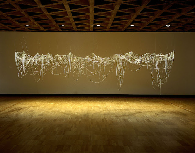
Eva Hesse was hugely influential on the postminimalism art movement of the 60s, despite only being active for the 10 years before her death in 1970 from a brain tumor.

Postminimalism is recognizable by complexity and simplicity. The sculpture here at first appears simplistic, like a spider web or party streamers. But it is very complex with overlapping forms and depth. It also appears to be floating in air, unlike a spider web, not attached to anything.

Hesse's work has been described as anti-form. Like the sculpture, while the stands all seem to be uniform in shape and size, their position in space is quite the opposite.

This chaotic mass could be influenced by her childhood, when at 8 her family fled Nazi Germany and immigrated to New York City. However, Hesse, like her works, was reluctant to give any concrete definition of any of her works, allowing them to speak for themselves.

Spiders in art often symbolize feminism and motherhood. The spider and her web are at the same time deadly and delicate. The web offers a safe place to nurture young, but deadly to intruders or prey. Her work has been praised at highlighting womens issues objectively without a political agenda.

With this in mind, the piece perhaps takes on an entirely different meaning - perhaps highlighting the beautiful chaos of life.

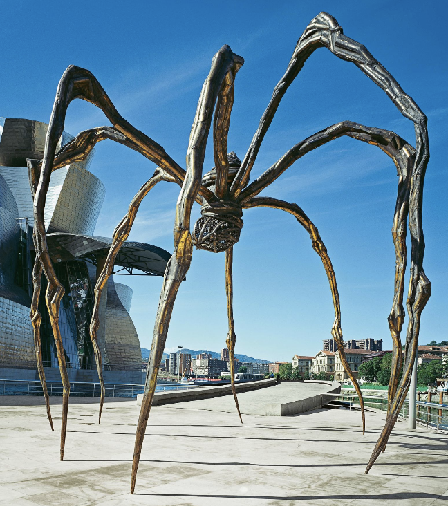
Other postminimalism works include this spider at the Guggenheim in Spain:

While the installation was created in 1999, there is perhaps a continuation from Hesse's work.

47

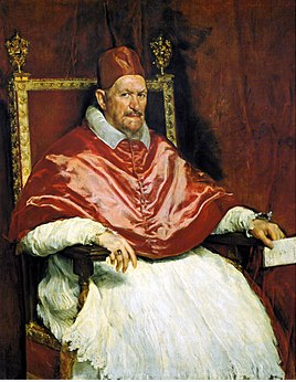
The original Portrait of Pope Innocent X, by Diego Velázquez in 1650:

"Velázquez was commissioned by Innocent X to paint the portrait as from life, the pope's motive being to increase his prestige. However, Velázquez did not flatter his sitter and the painting is noted for its realism, being an unflinching portrait of a highly intelligent and shrewd, but aging man.

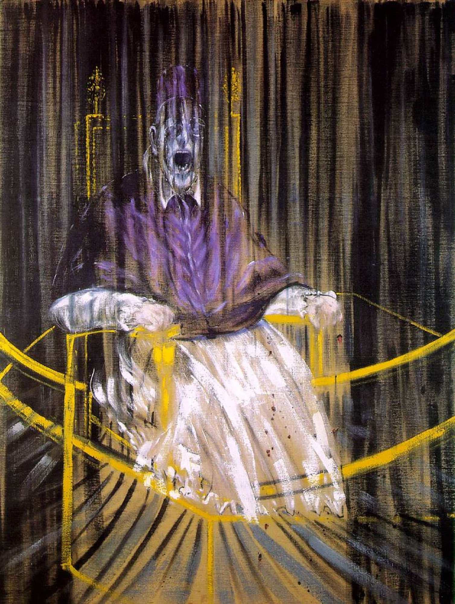
Bacon never painted from life, preferring to use a variety of visual source material, including photographs both found (including in movie stills, medical text books and 19th century journals) and commissioned. Equally, Bacon rarely worked from commission, and could portray the pope in an even less flattering light; according to art critic Arim Zweite, "in a sinister manner, in cavernous dungeons, afflicted by an emotional outburst and devoid of any authority".[8]

Although Bacon avoided seeing the original, the painting remains the single greatest influence on him; its presence can be seen in many of his best works from the late 1940s to the early 1960s. In Bacon's version of the 17th century masterpiece, the Pope is shown screaming yet his voice is "silenced" by the enclosing drapes and dark rich colors. The dark colors of the background lend a grotesque and nightmarish tone to the painting.[9] Although a noted bon vivant, Bacon closely guarded his private life, working habits, and thought processes. He produced some 50 paintings of popes, but destroyed a great many that he was unhappy with"

https://en.wikipedia.org/wiki/Study_after_Vel%C3%A1zquez%27s_Portrait_of_Pope_Innocent_X

7
submitted 1 year ago* (last edited 1 year ago) by erogenouswarzone@lemmy.ml to c/artporn@lemm.ee

Hi, I'm erogenouswarzone. I frequently post in-depth analyses of artworks in this community.

For some time I have wanted to start a meta-series offering guidance on enjoying art, and since I have two huge posts in the making, I figured this would be a good time to start.

These posts I'm working on will contain a lot of information about the art and history and the artist and anything else I find interesting during my research.

erogenouswarzone

The first thing that seems appropriate would be to introduce myself and explain my relationship to art.

First, I have no formal training in art. One day - a few weeks ago - I was surfing Lemmy.ml and a post (https://lemmy.ml/post/3149999) from this community showed up and I loved it. Everything I know about art, I have learned since then.

The more I started engaging with the community the more curious I became about the historic periods and artists and learning everything I could about pieces I love. I work as a software engineer for a county in the continental United States, and write these posts while I wait for JBoss to refresh. (Btw, if you have any advice on how to make this process less painful, please pm me!)

Anyway, I requested to be made co-mod of this community and was granted that privilege by craftyindividual. Thanks again to him. I work hard to make sure there are no ads or low-quality posts so that your enjoyment is at its apex. I realize this post may be outside the guidelines, but I'm hoping its still relevant and enjoyed.

The Point

The point is I make posts and comments containing a lot of information about the paintings. But this information should not be taken in lightly.

Contextualism vs Isolationism

There is a spectrum of interpretation of art. On one side the viewer knows everything about the painting. On the other, the viewer knows nothing other than what they see - not the year or artist or anything.

Context |-------------------------------*--------| Isolation

Unless you've studied art history, you typically approach paintings close to the star above. Meaning, you know little to nothing about the painting other than what you see (and the author and year because that's typically included).

Some people, called Contextualists, will say you can only interpret a painting if you know as much as possible about the painting. Others, called Isolationists, say the opposite - art is created for the viewer, so nothing else matters other than what the viewer interprets with whatever knowledge the show up with.

Personally, I am a fervent believer in the latter because once you gain knowledge you can't lose it. And that knowledge will affect your interpretation of the work. So that is the point of this post: while I love doing the research and writing the essays, you should only learn more about art when you're ready. And then, if you're curious or want to check your hypotheses, great, go ahead and look. But your interpretation is all that matters in the end - not the artist's meaning, the political climate at the time or anything else.

And you should strive to protect it: your interpretations are not wrong no matter what you learn or what the artist says or even what I say. It is my hope that the information I provide is simply an amplification of your own enjoyment.

53

Originally this piece was called "Love and Pain". It was only later that it picked up the name "Vampire" and interpretation of a man locked in a vampire's embrace. Munch maintained it was nothing more than a woman kissing a man on the neck.

Personally, I don't like either interpretation. I see a man in emotional pain, and a woman comforting someone she loves. Her hair is carelessly draped over him, covering him from the outside, as if he ran like a boy seeking his mother. Instead, his lover suffices. And she knows just by the look on his face that this is what he needed. They are so familiar, even this bizarre circumstance is met with understanding and concern. She doesn't ask what is troubling him, she knows it is dreadful, imagining the horrible details.

The Nazis declared it morally 'degenerate.' Some thought it was about his visits to prostitutes, yet others saw it as some sort of macabre fantasy about the death of his favorite sister. Evidently Munch remained ambiguous about the deeper meaning behind it.

[-] erogenouswarzone@lemmy.ml 23 points 1 year ago

Ok, it's true college isn't what it used to be.

A college degree used to be rare, meaning you could get any degree and do any job.

Obviously, it's not like that anymore. Everyone has a degree. You need to get a degree that means something.

If you have rich parents that will support you, great, you can fuck around and graduate after 8 years with an English degree, and you'll be alright.

If your parents aren't rich and can't support you indefinitely, you need a degree in something that is hiring or will be hiring when you graduate. Preferably, with a large paycheck, so paying back the loans is reasonable.

Or, ya know, just don't go to college. Learn to weld or install sattelite dishes, or even better, be a general contractor. You can make a goddamn fortune as a general contractor.

Or, do what Mark Twain did, and mary into wealth. Love is fake anyway!

But, ya know, being 18 and impressionable to romantic ideas, it's tempting to think you don't have to follow this guidance and get an art degree and you'll be fine. Don't fall into that. Be smart.

[-] erogenouswarzone@lemmy.ml 21 points 1 year ago

I think apple would figure out some very creative ways to fuck it's customers, some more.

[-] erogenouswarzone@lemmy.ml 27 points 1 year ago

I use a bar of soap that is exclusive to me. I lather somewhere hairy, like my stomach, to build up some suds.Then, I soap everything with the suds and soap.

It wastes a ton of soap compared to a washcloth. And when I'm done I wash the bar off and wash my hands one last time. It's the quickest way I have found to shower. I am usually out in about 15 minutes.

[-] erogenouswarzone@lemmy.ml 21 points 1 year ago

Watch a Video or read something because it really is an invaluable tool. But here's a crash course:

Debuggers, or IDEs, let you step through your code in slo-mo so you can see what is happening.

  1. Set a breakpoint - Click to the left of a line of code so a red dot appears. Run your program, and the IDE will execute to that line, then pause.
  2. Look at variables' values - While the execution is paused you can hover over variables before that line to see their value.
  3. Step through the code - See what happens next in slo-mo.
    • Use "Step Into" to enter into a function and see what that code does.
    • Use "Step Over" to not go into a function and continue in the current spot after the function has done its business.
    • Use "Step Out" to exit a function and pick up the execution after it has run. Use this when you're in too deep and the code stops making sense.
  4. See whats in the heap - The heap will list all the functions that you're currently inside of. You can jump to any of those points by clicking them.
  5. Set a watch - Keep a variable in the watch so you can see what its value is at all times.
  6. Set a condition on the breakpoint - If the breakpoint is inside a big loop, you can right-click on the red dot to create a conditional breakpoint, so you write something like x===3 and it will only pause when x is 3.

There are many other things an IDE can do to help you, so def look into it more if you want to save yourself a lot of insanity. But this is a good starting point.

If you're developing for the web use F12 to open web tools, and when an error happens, click the file/line number to see that point in the Sources tab, and you can debug there.

view more: ‹ prev next ›

erogenouswarzone

joined 1 year ago
MODERATOR OF