Well, where's the fork?
The lamp on top is kind of referring to the Reddit mascot still, which has a weird feel for me.
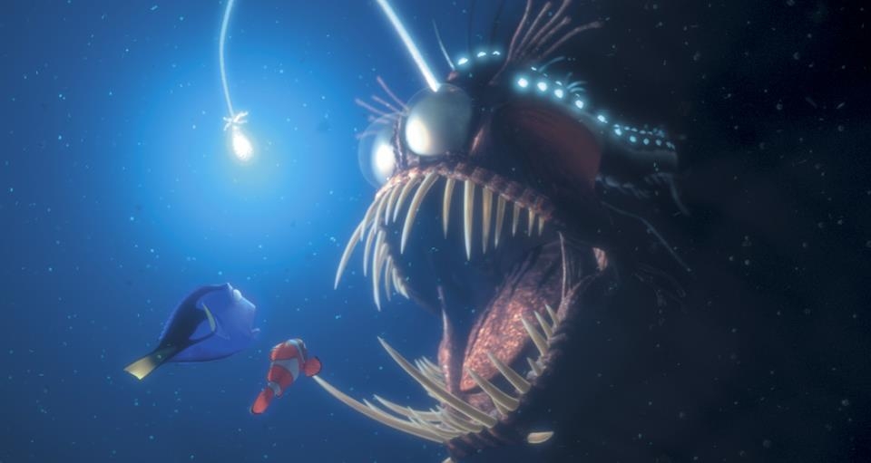
Oh shit! I didn't even notice the similarities!! I was inspired by the anglerfish actually but yeah I can see that now !

But thats just me and my opinion, don't let that discourage you, thanks for submitting this!
No worries!! Thank you for sharing! This probably won't be my last entry so this is great feedback nonetheless :) I will welcome all sorts of comments and yours was very kind
Constructive advice about the UI:
The padding on the top feels unnatural as there's lots of open space which isn't common for that area. Maybe add a header that gives instructions and move the content higher, something like "Getting started" with an icon and some text below?
Different background colour so the final result doesn't look as empty
This is the worst one imo
Fuck Meta!!
Missed opportunity to not say fediverse
Yeah I didn't want that 😭 I was hoping people would read to the end


From what I've seen it's all on-device using their new chip, but I really don't trust Apple to not collect data with it