678
The market will for sure solve this
(slrpnk.net)
A place to share and discuss data visualizations. #dataviz
(under new moderation as of 2024-01, please let me know if there are any changes you want to see!)
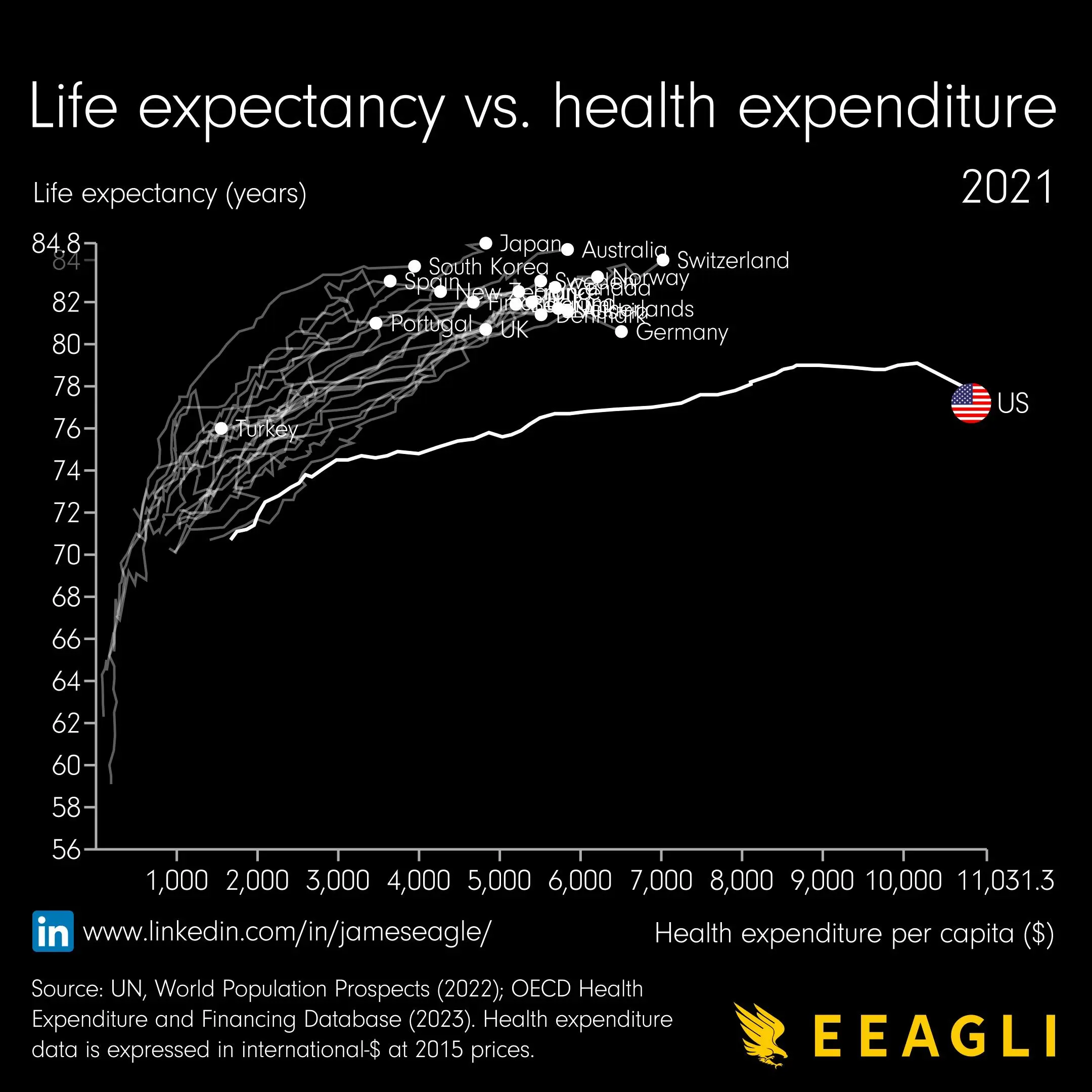
I would really like to know how this graph was generated, because some expenditure per capita values have three different corresponding life expectancy values. Just look at Spain for example.
I assumed each line represents time, so Spain's values fluctuated some