25
cross-posted from: https://lemdro.id/post/34179548
cross-posted from: https://lemdro.id/post/34179548
Design is the intent behind the product. Good design is when the user is empowered without being able to identify any specific design choices.
My wife accidentally upgraded her phone and is hating it
Turn on increase contrast and or reduce transparency in accessibility settings.
They added an option for “Tinted” liquid glass in Display Settings. Looks basically like ios 18 with that on.
Yeah, I’m an avid mac/i/iPadOS user, and that was a bad choice. And it’s sad, because it feels like a choice made just to have something to reveal at WWDC. I’d respect them a whole lot more with optimizations, performance improvements, and developer enhancements. I was good with 18, not to mention some elements from the older designs.
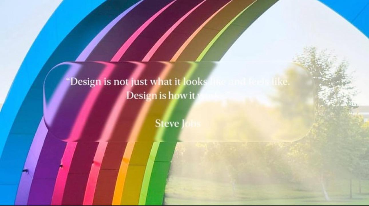
This image exemplifies everything that’s wrong with the transparency in the current iOS/macOS versions
I’m trying to figure out from this picture if it’s satire or not
to the largest Apple community on Lemmy. This is the place where we talk about everything Apple, from iOS to the exciting upcoming Apple Vision Pro. Feel free to join the discussion!
Apple Hardware
Apple TV
Apple Watch
iPad
iPhone
Mac
Vintage Apple
Apple Software
iOS
iPadOS
macOS
tvOS
watchOS
Shortcuts
Xcode
Community banner courtesy of u/Antsomnia.