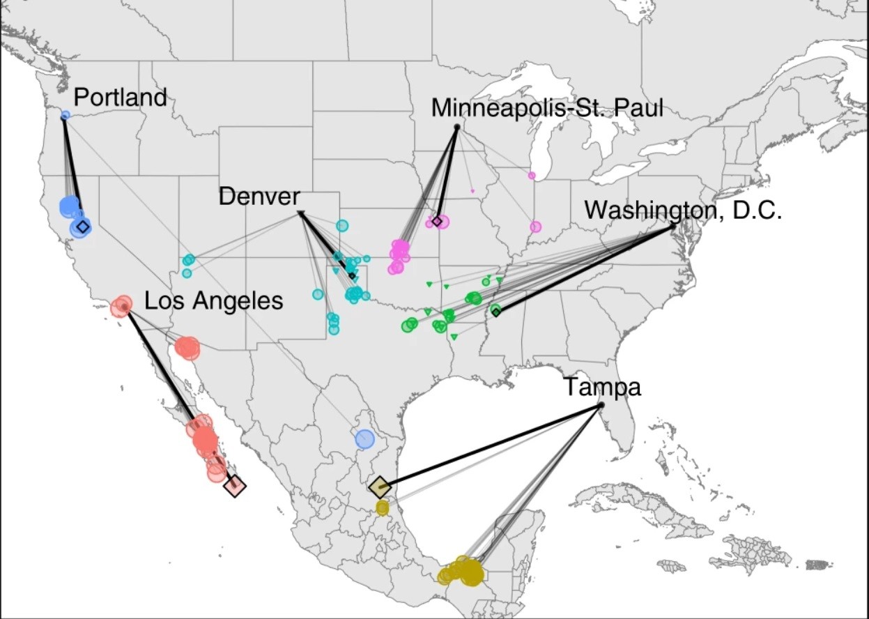
137
submitted 8 months ago by anatole@mapstodon.space to c/climate@slrpnk.net
top 16 comments
sorted by: hot top controversial new old
[-] incogtino@lemmy.zip 35 points 8 months ago* (last edited 8 months ago)

Thanks, this is interesting

For anyone who is not going to read the article, the map shows what locations have the climate today, that the major city will have in 2080, under a variety of climate change scenarios

"Climates of most urban areas in the central and western U.S. will become most similar to contemporary climates found to the south or southeast (Fig. 2). Put another way, by the 2080s climate of cities in the northeast will tend to feel more like the humid subtropical climates typical of parts of the Midwest or southeastern U.S. today (warmer and wetter in all seasons, Supplementary Figure 2), whereas the climates of western cities are expected to become more like those of the desert Southwest or southern California (warmer in all seasons, with changes in the amount and seasonal distribution of precipitation, Supplementary Figure 3)."

[-] greenhorn@lemm.ee 21 points 8 months ago

They also made a web app where you can input any city and it will show you its 2080 analog: https://fitzlab.shinyapps.io/cityapp/

[-] HootinNHollerin@lemmy.world 2 points 8 months ago

That’s pretty nifty and easy to interpret

[-] onion@feddit.de 4 points 8 months ago

And they use OpenStreetMap, pretty cool

[-] LibertyLizard@slrpnk.net 2 points 8 months ago

Cool idea, but outdated and pretty inaccurate for a lot of areas unfortunately. I’ve seen a few better versions out there.

[-] naeap@sopuli.xyz 4 points 8 months ago

Do you have some links?
Maybe also something that's not just US only? :⁠-⁠\

[-] LibertyLizard@slrpnk.net 2 points 8 months ago* (last edited 8 months ago)

I’ll see if I can find what I was looking at. I haven’t seen a really perfect one though. If you want to answer a specific question about your future climate, it’s often best to just look at local predictions.

[-] naeap@sopuli.xyz 1 points 8 months ago

Thanks for the effort already! :⁠-⁠)

[-] LibertyLizard@slrpnk.net 2 points 8 months ago

I think this was the best one I had found: https://climate.copernicus.eu/climate-analogues-finding-tomorrows-climate-today

Unfortunately it appears to be broken at the moment. Hopefully that is temporary.

[-] Hope@lemmy.world 14 points 8 months ago

Many people might not realize it, but the area of northern California they're saying Portland will become like is insanely hot in the summers. My first summer there I swear the high was in the 100s F from May 1st til Halloween.

[-] LibertyLizard@slrpnk.net 1 points 8 months ago

I wouldn’t put too much stock in this model. It’s not very accurate.

[-] wcbdata@vis.social 4 points 8 months ago

@anatole
What I find really interesting here is what happens when you trace the future climate of areas that currently produce most of the food for the US. Where they end up, climate-wise, the climate seems best suited for growing chickens and cattle (neither of which can be sustained without the grain from the breadbasket), sweet potatoes, peanuts, cotton, and, well, kudzu.
@climate

[-] wcbdata@vis.social 3 points 8 months ago

@anatole
Wow - every visual in this is excellent... And the narrative formed for the reader is specific and compelling.
@climate

this post was submitted on 25 Jan 2024
137 points (96.6% liked)

Climate - truthful information about climate, related activism and politics.

5143 readers
449 users here now

Discussion of climate, how it is changing, activism around that, the politics, and the energy systems change we need in order to stabilize things.

As a starting point, the burning of fossil fuels, and to a lesser extent deforestation and release of methane are responsible for the warming in recent decades: Graph of temperature as observed with significant warming, and simulated without added greenhouse gases and other anthropogentic changes, which shows no significant warming

How much each change to the atmosphere has warmed the world: IPCC AR6 Figure 2 - Thee bar charts: first chart: how much each gas has warmed the world.  About 1C of total warming.  Second chart:  about 1.5C of total warming from well-mixed greenhouse gases, offset by 0.4C of cooling from aerosols and negligible influence from changes to solar output, volcanoes, and internal variability.  Third chart: about 1.25C of warming from CO2, 0.5C from methane, and a bunch more in small quantities from other gases.  About 0.5C of cooling with large error bars from SO2.

Recommended actions to cut greenhouse gas emissions in the near future:

Anti-science, inactivism, and unsupported conspiracy theories are not ok here.

founded 1 year ago
MODERATORS