201
submitted 8 months ago* (last edited 8 months ago) by skhayfa@lemmy.world to c/climate@slrpnk.net
top 12 comments
sorted by: hot top controversial new old
[-] henfredemars@infosec.pub 48 points 8 months ago

My retirement savings will probably be enough after all.

[-] DarkThoughts@fedia.io 34 points 8 months ago

Having such large gaps on a linear graph is actually fucking scary. It looks like things are accelerating fast now, which make me think it might already be a runaway effect.

[-] JoMomma@lemm.ee 18 points 8 months ago

We just keep winning the race!

[-] tinwhiskers@lemmy.world 14 points 8 months ago

The max on this graph is 21.2. Each year, the time when cooling begins is getting later. If it's anything like last year, it seems possible it could break 21.5. Where is this 21.9 coming from?

[-] barter@lemmy.eco.br 14 points 8 months ago* (last edited 8 months ago)

My guess is that it’s actually 21.19 and they missed a 1

[-] skhayfa@lemmy.world 4 points 8 months ago
[-] Johanno@feddit.de 3 points 8 months ago

You can edit titles in lemmy

[-] skhayfa@lemmy.world 3 points 8 months ago

Awesome! Thanks for the tip!

[-] TropicalDingdong@lemmy.world 8 points 8 months ago* (last edited 8 months ago)
[-] Kanda@reddthat.com 6 points 8 months ago

New record! Call Guinness

this post was submitted on 06 Mar 2024
201 points (99.5% liked)

Climate - truthful information about climate, related activism and politics.

5229 readers
500 users here now

Discussion of climate, how it is changing, activism around that, the politics, and the energy systems change we need in order to stabilize things.

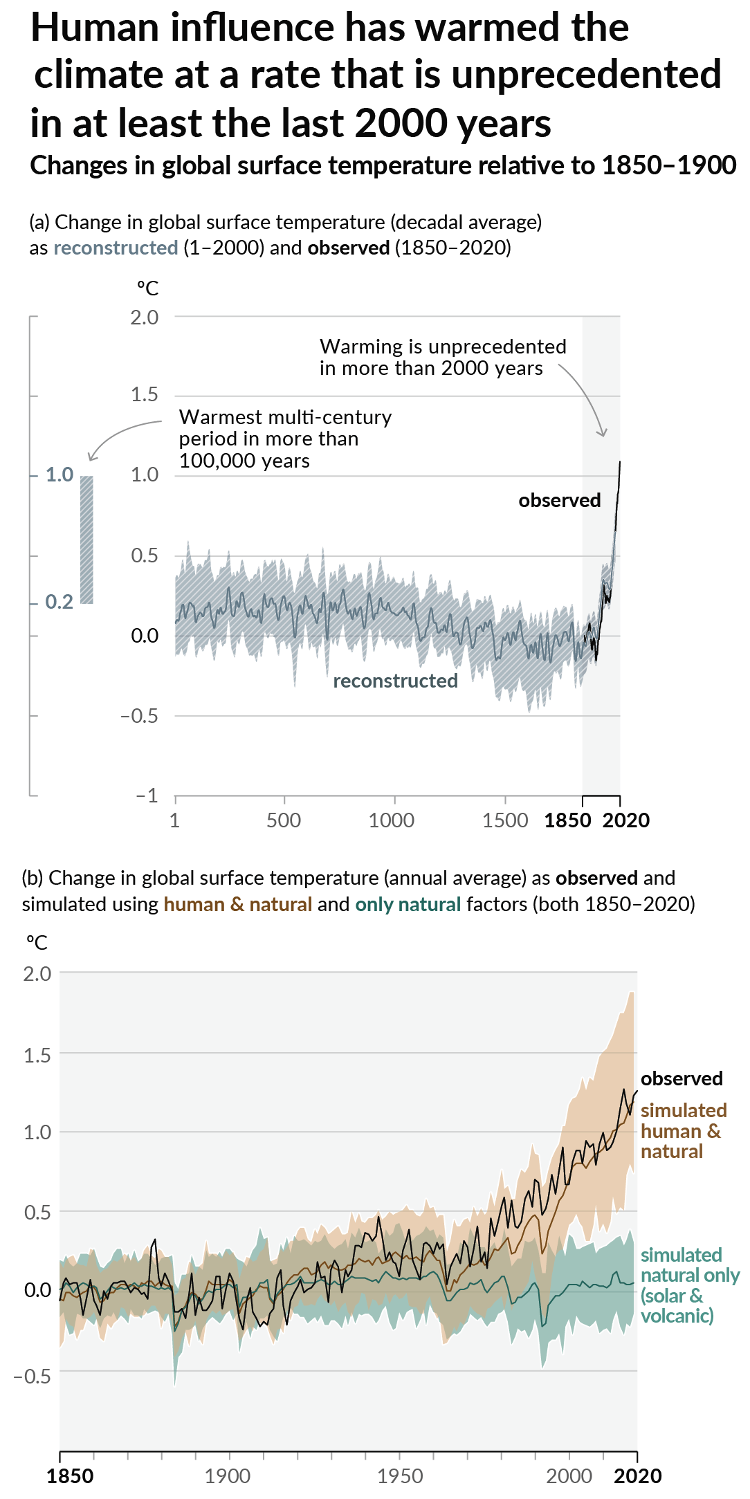
As a starting point, the burning of fossil fuels, and to a lesser extent deforestation and release of methane are responsible for the warming in recent decades: Graph of temperature as observed with significant warming, and simulated without added greenhouse gases and other anthropogentic changes, which shows no significant warming
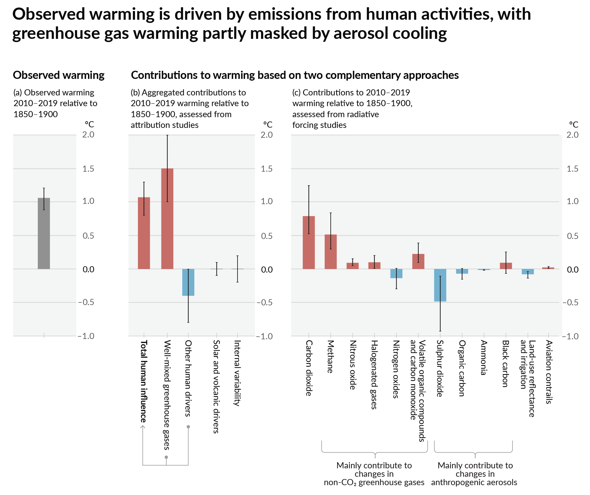
How much each change to the atmosphere has warmed the world: IPCC AR6 Figure 2 - Thee bar charts: first chart: how much each gas has warmed the world.  About 1C of total warming.  Second chart:  about 1.5C of total warming from well-mixed greenhouse gases, offset by 0.4C of cooling from aerosols and negligible influence from changes to solar output, volcanoes, and internal variability.  Third chart: about 1.25C of warming from CO2, 0.5C from methane, and a bunch more in small quantities from other gases.  About 0.5C of cooling with large error bars from SO2.
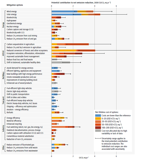
Recommended actions to cut greenhouse gas emissions in the near future:
Anti-science, inactivism, and unsupported conspiracy theories are not ok here.

founded 1 year ago
MODERATORS