Nintendo GameCube
Purple, had a handle for carrying and the gray perfectly offset the purple
Nintendo GameCube
Purple, had a handle for carrying and the gray perfectly offset the purple
For me all colors are cool. This machine is gorgeous.
Physical console design? Atari 2600. The black slots and wood grain front with the sleek angular design is still peak console styling IMO.
User interface design? Xbox 360 Blades. Hands down. Easy to navigate, easy to understand, and good potential for minimal advertising abuse.
Were blades the original UI for Xbox 360 or were they the update? I remember getting a beta invite to try the new UI, I can't remember whether it was going to or away from blades. But yeah, I liked that one too.
Yes the original dashboard used blades
DS Lite: the most timeless handheld imo

I had that exact DS Lite. It was such a huge improvement over the original DS. Such a clean design
I wasn’t even considering handhelds when I wrote this, but you are right. That looks so good. I guess I also love the gameboy pocket.
The original Wii
I liked the way it would just swallow the discs whole
And the blue LED ring 'round the disk slot that doubled as an activity indicator. So cool.
I always liked the translucent purple N64 and the controller that came with it. If they made a GameCube that way it would probably be my favourite.
I loved the translucent things (or even pure transparent)
Found an article with a few more
https://www.wired.com/story/remember-when-you-could-see-inside-gaming-console/
Black Dreamcast is pretty sexy.

The GameCube in a cool color (like Spice Orange). Not just because I like orange. It has great contrast with the grey and black parts of the console. And the whole thing is wrapped up in a tidy, aptly-named package!
The Dreamcast still looks futuristic in 2024.
Not sure if it counts (given this community), but the original PS4 immediately became my favorite console design. I am generally a fan of simple, elegant, soulless aesthetics.
the 2600 and the coleco telstar are the first that come to mind. it's a shame wood grain fell out of fashion right as game consoles fell into fashion! i also love the the grey variant of the Saturn. Panasonic got two hits in a row with the 3DO and their GameCube-compatible DVD player thing.
honorable mention goes to the Daewoo CPG-120 which I only just learned about today. it's a consolized MSX2 that looks like a cross between the Enterprise and a Roomba. i can't decide if it looks magnificent or awful and it's arguably not a console to begin with but hey
edit: oh, and sharp's twin famicom! in general companies that made other kinds of electronic appliances had a way of bringing a certain class to console design without eliminating the fun
If we can pick home computers that lean into cartridges, the Atari 800XL is a real winner. Nice two-tone finish, classy silver buttons with a plexi trim oiece covering the power light.
My fist general purpose console was the Sega Master System. It had a flowchart displayed on the top telling you how to use it.

It might not have been pretty in the traditional sense but I loved it.
Looking back on it the chart was somewhat misleading, the console had two built in games that were only accessible if you didn't insert a cartridge or card (Hang On, and Safari Hunt), and a third that also needed a controller connected and a few buttons held down when you turned the system on (snail maze).
Console: Nintendo Wii, it is small, and has a sleek vertical design.
Handheld: PSP 2000 and 3000, it is just a beauty at any angle.
Gamecube.
2nd would be PS Vita (original OLED version).
The PS5 is probably my most hated look and shape. Just an idiotic and clunky design, and moronic decisions to go white.
I still think the PS2 had the best looking and at the time most radical design. 1 was cool and iconic. 3 was just ugly. 4 ok, The current design looks cool but is extremely impractical.
Of Nintendo I liked the European SNES, Gameboy Color and DS Lite. N64 is dear to my heart but it was not good looking and the controller was horrendous.
Amstrad GX4000! Fantastic looking machine, sold mine a few years ago, which is a bit of a regret. https://en.wikipedia.org/wiki/Amstrad_GX4000

That looks like it would give me at least 25 hp when I pick it up.
New nintendo 3DS for me. Small compact boxy look. True handheld. Pocketable. Just perfect.
The 3DO FZ-10 looks much cooler than one would think the console deserves based on its reputation
Definitely a looker. Picked one up a year ago and have not been disappointed, bearing in mind the limited game library.
Similarly the 1st version PC-Engine Duo is top class. Just a great sleek look
Rented this a few times from Blockbuster and played it at the demo that was always set up at Costco, it was a really solid system with actual potential. Blockbuster had a program back in the day where for $40 or something like that you could rent a system with 2 controllers and 2 games for 7 days. Did the same with the Sega Saturn with similar feelings, eventually ended up owning a N64 and that was not a disappointment in the end.
The ballistic hard shell cases with foam inserts Blockbuster rented out consoles in were seriously cool I wonder if any exist still
Super Famicom or ‘this is cool’ Saturn
Even though I had the model 2 growing up, I really like the model 1 Genesis/Megadrive. Had a kind of futuristic/sci-fi vibe to me.

For actually released consoles, I think the Famicom is just neat looking

I also like the Famicom. I almost put it in the post.
I always loved the look of the Super Nintendo, for some reason it looked like a piece of decoration straight out of a Super Mario game.
Weirdly the 3DS XL for me, I think.
Japanese Sega Saturn is my all-time favorite design
Dreamcast and Japanese/PAL SNES are also up there.
I appreciate how sleek the Mega Drive model 2 looks. Without any of the life support modules, of course.
I'd choose either the PSP or the dreamcast
For me, it's the PS5 for having such a slick and futuristic look.
Honourable mention goes to Nintendo Switch for being so cute.
The slim ps3, that rounded shape, the black chrome front panel, and those nice tactile buttons
Console design peaked with that console and everything newer lives in its shadow for me

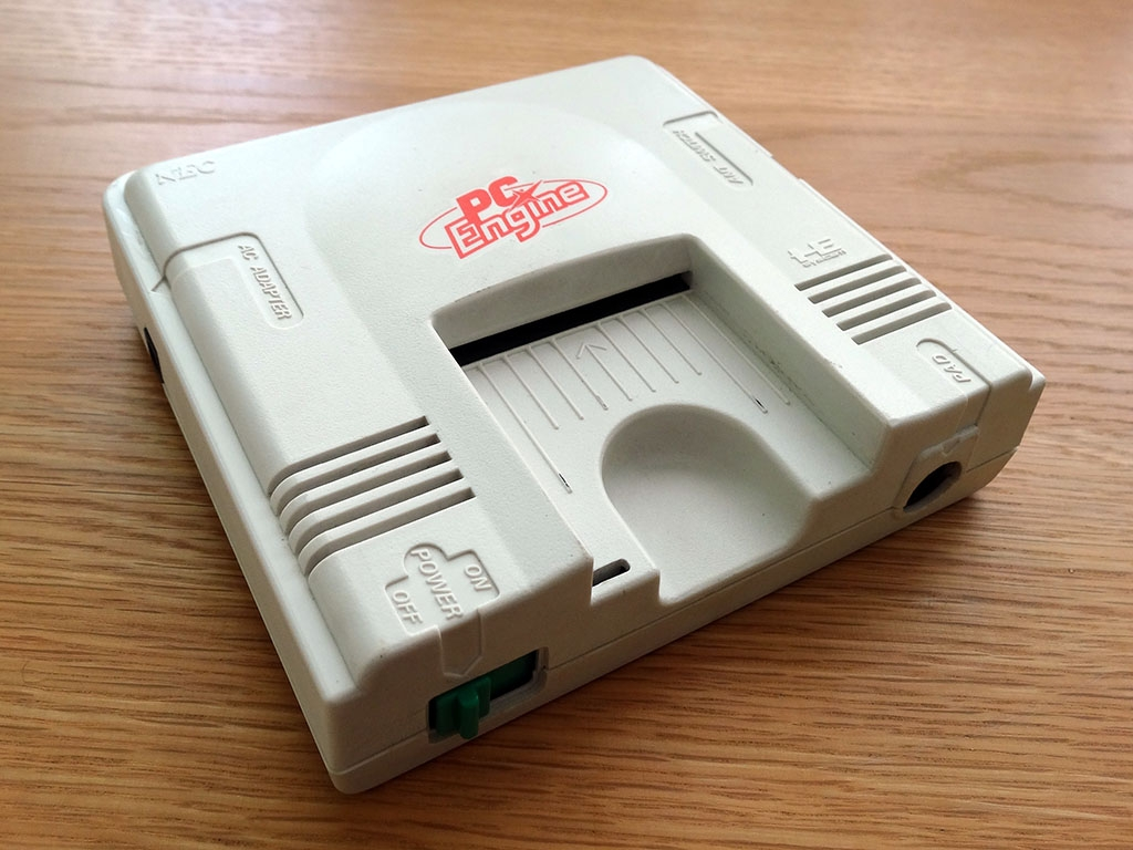
The PC Engine is definitely a contender. Looks like something from the set of Star Trek TNG, takes unique little cards, and is extremely tiny* and compact. (particularly for a system that was ahead of its time) I think it's neat!
*roughly the size of a sandwich
Ita between the Dreamcast and GameCube for me. Especially all the coloured shells for the DC that look great.
Small shout to the Xbox One S with the vertical stand for looking slick too.
Vintage gaming community.
Rules:
If you see these please report them.