126
4

Robots can look like all sorts of things, but they’re often more fun if you make them look like some kind of charming animal. That’s precisely what [Ananya], [Laurence] and [Shao] did when they built Cucumber the Robot Dog for their final project in the ECE 4760 class.

Cucumber is controllable over WiFi, which was simple enough to implement by virtue of the fact that it’s based around the Raspberry Pi Pico W. With its custom 3D-printed dog-like body, it’s able to move around on its four wheels driven by DC gear motors, and it can flex its limbs thanks to servos in its various joints. It’s able to follow someone with some autonomy thanks to its ultrasonic sensors, while it can also be driven around manually if so desired. To give it more animal qualities, it can also be posed, or commanded to bark, howl, or growl, with commands issued remotely via a web interface.

The level of sophistication is largely on the level of the robot dogs that were so popular in the early 2000s. One suspects it could be pretty decent at playing soccer, too, with the right hands behind the controls. Video after the break.


From Blog – Hackaday via this RSS feed

127
5

We have all suffered from this; the boss wants you to compile a report on the number of paper clips and you’re crawling up the wall with boredom, so naturally your mind strays to other things. You check social media, or maybe the news, and before you know it a while has been wasted. [Neil Chen] came up with a solution, to configure a cheap smart plug with a script to block his diversions of choice.

The idea is simple enough, the plug is in an outlet that requires getting up and walking a distance to access, so to flip that switch you’ve really got to want to do it. Behind it lives a Python script that can be found in a Git Hub repository, and that’s it! We like it for its simplicity and ingenuity, though we’d implore any of you to avoid using it to block Hackaday. Some sites are simply too important to avoid!

Of course, if distraction at work is your problem, perhaps you should simply run something without it.


From Blog – Hackaday via this RSS feed

128
7

Animal Crossing keyboard banner

[Hunter Irving] is a talented hacker with a wicked sense of humor, and he has written in to let us know about his latest project which is to make a GameCube keyboard controller work with Animal Crossing.

This project began simply enough but got very complicated in short order. Initially the goal was to get the GameCube keyboard controller integrated with the game Animal Crossing. The GameCube keyboard controller is a genuine part manufactured and sold by Nintendo but the game Animal Crossing isn’t compatible with this controller. Rather, Animal Crossing has an on-screen keyboard which players can use with a standard controller. [Hunter] found this frustrating to use so he created an adapter which would intercept the keyboard controller protocol and replace it with equivalent “keypresses” from an emulated standard controller.

Controller wiring schematic.In this project [Hunter] intercepts the controller protocol and the keyboard protocol with a Raspberry Pi Pico and then forwards them along to an attached GameCube by emulating a standard controller from the Pico. Having got that to work [Hunter] then went on to add a bunch of extra features.

First he designed and 3D-printed a new set of keycaps to match the symbols available in the in-game character set and added support for those. Then he made a keyboard mode for entering musical tunes in the game. Then he integrated a database of cheat codes to unlock most special items available in the game. Then he made it possible to import images (in low-resolution, 32×32 pixels) into the game. Then he made it possible to play (low-resolution) videos in the game. And finally he implemented a game of Snake, in-game! Very cool.

If you already own a GameCube and keyboard controller (or if you wanted to get them) this project would be good fun and doesn’t demand too much extra hardware. Just a Raspberry Pi Pico, two GameCube controller cables, two resistors, and a Schottky diode. And if you’re interested in Animal Crossing you might enjoy getting it to boot Linux!

Thanks very much to [Hunter] for writing in to let us know about this project. Have your own project? Let us know on the tipsline!


From Blog – Hackaday via this RSS feed

129
5

[Ralph] is excited about impedance matching, and why not? It is important to match the source and load impedance to get the most power out of a circuit. He’s got a whole series of videos about it. The latest? Matching using a PI network and the venerable Smith Chart.

We like that he makes each video self-contained. It does mean if you watch them all, you get some review, but that’s not a bad thing, really. He also does a great job of outlining simple concepts, such as what a complex conjugate is, that you might have forgotten.

Smith charts almost seem magical, but they are really sort of an analog computer. The color of the line and even the direction of an arrow make a difference, and [Ralph] explains it all very simply.

The example circuit is simple with a 50 MHz signal and a mismatched source and load. Using the steps and watching the examples will make it straightforward, even if you’ve never used a Smith Chart before.

The red lines plot impedance, and the blue lines show conductance and succeptance. Once everything is plotted, you have to find a path between two points on the chart. That Smith was a clever guy.

We looked at part 1 of this series earlier this year, so there are five more to watch since then. If your test gear leaves off the sign of your imaginary component, the Smith Chart can work around that for you.


From Blog – Hackaday via this RSS feed

130
17

Two clear acrylic tubes are shown in the foreground. Swirls of sawdust are visible on the inside of the tubes, and the tubes are held in place by grey plastic connectors. Below the tubes, there are two clear plastic tubs containing sawdust.

[Ruud], the creator of [Capturing Dust], started his latest video with what most of us would consider a solved problem: the dust collection system for his shop already had a three-stage centrifugal dust separator with more than 99.7% efficiency. This wasn’t quite as efficient as it could be, though, so [Ruud]’s latest upgrade shrinks the size of the third stage while increasing efficiency to within a rounding error of 99.9%.The old separation system had two stages to remove large and medium particles, and a third stage to remove fine particles. The last stage was made out of 100 mm acrylic tubing and 3D-printed parts, but [Ruud] planned to try replacing it with two parallel centrifugal separators made out of 70 mm tubing. Before he could do that, however, he redesigned the filter module to make it easier to weigh, allowing him to determine how much sawdust made it through the extractors. He also attached a U-tube manometer (a somewhat confusing name to hear on YouTube) to measure pressure loss across the extractor.The new third stage used impellers to induce rotational airflow, then directed it against the circular walls around an air outlet. The first design used a low-profile collection bin, but this wasn’t keeping the dust out of the air stream well enough, so [Ruud] switched to using plastic jars. Initially, this didn’t perform as well as the old system, but a few airflow adjustments brought the efficiency up to 99.879%. In [Ruud]’s case, this meant that of 1.3 kilograms of fine sawdust, only 1.5 grams of dust made it through the separator to the filter, which is certainly impressive in our opinion. The design for this upgraded separator is available on GitHub.[Ruud] based his design off of another 3D-printed dust separator, but adapted it to European fittings. Of course, the dust extractor is only one part of the problem; you’ll still need a dust routing system.

Thanks to [Keith Olson] for the tip!


From Blog – Hackaday via this RSS feed

131
6

For as versatile and inexpensive as switch-mode power supplies are at all kinds of different tasks, they’re not always the ideal choice for every DC-DC circuit. Although they can do almost any job in this arena, they tend to have high parts counts, higher complexity, and higher cost than some alternatives. [Jasper] set out to test some alternative linear chargers called low dropout regulators (LDOs) for small-scale charging of lithium ion capacitors against those more traditional switch-mode options.

The application here is specifically very small solar cells in outdoor applications, which are charging lithium ion capacitors instead of batteries. These capacitors have a number of benefits over batteries including a higher number of discharge-recharge cycles and a greater tolerance of temperature extremes, so they can be better off in outdoor installations like these. [Jasper]’s findings with using these generally hold that it’s a better value to install a slightly larger solar cell and use the LDO regulator rather than using a smaller cell and a more expensive switch-mode regulator. The key, though, is to size the LDO so that the voltage of the input is very close to the voltage of the output, which will minimize losses.

With unlimited time or money, good design can become less of an issue. In this case, however, saving a few percentage points in efficiency may not be worth the added cost and complexity of a slightly more efficient circuit, especially if the application will be scaled up for mass production. If switched mode really is required for some specific application, though, be sure to design one that’s not terribly noisy.


From Blog – Hackaday via this RSS feed

132
3

In theory, writing a Linux device driver shouldn’t be that hard, but it is harder than it looks. However, using libusb, you can easily deal with USB devices from user space, which, for many purposes, is fine.  [Crescentrose] didn’t know anything about writing user-space USB drivers until they wrote one and documented it for us. Oh, the code is in Rust, for which there aren’t as many examples.

The device in question was a USB hub with some extra lights and gadgets. So the real issue, it seems to us, wasn’t the code, but figuring out the protocol and the USB stack. The post covers that, too, explaining configurations, interfaces, and endpoints.

There are other ancillary topics, too, like setting up udev. This lets you load things when a USB device (or something else) plugs in.

Of course, you came for the main code. The Rust program is fairly straightforward once you have the preliminaries out of the way. The libusb library helps a lot. By the end, the code kicks off some threads, handles interrupts, and does other device-driver-like things.

So if you like Rust and you ever thought about a user space device driver for a USB device, this is your chance to see it done. It didn’t take years. However, you can do a lot in user space.


From Blog – Hackaday via this RSS feed

133
9

It’s about time! Or maybe it’s about time’s reciprocal: frequency. Whichever way you see it, Hackaday is pleased to announce, just this very second, the 2025 One Hertz Challenge over on Hackaday.io. If you’ve got a device that does something once per second, we’ve got the contest for you. And don’t delay, because the top three winners will each receive a $150 gift certificate from this contest’s sponsor: DigiKey.

What will you do once per second? And how will you do it? Therein lies the contest! We brainstormed up a few honorable mention categories to get your creative juices flowing.

Timelords: How precisely can you get that heartbeat? This category is for those who prefer to see a lot of zeroes after the decimal point.Ridiculous: This category is for the least likely thing to do once per second. Accuracy is great, but absurdity is king here. Have Rube Goldberg dreams? Now you get to live them out.Clockwork: It’s hard to mention time without thinking of timepieces. This category is for the clockmakers among you. If your clock ticks at a rate of one hertz, and you’re willing to show us the mechanism, you’re in.Could Have Used a 555: We knew you were going to say it anyway, so we made it an honorable mention category. If your One Hertz project gets its timing from the venerable triple-five, it belongs here.

We love contests with silly constraints, because you all tend to rise to the challenge. At the same time, the door is wide open to your creativity. To enter, all you have to do is document your project over on Hackaday.io and pull down the “Contests” tab to One Hertz to enter. New projects are awesome, but if you’ve got an oldie-but-goodie, you can enter it as well. (Heck, maybe use this contest as your inspiration to spruce it up a bit?)

Time waits for no one, and you have until August 19th at 9:00 AM Pacific time to get your entry in. We can’t wait to see what you come up with.


From Blog – Hackaday via this RSS feed

134
6

Resin keycap made from dried flowers

Here’s a fun build. Over on their YouTube channel our hacker [Atasoy] shows us how to make a custom floral keyboard keycap using resin.

We begin by using an existing keycap as a pattern to make a mold. We plug the keycap with all-purpose adhesive paste so that we can attach it to a small sheet of Plexiglas, which ensures the floor of our mold is flat. Then a side frame is fashioned from 100 micron thick acetate which is held together by sticky tape. Hot glue is used to secure the acetate side frame to the Plexiglas floor, keeping the keycap centered. RTV2 molding silicone is used to make the keycap mold. After 24 hours the silicone mold is ready.

Then we go through a similar process to make the mold for the back of the keycap. Modeling clay is pushed into the back of the keycap. Then silicone is carefully pushed into the keycap, and 24 hours later the back silicone mold is also ready.

The back mold is then glued to a fresh sheet of Plexiglas and cut to shape with a craft knife. Holes are drilled into the Plexiglas. A mix of artificial grass and UV resin is made to create the floor. Then small dried flowers are cut down to size for placement in the top of the keycap. Throughout the process UV light is used to cure the UV resin as we go along.

Finally we are ready to prepare and pour our epoxy resin, using our two molds. Once the mold sets our new keycap is cut out with a utility knife, then sanded and polished, before being plugged into its keyboard. This was a very labor intensive keycap, but it’s a beautiful result.

If you’re interested in making things with UV resin, we’ve covered that here before. Check out 3D Printering: Print Smoothing Tests With UV Resin and UV Resin Perfects 3D Print, But Not How You Think. Or if you’re interested in epoxy resin, we’ve covered that too! See Epoxy Resin Night Light Is An Amazing Ocean-Themed Build and Degassing Epoxy Resin On The (Very) Cheap.

Thanks to [George Graves] for sending us this one via the tipsline!


From Blog – Hackaday via this RSS feed

135
6

A lot of people complain that driving across the United States is boring. Having done the coast-to-coast trip seven times now, I can’t agree. Sure, the stretches through the Corn Belt get a little monotonous, but for someone like me who wants to know how everything works, even endless agriculture is fascinating; I love me some center-pivot irrigation.

One thing that has always attracted my attention while on these long road trips is the weigh stations that pop up along the way, particularly when you transition from one state to another. Maybe it’s just getting a chance to look at something other than wheat, but weigh stations are interesting in their own right because of everything that’s going on in these massive roadside plazas. Gone are the days of a simple pull-off with a mechanical scale that was closed far more often than it was open. Today’s weigh stations are critical infrastructure installations that are bristling with sensors to provide a multi-modal insight into the state of the trucks — and drivers — plying our increasingly crowded highways.

All About the Axles

Before diving into the nuts and bolts of weigh stations, it might be helpful to discuss the rationale behind infrastructure whose main function, at least to the casual observer, seems to be making the truck driver’s job even more challenging, not to mention less profitable. We’ve all probably sped by long lines of semi trucks queued up for the scales alongside a highway, pitying the poor drivers and wondering if the whole endeavor is worth the diesel being wasted.

The answer to that question boils down to one word: axles. In the United States, the maximum legal gross vehicle weight (GVW) for a fully loaded semi truck is typically 40 tons, although permits are issued for overweight vehicles. The typical “18-wheeler” will distribute that load over five axles, which means each axle transmits 16,000 pounds of force into the pavement, assuming an even distribution of weight across the length of the vehicle. Studies conducted in the early 1960s revealed that heavier trucks caused more damage to roadways than lighter passenger vehicles, and that the increase in damage is proportional to the fourth power of axle weight. So, keeping a close eye on truck weights is critical to protecting the highways.

Just how much damage trucks can cause to pavement is pretty alarming. Each axle of a truck creates a compression wave as it rolls along the pavement, as much as a few millimeters deep, depending on road construction and loads. The relentless cycle of compression and expansion results in pavement fatigue and cracks, which let water into the interior of the roadway. In cold weather, freeze-thaw cycles exert tremendous forces on the pavement that can tear it apart in short order. The greater the load on the truck, the more stress it puts on the roadway and the faster it wears out.

The other, perhaps more obvious reason to monitor axles passing over a highway is that they’re critical to truck safety. A truck’s axles have to support huge loads in a dynamic environment, and every component mounted to each axle, including springs, brakes, and wheels, is subject to huge forces that can lead to wear and catastrophic failure. Complete failure of an axle isn’t uncommon, and a driver can be completely unaware that a wheel has detached from a trailer and become an unguided missile bouncing down the highway. Regular inspections of the running gear on trucks and trailers are critical to avoiding these potentially catastrophic occurrences.

Ways to Weigh

The first thing you’ll likely notice when driving past one of the approximately 700 official weigh stations lining the US Interstate highway system is how much space they take up. In contrast to the relatively modest weigh stations of the past, modern weigh stations take up a lot of real estate. Most weigh stations are optimized to get the greatest number of trucks processed as quickly as possible, which means constructing multiple lanes of approach to the scale house, along with lanes that can be used by exempt vehicles to bypass inspection, and turnout lanes and parking areas for closer inspection of select vehicles.

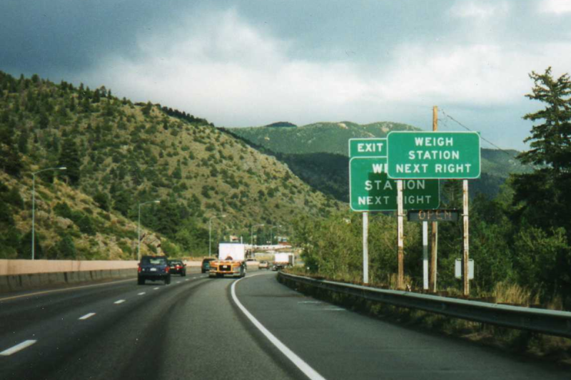
In addition to the physical footprint of the weigh station proper, supporting infrastructure can often be seen miles in advance. Fixed signs are usually the first indication that you’re getting near a weigh station, along with electronic signboards that can be changed remotely to indicate if the weigh station is open or closed. Signs give drivers time to figure out if they need to stop at the weigh station, and to begin the process of getting into the proper lane to negotiate the exit. Most weigh stations also have a net of sensors and cameras mounted to poles and overhead structures well before the weigh station exit. These are monitored by officers in the station to spot any trucks that are trying to avoid inspections.

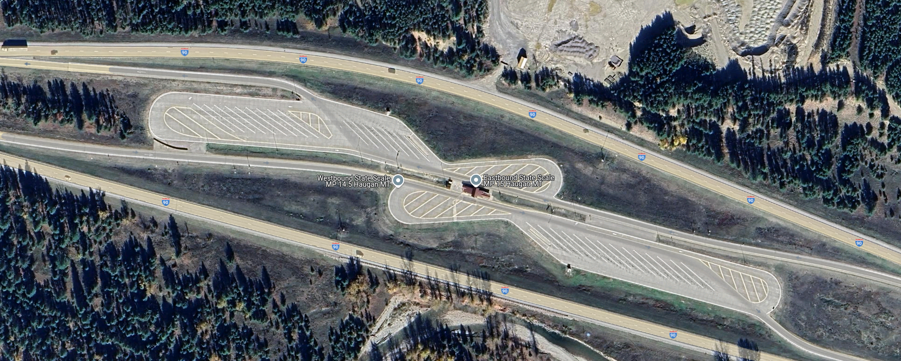
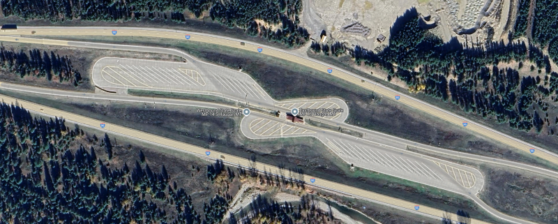
Overhead view of a median weigh station on I-90 in Haugan, Montana. Traffic from both eastbound and westbound lanes uses left exits to access the scales in the center. There are ample turnouts for parking trucks that fail one test or another. Source: Google Maps.

Most weigh stations in the US are located off the right side of the highway, as left-hand exit ramps are generally more dangerous than right exits. Still, a single weigh station located in the median of the highway can serve traffic from both directions, so the extra risk of accidents from exiting the highway to the left is often outweighed by the savings of not having to build two separate facilities. Either way, the main feature of a weigh station is the scale house, a building with large windows that offer a commanding view of the entire plaza as well as an up-close look at the trucks passing over the scales embedded in the pavement directly adjacent to the structure.

Scales at a weigh station are generally of two types: static scales, and weigh-in-motion (WIM) systems. A static scale is a large platform, called a weighbridge, set into a pit in the inspection lane, with the surface flush with the roadway. The platform floats within the pit, supported by a set of cantilevers that transmit the force exerted by the truck to electronic load cells. The signal from the load cells is cleaned up by signal conditioners before going to analog-to-digital converters and being summed and dampened by a scale controller in the scale house.

The weighbridge on a static scale is usually long enough to accommodate an entire semi tractor and trailer, which accurately weighs the entire vehicle in one measurement. The disadvantage is that the entire truck has to come to a complete stop on the weighbridge to take a measurement. Add in the time it takes for the induced motion of the weighbridge to settle, along with the time needed for the driver to make a slow approach to the scale, and each measurement can add up to significant delays for truckers.

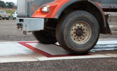
Weigh-in-motion sensor. WIM systems measure the force exerted by each axle and calculate a total gross vehicle weight (GVW) for the truck while it passes over the sensor. The spacing between axles is also measured to ensure compliance with state laws. Source: Central Carolina Scales, Inc.

To avoid these issues, weigh-in-motion systems are often used. WIM systems use much the same equipment as the weighbridge on a static scale, although they tend to use piezoelectric sensors rather than traditional strain-gauge load cells, and usually have a platform that’s only big enough to have one axle bear on it at a time. A truck using a WIM scale remains in motion while the force exerted by each axle is measured, allowing the controller to come up with a final GVW as well as weights for each axle. While some WIM systems can measure the weight of a vehicle at highway speed, most weigh stations require trucks to keep their speed pretty slow, under five miles per hour. This is obviously for everyone’s safety, and even though the somewhat stately procession of trucks through a WIM can still plug traffic up, keeping trucks from having to come to a complete stop and set their brakes greatly increases weigh station throughput.

Another advantage of WIM systems is that the spacing between axles can be measured. The speed of the truck through the scale can be measured, usually using a pair of inductive loops embedded in the roadway around the WIM sensors. Knowing the vehicle’s speed through the scale allows the scale controller to calculate the distance between axles. Some states strictly regulate the distance between a trailer’s kingpin, which is where it attaches to the tractor, and the trailer’s first axle. Trailers that are not in compliance can be flagged and directed to a parking area to await a service truck to come by to adjust the spacing of the trailer bogie.

Keep It Moving, Buddy

A PrePass transponder reader and antenna over Interstate 10 near Pearlington, Mississippi. Trucks can bypass a weigh station if their in-cab transponder identifies them as certified. Source: Tony Webster, CC BY-SA 2.0.

Despite the increased throughput of WIM scales, there are often too many trucks trying to use a weigh station at peak times. To reduce congestion further, some states participate in automatic bypass systems. These systems, generically known as PrePass for the specific brand with the greatest market penetration, use in-cab transponders that are interrogated by transmitters mounted over the roadway well in advance of the weigh station. The transponder code is sent to PrePass for authentication, and if the truck ID comes back to a company that has gone through the PrePass certification process, a signal is sent to the transponder telling the driver to bypass the weigh station. The transponder lights a green LED in this case, which stays lit for about 15 minutes, just in case the driver gets stopped by an overzealous trooper who mistakes the truck for a scofflaw.

PrePass transponders are just one aspect of an entire suite of automatic vehicle identification (AVI) systems used in the typical modern weigh station. Most weigh stations are positively bristling with cameras, some of which are dedicated to automatic license plate recognition. These are integrated into the scale controller system and serve to associate WIM data with a specific truck, so violations can be flagged. They also help with the enforcement of traffic laws, as well as locating human traffickers, an increasingly common problem. Weigh stations also often have laser scanners mounted on bridges over the approach lanes to detect unpermitted oversized loads. Image analysis systems are also used to verify the presence and proper operation of required equipment, such a mirrors, lights, and mudflaps. Some weigh stations also have systems that can interrogate the electronic logging device inside the cab to verify that the driver isn’t in violation of hours of service laws, which dictate how long a driver can be on the road before taking breaks.

Sensors Galore

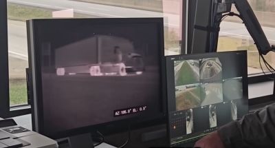
IR cameras watch for heat issues on trucks at a Kentucky weigh station. Heat signatures can be used to detect bad tires, stuck brakes, exhaust problems, and even illicit cargo. Source: Trucking Life with Shawn

Another set of sensors often found in the outer reaches of the weigh station plaza is related to the mechanical status of the truck. Infrared cameras are often used to scan for excessive heat being emitted by an axle, often a sign of worn or damaged brakes. The status of a truck’s tires can also be monitored thanks to Tire Anomaly and Classification Systems (TACS), which use in-road sensors that can analyze the contact patch of each tire while the vehicle is in motion. TACS can detect flat tires, over- and under-inflated tires, tires that are completely missing from an axle, or even mismatched tires. Any of these anomalies can cause a tire to quickly wear out and potentially self-destruct at highway speeds, resulting in catastrophic damage to surrounding traffic.

Trucks with problems are diverted by overhead signboards and direction arrows to inspection lanes. There, trained truck inspectors will closely examine the flagged problem and verify the violation. If the problem is relatively minor, like a tire inflation problem, the driver might be able to fix the issue and get back on the road quickly. Trucks that can’t be made safe immediately might have to wait for mobile service units to come fix the problem, or possibly even be taken off the road completely. Only after the vehicle is rendered road-worthy again can you keep on trucking.

Featured image: “WeighStationSign” by [Wasted Time R]


From Blog – Hackaday via this RSS feed

136
6

The Stronghero 3D hybrid PLA PETG filament, with visible PETG core. (Credit: My Tech Fun, YouTube)The Stronghero 3D hybrid PLA PETG filament, with visible PETG core. (Credit: My Tech Fun, YouTube)

Sometimes you see an FDM filament pop up that makes you do a triple-take because it doesn’t seem to make a lot of sense. This is the case with a hybrid PLA/PETG filament by Stronghero 3D  that features a PETG core. This filament also intrigued [Dr. Igor Gaspar] who imported a spool from the US to have a poke at it to see why you’d want to combine these two filament materials.

According to the manufacturer, the PLA outside makes up 60% of the filament, with the rest being the PETG core. The PLA is supposed to shield the PETG from moisture, while adding more strength and weather resistance to the PLA after printing. Another interesting aspect is the multi-color look that this creates, and which [Igor]’s prints totally show. Finding the right temperatures for the bed and extruder was a challenge and took multiple tries with the Bambu Lab P1P including bed adhesion troubles.

As for the actual properties of this filament, the layer adhesion test showed it to be significantly worse than plain PLA or PETG when printed at extruder temperatures from 225 °C to 245 °C. When the shear stress is put on the material instead of the layer adhesion, the results are much better, while torque resistance is better than plain PETG. This is a pattern that repeats across impact and other tests, with PETG more brittle. Thermal deformation  temperature is, unsurprisingly, between both materials, making this filament mostly a curiosity unless its properties work much better for your use case than a non-hybrid filament.


From Blog – Hackaday via this RSS feed

137
8

A favourite thing for the developers behind a complex software project is to embed an Easter egg: something unexpected that can be revealed only by those in the know. Apple certainly had their share of them in their early days, a practice brought to a close by Steve Jobs on his return to the company. One of the last Macs to contain one was the late 1990s beige G3, and while its existence has been know for years, until now nobody has decoded the means to display it on the Mac. Now [Doug Brown] has taken on the challenge.

The Easter egg is a JPEG file embedded in the ROM with portraits of the team, and it can’t be summoned with the keypress combinations used on earlier Macs. We’re taken on a whirlwind tour of ROM disassembly as he finds an unexpected string in the SCSI driver code. Eventually it’s found that formatting the RAM disk with the string as a volume name causes the JPEG to be saved into the disk, and any Mac user can come face to face with the dev team. It’s a joy reserved now for only a few collectors of vintage hardware, but still over a quarter century later, it’s fascinating to learn about. Meanwhile, this isn’t the first Mac easter egg to find its way here.


From Blog – Hackaday via this RSS feed

138
10

As humans we often think we have a pretty good handle on the basics of the way the world works, from an intuition about gravity good enough to let us walk around, play baseball, and land spacecraft on the moon, or an understanding of electricity good enough to build everything from indoor lighting to supercomputers. But zeroing in on any one phenomenon often shows a world full of mystery and surprise in an area we might think we would have fully understood by now. One such area is static electricity, and the way that it forms within certain materials shows that it can impart a kind of memory to them.

The video demonstrates a number of common ways of generating static electricity that most of us have experimented with in the past, whether on purpose or accidentally, from rubbing a balloon on one’s head and sticking it to the wall or accidentally shocking ourselves on a polyester blanket. It turns out that certain materials like these tend to charge themselves positively or negatively depending on what material they were rubbed against, but some researchers wondered what would happen if an object were rubbed against itself. It turns out that in this situation, small imperfections in the materials cause them to eventually self-order into a kind of hierarchy, and repeated charging of these otherwise identical objects only deepen this hierarchy over time essentially imparting a static electricity memory to them.

The effect of materials to gain or lose electrons in this way is known as the triboelectric effect, and there is an ordering of materials known as the triboelectric series that describes which materials are more likely to gain or lose electrons when brought into contact with other materials. The ability of some materials, like quartz in this experiment, to develop this memory is certainly an interesting consequence of an otherwise well-understood phenomenon, much like generating power for free from static electricity that’s always present within the atmosphere might surprise some as well.


From Blog – Hackaday via this RSS feed

139
13

Procedural generation is a big part of game design these days. Usually you generate your map, and [Fractal Philosophy] has decided to go one step further: using a procedurally-generated world from an older video, he is procedurally generating history by simulating the rise and fall of empires on that map in a video embedded below.

Now, lacking a proper theory of Psychohistory, [Fractal Philosophy] has chosen to go with what he admits is the simplest model he could find, one centered on the concept of “solidarity” and based on the work of [Peter Turchin], a Russian-American thinker. “Solidarity” in the population holds the Empire together; external pressures increase it, and internal pressures decrease it. This leads to an obvious cellular automation type system (like Conway’s Game of Life), where cells are evaluated based on their nearest neighbors: the number of nearest neighbors in the empire goes into a function that gives the probability of increasing or decreasing the solidarity score each “turn”. (Probability, in order to preserve some randomness.) The “strength” of the Empire is given by the sum of the solidarity scores in every cell.

Each turn, Empires clash, with the the local solidarity, sum strength, and distance from Imperial center going into determining who gains or loses territory. It is a simple model; you can judge from the video how well it captures the ebb and flow of history, but we think it did surprisingly well all things considered. The extra 40-minute video of the model running is oddly hypnotic, too.

3D model of an Alpaca next to a LlamaIn v2 of the model, one of these fluffy creatures will betray you.

After a dive into more academic support for the main idea, and a segue into game theory and economics, a slight complication is introduced later in the video, dividing each cell into two populations: “cooperators” or “selfish” individuals.

This allows for modeling of internal conflicts between the two groups. This hitch gives a very similar looking map at the end of its run, although has an odd quirk that it automatically starts with a space-filling empire across the whole map that quickly disintegrates.

Unfortunately, the model not open-source, but the ideas are discussed in enough detail that one could probably produce a very similar algorithm in an afternoon. For those really interested, [Fractal Philosophy] does offer a one-time purchase through his Patreon. It also includes the map-generating model from his last video.

We’re much more likely to talk about simulating circuits, or feature projects that use fluid simulations here at Hackaday, but this hack of a history model


From Blog – Hackaday via this RSS feed

140
5

[Claywoven] mostly prints with ceramics, although he does produce plastic inserts for functional parts in his designs. The ceramic parts have an interesting texture, and he wondered if the same techniques could work with plastics, too. It turns out it can, as you can see in the video below.

Ceramic printing, of course, doesn’t get solid right away, so the plastic can actually take more dramatic patterns than the ceramic. The workflow starts with Blender and winds up with a standard printer.

The example prints are lamps, although you could probably do a lot with this technique. You can select where the texturing occurs, which is important in this case to allow working threads to avoid having texture.

You will need a Blender plugin to get similar results. The target printer was a Bambu, but there’s no reason this wouldn’t work with any FDM printer.

We admire this kind of artistic print. We’ve talked before about how you can use any texture to get interesting results. If you need help getting started with Blender, our tutorial is one place to start.


From Blog – Hackaday via this RSS feed

141
5

We haven’t seen any projects from serial experimenter [Les Wright] for quite a while, and honestly, we were getting a little worried about that. Turns out we needn’t have fretted, as [Les] was deep into this exploration of the Pockels Effect, with pretty cool results.

If you’ll recall, [Les]’s last appearance on these pages concerned the automated creation of huge, perfect crystals of KDP, or potassium dihydrogen phosphate. KDP crystals have many interesting properties, but the focus here is on their ability to modulate light when an electrical charge is applied to the crystal. That’s the Pockels Effect, and while there are commercially available Pockels cells available for use mainly as optical switches, where’s the sport in buying when you can build?

As with most of [Les]’s projects, there are hacks galore here, but the hackiest is probably the homemade diamond wire saw. The fragile KDP crystals need to be cut before use, and rather than risk his beauties to a bandsaw or angle grinder, [Les] threw together a rig using a stepper motor and some cheap diamond-encrusted wire. The motor moves the diamond wire up and down while a weight forces the crystal against it on a moving sled. Brilliant!

The cut crystals are then polished before being mounted between conductive ITO glass and connected to a high-voltage supply. The video below shows the beautiful polarization changes induced by the electric field, as well as demonstrating how well the Pockels cell acts as an optical switch. It’s kind of neat to see a clear crystal completely block a laser just by flipping a switch.

Nice work, [Les], and great to have you back.


From Blog – Hackaday via this RSS feed

142
3

This week Jonathan chats with Davide Bettio and Paul Guyot about AtomVM! Why Elixir on embedded? And how!? And what is a full stack Elixir developer, anyways? Watch to find out!

https://atomvm.org/https://github.com/atomvm/AtomVMhttps://popcorn.swmansion.com/https://www.kickstarter.com/projects/multiplie/la-machine

Did you know you can watch the live recording of the show right on our YouTube Channel? Have someone you’d like us to interview? Let us know, or contact the guest and have them contact us! Take a look at the schedule here.

Direct Download in DRM-free MP3.

If you’d rather read along, here’s the transcript for this week’s episode.

Places to follow the FLOSS Weekly Podcast:

SpotifyRSS

Theme music: “Newer Wave” Kevin MacLeod (incompetech.com)

Licensed under Creative Commons: By Attribution 4.0 License


From Blog – Hackaday via this RSS feed

143
14

If you ever look at projects in an old magazine and compare them to today’s electronic projects, there’s at least one thing that will stand out. Most projects in “the old days” looked like something you built in your garage. Today, if you want to make something that rivals a commercial product, it isn’t nearly as big of a problem.

Dynamic diode tester from Popular Electronics (July 1970)

For example, consider the picture of this project from Popular Electronics in 1970. It actually looks pretty nice for a hobby project, but you’d never expect to see it on a store shelf.

Even worse, the amount of effort required to make it look even this good was probably more than you’d expect. The box was a standard case, and drilling holes in a panel would be about the same as it is today, but you were probably less likely to have a drill press in 1970.

But check out the lettering! This is a time before inkjet and laser printers. I’d guess these are probably “rub on” letters, although there are other options. Most projects that didn’t show up in magazines probably had Dymo embossed lettering tape or handwritten labels.

Another project from the same issue of Popular Electronics. Nice lettering, but the aluminum box is a dead giveaway

Of course, even as now, sometimes you just make a junky looking project, but to make a showpiece, you had to spend way more time back then to get a far less professional result.

You notice the boxes are all “stock,” so that was part of it. If you were very handy, you might make your own metal case or, more likely, a wooden case. But that usually gave away its homemade nature, too. Very few commercial items come in a wooden box, and those that do are in fine furniture, not some slap-together box with a coat of paint.

The Inside Story

A Dymo label gun you could buy at Radio Shack

The insides were also a giveaway. While PC boards were not unknown, they were very expensive to have produced commercially. Sure, you could make your own, but it wasn’t as easy as it is now. You probably hand-drew your pattern on a copper board or maybe on a transparency if you were photo etching. Remember, no nice computer printers yet, at least not in your home.

So, most home projects were handwired or maybe wirewrapped. Not that there isn’t a certain aesthetic to that. Beautiful handwiring can be almost an art form. But it hardly looks like a commercial product.

Kits

The best way to get something that looked more or less professional was to get a kit from Heathkit, Allied, or any of the other kit makers. They usually had nice cases with lettering. But building a kit doesn’t feel the same as making something totally from scratch.

Sure, you could modify the kit, and many did. But still not quite the same thing. Besides, not all kits looked any better than your own projects.

The Tao

Of course, maybe we shouldn’t emulate commercial products. Some of the appeal of a homemade product is that it looks homemade. It is like the Tao of Programming notes about software development:

3.3 There was once a programmer who was attached to the court of the warlord of Wu. The warlord asked the programmer: “Which is easier to design: an accounting package or an operating system?”

“An operating system,” replied the programmer.

The warlord uttered an exclamation of disbelief. “Surely an accounting package is trivial next to the complexity of an operating system,” he said.

“Not so,” said the programmer, “When designing an accounting package, the programmer operates as a mediator between people having different ideas: how it must operate, how its reports must appear, and how it must conform to the tax laws. By contrast, an operating system is not limited by outside appearances. When designing an operating system, the programmer seeks the simplest harmony between machine and ideas. This is why an operating system is easier to design.”

Commercial gear has to conform to standards and interface with generic things. Bespoke projects can “seek the simplest harmony between machine and ideas.”

Then again, if you are trying to make something to sell on Tindie, or as a prototype, maybe commercial appeal is a good thing. But if you are just building for yourself, maybe leaning into the homebrew look is a better choice. Who would want to mess with a beautiful wooden arcade cabinet, for example? Or this unique turntable?

Let us know how you feel about it in the comments.


From Blog – Hackaday via this RSS feed

144
6

If you need a seven-segment display for a project, you could just grab some LED units off the shelf. Or you could build something big and electromechanical out of Lego. That’s precisely what [upir] did, with attractive results.

The build relies on Lego Technic parts, with numbers displayed by pushing small black axles through a large yellow faceplate. This creates a clear and easy to read display thanks to the high contrast. Each segment is made up of seven axles that move as a single unit, driven by a gear rack to extend and retract as needed. By extending and retracting the various segments in turn, it’s possible to display all the usual figures you’d expect of a seven-segment design.

It’s worth noting, though, that not everything in this build is Lego. The motors that drive the segments back and forth are third-party components. They’re Geekservo motors, which basically act as Lego-mountable servos you can drive with the electronics of your choice. They’re paired with an eight-channel servo driver board which controls each segment individually. Ideally, though, we’d see this display paired with a microcontroller for more flexibility. [upir] leaves that as an exercise for the viewer for now, with future plans to drive it with an Arduino Uno.

Design files are on Github for the curious. We’ve featured some similar work before, too, because you really can build anything out of Lego. Video after the break.


From Blog – Hackaday via this RSS feed

145
4

As the Industrial Age took the world by storm, city centers became burgeoning hubs of commerce and activity. New offices and apartments were built higher and higher as density increased and skylines grew ever upwards. One could live and work at height, but this created a simple inconvenience—if you wanted to send any mail, you had to go all the way down to ground level.

In true American fashion, this minor inconvenience would not be allowed to stand. A simple invention would solve the problem, only to later fall out of vogue as technology and safety standards moved on. Today, we explore the rise and fall of the humble mail chute.

Going Down

Born in 1848 in Albany, New York, James Goold Cutler would come to build his life in the state. He lived and worked in the growing state, and as an architect, he soon came to identify an obvious problem. For those occupying higher floors in taller buildings, the simple act of sending a piece of mail could quickly become a tedious exercise. One would have to make their way all the way to a street level post box, which grew increasingly tiresome as buildings grew ever taller.

Cutler’s original patent for the mail chute. Note element G – a hand guard that prevented people from reaching into the chute to grab mail falling from above. Security of the mail was a key part of the design. Credit: US Patent, public domain

Cutler saw that there was an obvious solution—install a vertical chute running through the building’s core, add mail slots on each floor, and let gravity do the work. It then became as simple as dropping a letter in, and down it would go to a collection box at the bottom, where postal workers could retrieve it during their regular rounds. Cutler filed a patent for this simple design in 1883. He was sure to include a critical security feature—a hand guard behind each floor’s mail chute. This was intended to stop those on lower levels reaching into the chute to steal the mail passing by from above. Installations in taller buildings were also to be fitted with an “elastic cushion” in the bottom to “prevent injury to the mail” from higher drop heights.

A Cutler Receiving Box that was built in 1920. This box would have lived at the bottom of a long mail chute, with the large door for access by postal workers. The brass design is typical of the era. Credit: National Postal Museum, CC0

One year later, the first installation went live in the Elwood Building, built in Rochester, New York to Cutler’s own design. The chute proved fit for purpose in the seven-story building, but there was a problem. The collection box at the bottom of Cutler’s chute was seen by the postal authorities as a mailbox. Federal mail laws were taken quite seriously, then as now, and they stated that mailboxes could only be installed in public buildings such as hotels, railway stations, or government facilities. The Elwood was a private building, and thus postal carriers refused to service the collection box.

It consists of a chute running down through each story to a mail box on the ground floor, where the postman can come and take up the entire mail of the tenants of the building. A patent was easily secured, for nobody else had before thought of nailing four boards together and calling it a great thing.

Letters could be dropped in the apertures on the fourth and fifth floors and they always fell down to the ground floor all right, but there they stated. The postman would not touch them. The trouble with the mail chute was the law which says that mail boxes shall be put only in Government and public buildings.

The Sun, New York, 20 Dec 1886

Cutler’s brilliantly simple invention seemed dashed at the first hurdle. However, rationality soon prevailed. Postal laws were revised in 1893, and mail chutes were placed under the authority of the US Post Office Department. This had important security implications. Only post-office approved technicians would be allowed to clear mail clogs and repair and maintain the chutes, to ensure the safety and integrity of the mail.

The Cutler Mail chutes are easy to spot at the Empire State Building. Credit: Teknorat, CC BY-SA 2.0

With the legal issues solved, the mail chute soared in popularity. As skyscrapers became ever more popular at the dawn of the 20th century, so did the mail chute, with over 1,600 installed by 1905. The Cutler Manufacturing Company had been the sole manufacturer reaping the benefits of this boom up until 1904, when the US Post Office looked to permit competition in the market. However, Cutler’s patent held fast, with his company merging with some rivals and suing others to dominate the market. The company also began selling around the world, with London’s famous Savoy Hotel installing a Cutler chute in 1904. By 1961, the company held 70 percent of the mail chute market, despite Cutler’s passing and the expiry of the patent many years prior.

The value of the mail chute was obvious, but its success was not to last. Many companies began implementing dedicated mail rooms, which provided both delivery and pickup services across the floors of larger buildings. This required more manual handling, but avoided issues with clogs and lost mail and better suited bigger operations. As postal volumes increased, the chutes became seen as a liability more than a convenience when it came to important correspondence. Larger oversized envelopes proved a particular problem, with most chutes only designed to handle smaller envelopes. A particularly famous event in 1986 saw 40,000 pieces of mail stuck in a monster jam at the McGraw-Hill building, which took 23 mailbags to clear. It wasn’t unusual for a piece of mail to get lost in a chute, only to turn up many decades later, undelivered.

An active mail chute in the Law Building in Akron, Ohio. The chute is still regularly visited by postal workers for pickup. Credit: Cards84664, CC BY SA 4.0 Mail chutes were often given fine, detailed designs befitting the building they were installed in. This example is from the Fitzsimons Army Medical Center in Colorado. Credit: Mikepascoe, CC BY SA 4.0

The final death knell for the mail chute, though, was a safety matter. Come 1997, the National Fire Protection Association outright banned the installation of new mail chutes in new and existing buildings. The reasoning was simple. A mail chute was a single continuous cavity between many floors of a building, which could easily spread smoke and even flames, just like a chimney.

Despite falling out of favor, however, some functional mail chutes do persist to this day. Real examples can still be spotted in places like the Empire State Building and New York’s Grand Central station. Whether in use or deactivated, many still remain in older buildings as a visible piece of mail history.

Better building design standards and the unstoppable rise of email mean that the mail chute is ultimately a piece of history rather than a convenience of our modern age. Still, it’s neat to think that once upon a time, you could climb to the very highest floors of an office building and drop your important letters all the way to the bottom without having to use the elevator or stairs.

Collage of mail chutes from Wikimedia Commons, Mark Turnauckas, and Britta Gustafson.


From Blog – Hackaday via this RSS feed

146
3

Kumiko is a form of Japanese woodworking that uses small cuts of wood (probably offcuts) to produce artful designs. It’s the kind of thing that takes zen-like patience to assemble, and years to master– and who has time for that? [Paper View] likes the style of kumiko, but when all you have is a 3D printer, everything is extruded plastic.

His video, embedded below, focuses mostly on the large tiled piece and the clever design required to avoid more than the unavoidable unsightly seams without excessive post processing. (Who has time for that?) The key is a series of top pieces to hide the edges where the seams come together. The link above, however, gives something more interesting, even if it is on Makerworld.

[Paper View] has created a kumiko-style (out of respect for the craftspeople who make the real thing, we won’t call this “kumiko”) panel generator, that allows one to create custom-sized frames to print either in one piece, or to assemble as in the video. We haven’t looked at MakerWorld’s Parametric Model Maker before, but this tool seems to make full use of its capabilities (to the point of occasionally timing out). It looks like this is a wrapper for OpenScad (just like Thingiverse used to do with Customizer) so there might be a chance if enough of us comment on the video [Paper View] can be convinced to release the scad files on a more open platform.

We’ve featured kumiko before, like this wood-epoxy guitar, but for ultimate irony points, you need to see this metal kumiko pattern made out of nails. (True kumiko cannot use nails, you see.)

Thanks to [Hari Wiguna] for the tip, and please keep them coming!


From Blog – Hackaday via this RSS feed

147
21

Can a 3D Minecraft implementation be done entirely in CSS and HTML, without a single line of JavaScript in sight? The answer is yes!

True, this small clone is limited to playing with blocks in a world that measures only 9x9x9, but the fact that [Benjamin Aster] managed it at all using only CSS and pure HTML is a fantastic achievement. As far as proofs of concept go, it’s a pretty clever one.

The project consists of roughly 40,000 lines of HTML radio buttons and labels, combined with fewer than 500 lines of CSS where the real work is done. In a short thread on X [Benjamin] explains that each block in the 9x9x9 world is defined with the help of tens of thousands of and elements to track block types and faces, and CSS uses that as a type of display filter. Clicking a block is clicking a label, and changing a block type (“air” or no block is considered a type of block) switches which labels are visible to the user.

Viewing in 3D is implemented via CSS animations which apply transforms to what is displayed. Clicking a control starts and stops the animation, resulting in a view change. It’s a lot of atypical functionality for plain HTML and CSS, showing what is possible with a bit of out-of-the-box thinking.

[Simon Willison] has a more in-depth analysis of CSS-Minecraft and how it works, and the code is on GitHub if you want a closer look.

Once you’re done checking that out and hungry for more cleverness, don’t miss Minecraft in COBOL and Minecraft Running in… Minecraft.


From Blog – Hackaday via this RSS feed

148
43

Two images side by side. One shows a laptop opened to a map view with a vehicle model showing a vehicles location. A transparent overlay shows various blue-ish buttons for sending commands to the vehicle. The image on the right is of the interior of a Nissan Leaf. Visible are the very edge of the steering wheel, the center dash including the infotainment display, vents, and shifter, and part of the right side of the dash. Passenger and driver legs are just barely visible at the bottom of the image.

As cars increasingly become computers on wheels, the attack surface for digital malfeasance increases. [PCAutomotive] has shared its exploit for turning the 2020 Nissan Leaf into 1600 kg RC car. [PDF via Electrek]

Starting with some scavenged infotainment systems and wiring harnesses, the group built test benches able to tear into vulnerabilities in the system. An exploit was found in the infotainment system’s Bluetooth implementation, and they used this to gain access to the rest of the system. By jamming the 2.4 GHz spectrum, the attacker can nudge the driver to open the Bluetooth connection menu on the vehicle to see why their phone isn’t connecting. If this menu is open, pairing can be completed without further user interaction.

Once the attacker gains access, they can control many vehicle functions, such as steering, braking, windshield wipers, and mirrors. It also allows remote monitoring of the vehicle through GPS and recording audio in the cabin. The vulnerabilities were all disclosed to Nissan before public release, so be sure to keep your infotainment system up-to-date!

If this feels familiar, we featured a similar hack on Tesla infotainment systems. If you’d like to hack your Leaf for the better, we’ve also covered how to fix some of the vehicle’s charging flaws, but we can’t help you with the loss of app support for early models.


From Blog – Hackaday via this RSS feed

149
17

A map of the United States showing a series of interconnected lines in white, red, orange, yellow, and green to denote fiber optic and electrical transmission lines. Dots of white, orange, and yellow denote the location of the data centers relative to nearby metropolitan centers.

Spending time as wee hackers perusing the family atlas taught us an appreciation for a good map, and [Billy Roberts], a cartographer at NREL, has served up a doozy with a map of the data center infrastructure in the United States. [via LinkedIn]

Fiber optic lines, electrical transmission capacity, and the data centers themselves are all here. Each data center is a dot with its size indicating how power hungry it is and its approximate location relative to nearby metropolitan areas. Color coding of these dots also helps us understand if the data center is already in operation (yellow), under construction (orange), or proposed (white).

Also of interest to renewable energy nerds would be the presence of some high voltage DC transmission lines on the map which may be the future of electrical transmission. As the exact location of fiber optic lines and other data making up the map are either proprietary, sensitive, or both, the map is only available as a static image.

If you’re itching to learn more about maps, how about exploring why they don’t quite match reality, how to bring OpenStreetMap data into Minecraft, or see how the live map in a 1960s airliner worked.


From Blog – Hackaday via this RSS feed

150
7

Leica’s film cameras were hugely popular in the 20th century, and remain so with collectors to this day. [Michael Suguitan] has previously had great success converting his classic Leica into a digital one, and now he’s taken the project even further.

[Michael’s] previous work saw him create a so-called “digital back” for the Leica M2. He fitted the classic camera with a Raspberry Pi Zero and a small imaging sensor to effectively turn it into a digital camera, creating what he called the LeicaMPi. Since then, [Michael] has made a range of upgrades to create what he calls the LeicaM2Pi.

The upgrades start with the image sensor. This time around, instead of using a generic Raspberry Pi camera, he’s gone with the fancier ArduCam OwlSight sensor. Boasting a mighty 64 megapixels, it’s still largely compatible with all the same software tools as the first-party cameras, making it both capable and easy to use. With a  crop factor of 3.7x, the camera’s Voigtlander 12mm lens has a much more useful field of view.

Unlike [Michael’s] previous setup, there was also no need to remove the camera’s IR filter to clear the shutter mechanism. This means the new camera is capable of taking natural color photos during the day.  [Michael] also added a flash this time around, controlled by the GPIOs of the Raspberry Pi Zero. The camera also features a much tidier onboard battery via the PiSugar module, which can be easily recharged with a USB-C cable.

If you’ve ever thought about converting an old-school film camera into a digital shooter, [Michael’s] work might serve as a great jumping off point. We’ve seen it done with DSLRs, before, too! Video after the break.

[Thanks to Stephen Walters for the tip!]


From Blog – Hackaday via this RSS feed

view more: ‹ prev next ›

Hackaday

316 readers
83 users here now

Fresh hacks every day

founded 11 months ago
MODERATORS