331
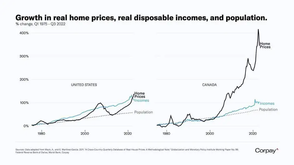
Comparison of population, wage, and home price growth
(sh.itjust.works)
A place to share and discuss data visualizations. #dataviz
I hate it when the chart doesn't say what it depicts. I assume those are averages, not median. The average hides that fact that most people's real income has barely grown in 20 years. All the income growth comes from the top 20% or so, you don't see that in the average.