940
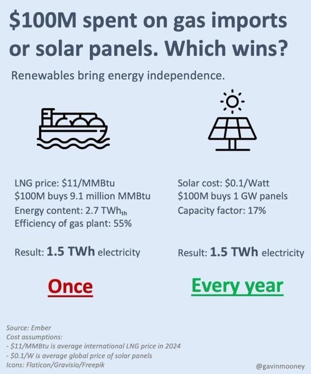
Gas imports or solar panels?
(slrpnk.net)
Discussion of climate, how it is changing, activism around that, the politics, and the energy systems change we need in order to stabilize things.
As a starting point, the burning of fossil fuels, and to a lesser extent deforestation and release of methane are responsible for the warming in recent decades:

How much each change to the atmosphere has warmed the world:

Recommended actions to cut greenhouse gas emissions in the near future:

Anti-science, inactivism, and unsupported conspiracy theories are not ok here.
And this is 2024 numbers. Gas is more expensive now that the strait of Hormuz is closed for a good long time
This is dead wrong (edit: kind of; see below). The dollars per million BTU for natural gas this February was $3.62, or 32% of the figure cited in the infographic. You're thinking of oil.
Solar is clearly more sustainable, economical, independent, and most importantly livable than LNG, but I still need to call out flawed assumptions on my side where I see them.
Edit: I actually have no idea how this infographic reached its $11 assumption. Wholesale prices for natural gas were $4.88 per MMBtu in 2024. Emphasis on "wholesale", but since this infographic doesn't deign to cite any sources other than "Ember" (this Ember?), I have no idea what figure it means.
Edit 2: After doing way too much digging into how global LNG prices are measured because this infographic barely even leaves breadcrumbs, they might've been using a metric like the JKMc1 ("LNG Japan/Korea Marker PLATTS Future") (edit 3: or the TFAc1). The prices of natural gas (transported via pipeline) and LNG (transported via ship) are going to be quite different, and there's no consistent "global average price" for LNG. The best you can really do is use some sort of proxy, for which it appears the JKMc1 is a reasonable one for reasons I don't fully understand yet. That was approximately $11 in 2024 (it was actually seemingly higher, but close enough; probably close but separate figures) and was $10.73 this February. It was $15.92 March 1, showing at least in East Asia that LNG is about 50% more expensive than last month. I don't know how well that applies to Lemmy's predominantly American and European userbase, however (well, I know the US now supplies about 60% of Europe's LNG and that American natural gas is currently cheaper).
God, it's so frustrating that this infographic barely cites anything. Anyway, to the person I responded to: you were at least somewhat right; the closing of the Strait seems to have clearly impacted East Asia... somehow. Iran and Qatar are the 3rd and 6th largest natural gas producers, respectively (no clue about LNG shipments), but I feel like I'll end up with a doctoral thesis on the geopolitics of LNG prices by 2030 from knowing basically nothing if I don't stop here. What all this does tell me is that an estimate of "global average price for LNG" means very little when prices per MMBtu (liquified or otherwise) seem to vary so heavily by region.
this right here is the only reason I'm still skeptical of pretty much everything
promoters of green and nuclear energy can't get their damn act together and create proper articles that aren't half-assed crap with no sources. They just claim shit from thin air.
Bitch, I WANT to believe you! Give me something to bloody believe that we really have no reason to use fossil fuels anymore.
I still ~~kinda~~ believe it. But CONVINCE ME ALREADY...
It's funny you assume they have to convince you.
We know already about climate change, we know already about geopolitics and sovereignty issues, we know fossil fuels are a finite resource, which means they'll inevitably get more expensive over time as we run through the most accessible deposit and go to ones that are harder and harder to harvest.
But you think they should convince you to use renewable, and not the other way around: why would you want to stick to fossil fuels? Name your argument and back it with solid sources, please!
I don't have one and I'm in favor of every renewable + nuclear
I think using fossil fuels increases dependence on other countries like the ~~south~~ middle east, which both causes instability in those regions, and makes us vulnerable to them.
Though you are right about how fossil fuels will become more expensive eventually, we've been finding more coal and oil deposits than we have been depleting... At least according to like an hour of research I did a while ago. It's close, but I don't think we will be running out soon.
Though the ozone layer is healing specifically because we cut back on that shit.
My point was - why fucking make shit up and lie in favor of renewables and nuclear? Why not quote proper sources? There's plenty of positives to renewables but man, some of these writers are incompetent.
In Yankee places "gas" means "gasoline" so I'd blame the infographic for saying "gas imports" instead of "natural gas imports" if it's supposed to target the country that uses the most natural gas
I don't blame it whatsoever for calling it "gas"; it should be clear to anyone remotely familiar enough with energy infrastructure to understand anything past "solar better", i.e. they should at least pick up on one of the following (in no particular order):
At some point it's incumbent on the reader to have a bare minimum understanding of how the world around them works; I learned some of this in circa sixth grade. Some of this on its own isn't common knowledge; all of this taken together should stop any reasonable reader from defaulting to "gasoline".
If you're just gleaning it in a hurry, you miss the relatively fine print from "LNG" to "55%". Selecting font sizes to emphasize the most important information, and being understandable by an uninformed audience base (think social media), is absolutely fundamental to infographics.
Not necessarily. Quite a lot of solar installation companies like Tesla's popular roof-like tiles push self-sufficiency for some reason. My guess is to sell batteries. Anyways, even without that, your petrol bill's still a useful visualization for how much more economic solar is
https://xkcd.com/2501/
Buddy, I obviously agree for MMBtu, which is why I cited it among other unordered points and explicitly called out that people are liable not to know it. If you do know it, though, it immediately gives it away, which is why I included it to cover bases.
But a crude oil tanker is a common thing plenty of people have seen, and putting "power plant" in there is straight-up a self-own: you are profoundly ignorant about energy infrastructure if you think we're taking gasoline into power plants to convert into electricity. That doesn't make someone bad or stupid; it just means they have zero standing to complain about how an energy infographic misled them by calling methane "gas". They lack the bare minimum foundation to even understand what it's trying to say.
It should also be obvious that when I said "not pure solar", I meant "generally", because at that point the reader would need to be willfully obtuse to construe the graphic to be about electric cars. I almost hedged with "generally", but I (wrongly, naïvely) assumed it wouldn't be subjected to superfluous pedantry.
Edit: I actually forgot another obvious point because there are just so many things that would tell reasonable people this isn't about gasoline: why would a tanker be used as an icon to represent gasoline anyway? A jerrycan, an oil barrel, or a gas pump would clearly be much better, because oil tankers don't represent the final product anyway, aren't a common icon for gasoline (if basically at all), and don't have a distinctive side profile. There are a million reasons it's not the graphic's fault if you look at it and assume it's about gasoline.
Not everyone lives in oceanside windows. Out of those who have looked at one they don't necessarily know that's an oil tanker; if it's through a beach, it's too distant (and likely heatwaved) to perceive something different with the deck at first sight, and at closer ranges I used to think they were just empty cargo ships "and of course the decks are so high up because the ship is floating higher up because it's lighter". Working with content who've never been on a ship they think there's nothing beneath the deck except what makes it float.
There's also the assumption that one wouldn't think "it's probably a different kind of oil tanker I haven't seen since it 'obviously' says gasoline". "What the fuck is an MMBtu?" Something related to gasoline, of course. Hindsight is not first sight.
Most US people are profoundly ignorant about energy infrastructure other than coal plants exist and the US relies on fossil fuels and you put petrol in your car. Just because you remember a great education doesn't mean others remember their bad education. Ask someone outside of the energy and environmental subject what they learned in Earth Science (sorry if I got the subject name wrong) other than the different types of rocks, tectonics, and what the weather really is.
An infographic's purpose is to communicate to the uninitiated, not preach to the choir. This is just a single word that artificially limits its target audience and frankly I don't see why we're arguing so pointedly about it.
I didn't think it was about cars either, but I still think it's plausible enough that one in a hundred could mistake it, and that is my point.
P.S.: Kudos for the diaeresis.
It's probably just AI generated bs.
Generally, solar takes 10+ years to break even in a residential situation, I can't see how things would be 10x cheaper at the TWh scale.
I don't agree with the "AI-generated" claim. Gavin Mooney appears to be a real person working with Kaluza, an Australian company which presents itself as:
(So a financial conflict of interest, but one I happen to agree with.) I just attribute it to a "shitty, token attempt at sourcing because nobody really checks these things" mindset.
When energy prices went crazy in the UK a while back I heard of some people getting under a year payback times. My energy usage is much lower than theirs so it would take me quite a bit longer though. A lot of the costs are fairly static.
At this point a battery alone might be a better investment. Cheaper install and using off peak rates to charge could drop my per unit costs from 24 to 8. But I think even that would take years to pay for myself. It's also annoying because the grid should already be fucking doing this! Why should I have to do it myself in a setup that is going to be far less efficient in costs than doing it at grid scales with bulk buying of batteries?
The tech exists today, I can buy it.
Economies of scale
Maybe.
I can't find any gavinmooney profiles on any socials... even x dot com.
For DYI plug-in small scale solar and meter running backwards (balkonkraftwerk scenario) for 0.3 eur/kWh break even is less than 2 years.
DYI larger/meter not running backwards but with battery buffering it's longer. Anything else requires a licensed electrician, and that does set you back.
The infographic is using 10c/watt as solar panel only. Your 10 year payback is based on tariffs, permits, sales comissions, and a monopoly utility designed to make solar prohibitive. In Australia, payback is about 2 years. But, yes, at utility scale the lack of BS costs make a giant difference. Under $1/watt installed instead of $3+/watt.
Europe is currently over $15/mmbtu. Your prices are not for LNG which is what Europe or Asia is faced with importing.