759
you are viewing a single comment's thread
view the rest of the comments
view the rest of the comments
this post was submitted on 03 Jul 2023
759 points (98.2% liked)
Technology
75745 readers
203 users here now
This is a most excellent place for technology news and articles.
Our Rules
- Follow the lemmy.world rules.
- Only tech related news or articles.
- Be excellent to each other!
- Mod approved content bots can post up to 10 articles per day.
- Threads asking for personal tech support may be deleted.
- Politics threads may be removed.
- No memes allowed as posts, OK to post as comments.
- Only approved bots from the list below, this includes using AI responses and summaries. To ask if your bot can be added please contact a mod.
- Check for duplicates before posting, duplicates may be removed
- Accounts 7 days and younger will have their posts automatically removed.
Approved Bots
founded 2 years ago
MODERATORS

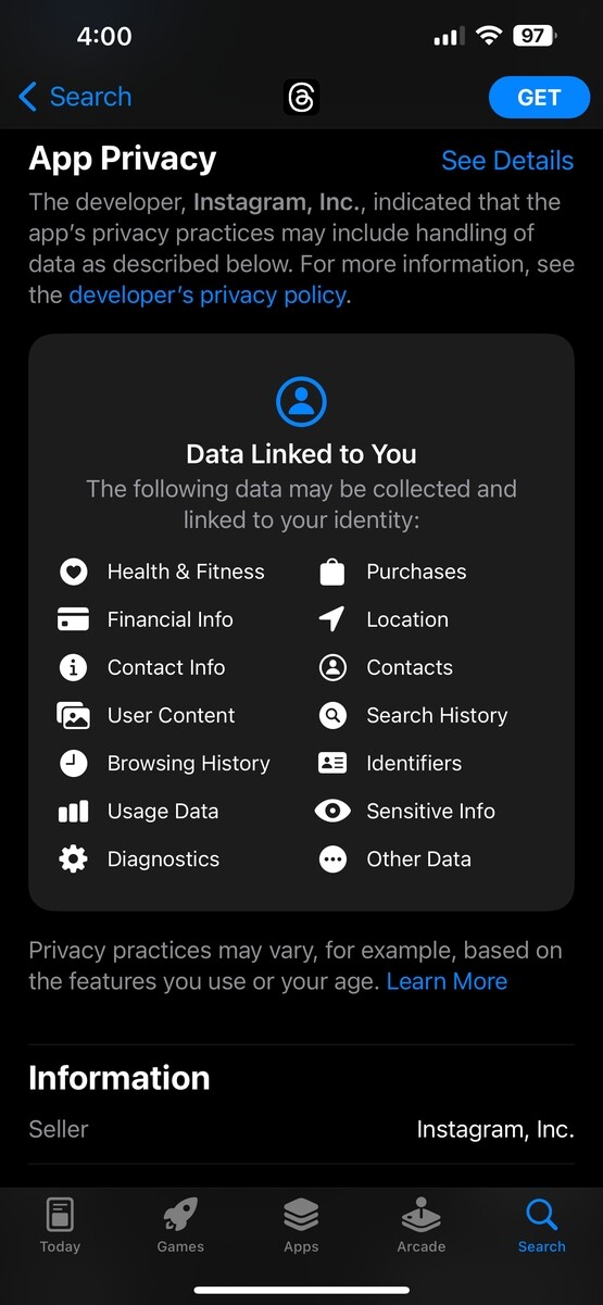
The user interface to display what is granted by using the app is... so sanitary. It disguises the ultimate goal of these insidious apps in such a clean and sterile list that it really seems innocuous. I wish that A$pple would start to display an intensity of how much data is collected by these apps. Green for good, red for bad, gradient for in-between. Or something... I suppose that accessibility for colorblind is important oto. Then it would be a bit more obvious to users when an app is really out to get them vs trying to improve performance.