587
you are viewing a single comment's thread
view the rest of the comments
view the rest of the comments
this post was submitted on 02 Dec 2023
587 points (94.1% liked)
Microblog Memes
10209 readers
158 users here now
A place to share screenshots of Microblog posts, whether from Mastodon, tumblr, ~~Twitter~~ X, KBin, Threads or elsewhere.
Created as an evolution of White People Twitter and other tweet-capture subreddits.
RULES:
- Your post must be a screen capture of a microblog-type post that includes the UI of the site it came from, preferably also including the avatar and username of the original poster. Including relevant comments made to the original post is encouraged.
- Your post, included comments, or your title/comment should include some kind of commentary or remark on the subject of the screen capture. Your title must include at least one word relevant to your post.
- You are encouraged to provide a link back to the source of your screen capture in the body of your post.
- Current politics and news are allowed, but discouraged. There MUST be some kind of human commentary/reaction included (either by the original poster or you). Just news articles or headlines will be deleted.
- Doctored posts/images and AI are allowed, but discouraged. You MUST indicate this in your post (even if you didn't originally know). If a post is found to be fabricated or edited in any way and it is not properly labeled, it will be deleted.
- Be nice. Take political debates to the appropriate communities. Take personal disagreements to private messages.
- No advertising, brand promotion, or guerrilla marketing.
Related communities:
founded 2 years ago
MODERATORS

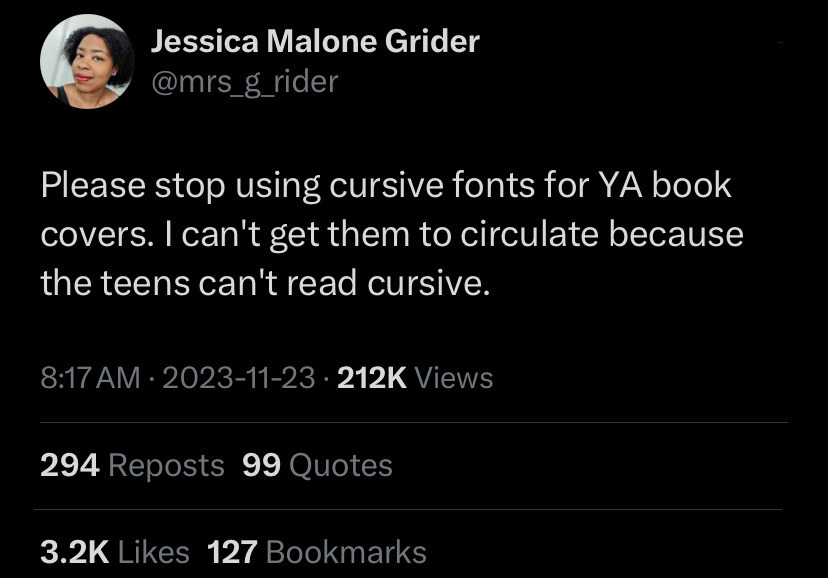
I think at one point a cursive S was "draw an S without lifting your pen from one letter to another" so it comes out looking a bit like an 8. Then the top loop got smaller and smaller, until the one guy who codified the cursive alphabet just didn't put the top loop on at all.
This same guy for some reason decided capital Q should look like a 2.
If I were in charge of the curriculum, students would get an introduction to cursive and an afternoon playing with it, basically so they can recognize it as a "font" and read it. Then let them continue to print or more likely type their work.