504
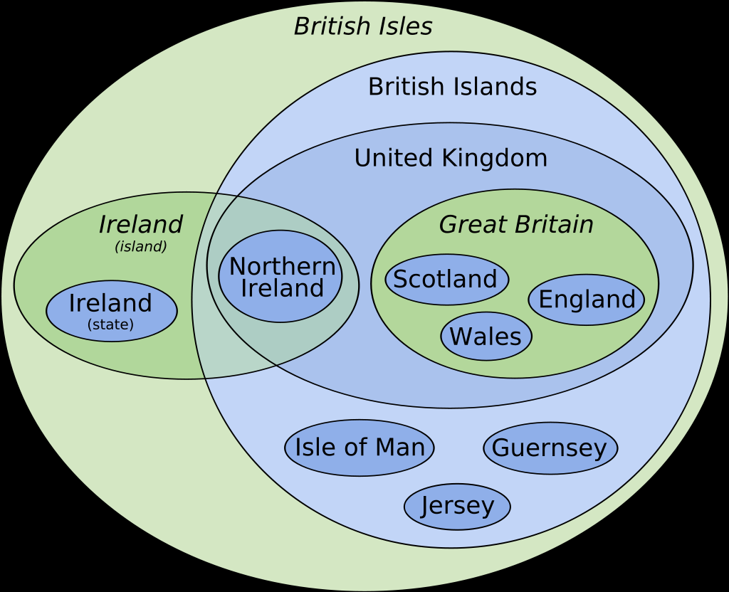
Euler diagram of the terminology of the British Isles
(lemmy.sdf.org)
Apologies. This might not be the perfect community for the post.
I would... (Australian)
Speaking of! Shouldn't Australia be in that chart too? And I'd like to see the "commonwealth" in the diagram too. It's all good complicated!