365
you are viewing a single comment's thread
view the rest of the comments
view the rest of the comments
this post was submitted on 03 Mar 2024
365 points (91.2% liked)
Climate
8441 readers
250 users here now
Discussion of climate, how it is changing, activism around that, the politics, and the energy systems change we need in order to stabilize things.
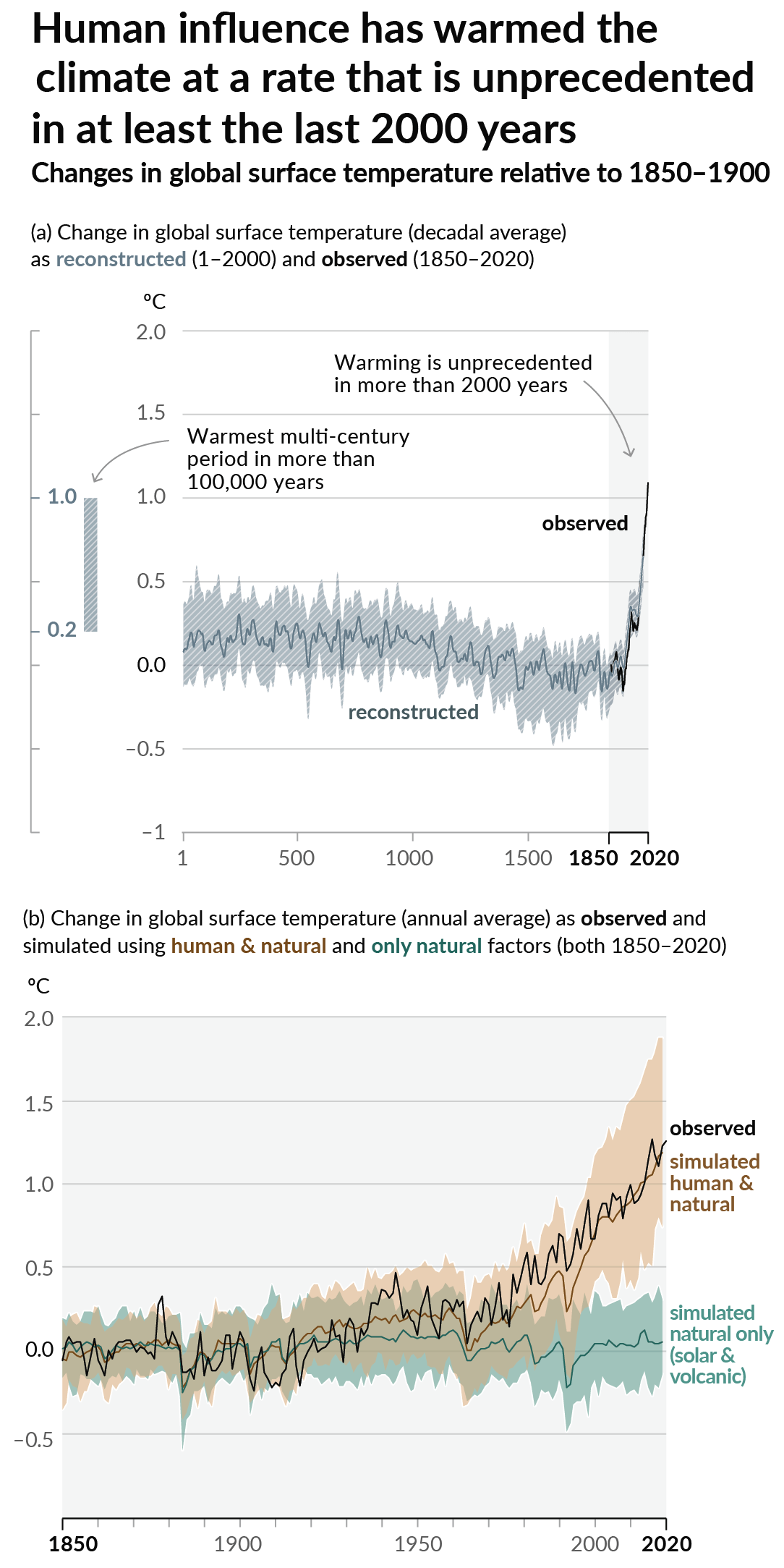
As a starting point, the burning of fossil fuels, and to a lesser extent deforestation and release of methane are responsible for the warming in recent decades:

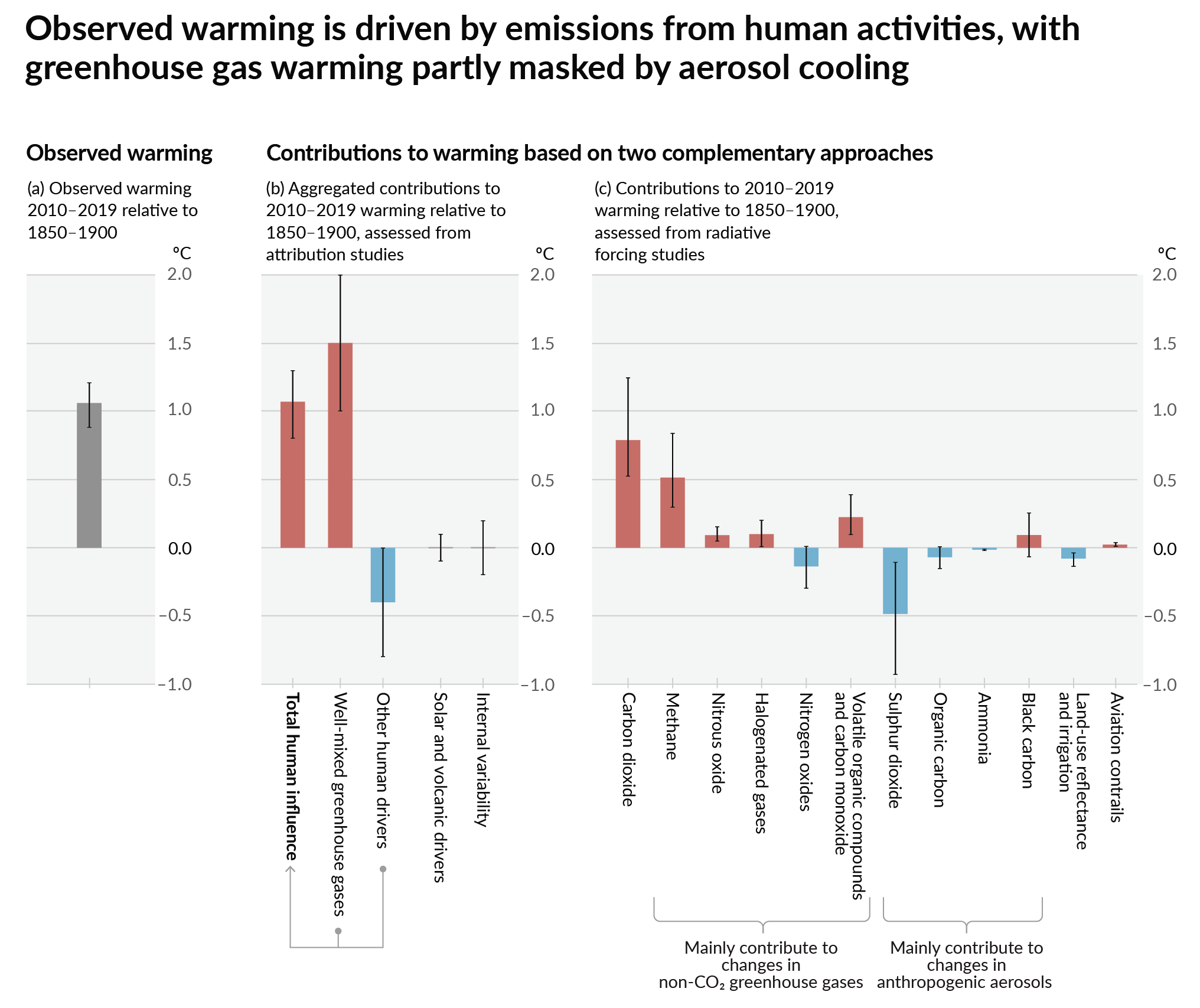
How much each change to the atmosphere has warmed the world:

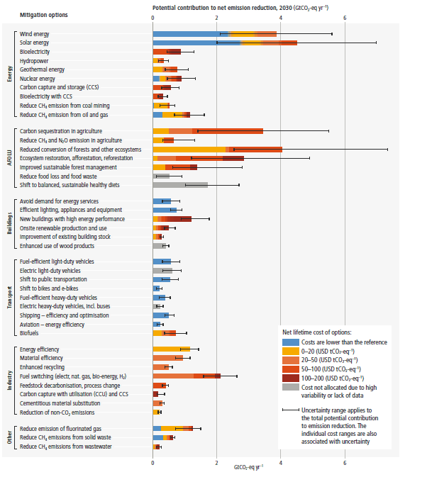
Recommended actions to cut greenhouse gas emissions in the near future:

Anti-science, inactivism, and unsupported conspiracy theories are not ok here.
founded 2 years ago
MODERATORS

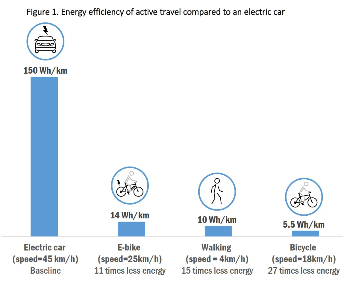
Now do one where you A) normalize this to the same trip distance (not speed, so that these choices for a single trip become meaningfull) and B) convert the kWh into CO2 emissions, including the emissions in growing and transporting the various power and food production methods used (coal to solar, locally produced veggies-air shipped beef)
It's already normalized to distance, the graph is showing kWh/km. The speed is just there for additional context.
Trip distance is dependent on methods of transportation at the aggregate level. That's only relevant for policy decisions or collective actions, not individuals of course, but if we are going to deal with climate change, collective action is necessary.
Given the graph is normalized by km traveled, its overly generous to cars.
Yeah, if you account for the amount of CO2 that goes into producing food the ebike will be much more efficient in terms of co2/km than a regular bicycle. Even if you cheat by making the regular bicycle drive slower than the ebike, like they did for this chart.