144
you are viewing a single comment's thread
view the rest of the comments
view the rest of the comments
this post was submitted on 04 Apr 2024
144 points (92.9% liked)
AssholeDesign
10055 readers
1 users here now
This is a community for designs specifically crafted to make the experience worse for the user. This can be due to greed, apathy, laziness or just downright scumbaggery.
founded 2 years ago
MODERATORS

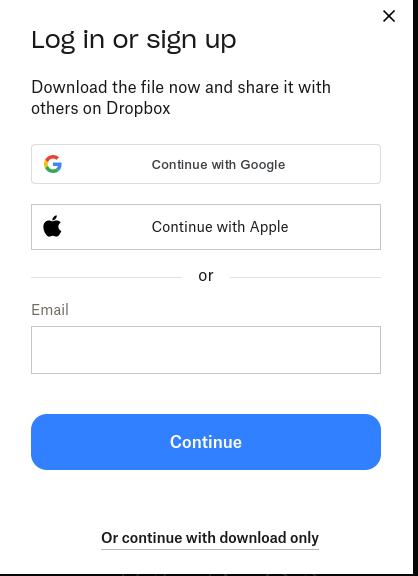
I've seen a number of websites where if you click on something it takes you to a massive sign up page with big boxes for a username and password. Then buried in a corner with small text will be the link to click if you already have an account. Basically we don't give a shit about our current users.