To me it seems that your interpretation completely disregards the Y-axis. On the other hand, I wouldn't think the colour coding does a good job in separating along the carnivorous-vegetarian-vegan scale.
It's not that they are separated on the chart, but that they are comparable (on both axes), that impressed me.
A place to share and discuss data visualizations. #dataviz
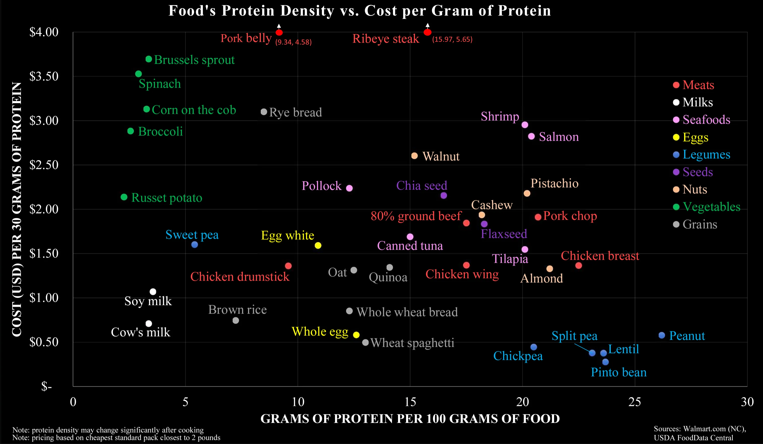
To me it seems that your interpretation completely disregards the Y-axis. On the other hand, I wouldn't think the colour coding does a good job in separating along the carnivorous-vegetarian-vegan scale.
It's not that they are separated on the chart, but that they are comparable (on both axes), that impressed me.