115
you are viewing a single comment's thread
view the rest of the comments
view the rest of the comments
this post was submitted on 05 Aug 2023
115 points (99.1% liked)
Canvas
2083 readers
1 users here now
Canvas — The Fediverse’s r/place
2024 Concluded!
Get a print!
- Check out the other items
- mastodon.world, lemmy.world, blahaj.zone, toot.community, toast.ooo, canvas 2024 stickers also available!
- Donate directly
Links
- fediverse.events
- GitLab / Source
- Matrix Space
- Discord Server (bridged to matrix)
Timelapses
founded 1 year ago
MODERATORS


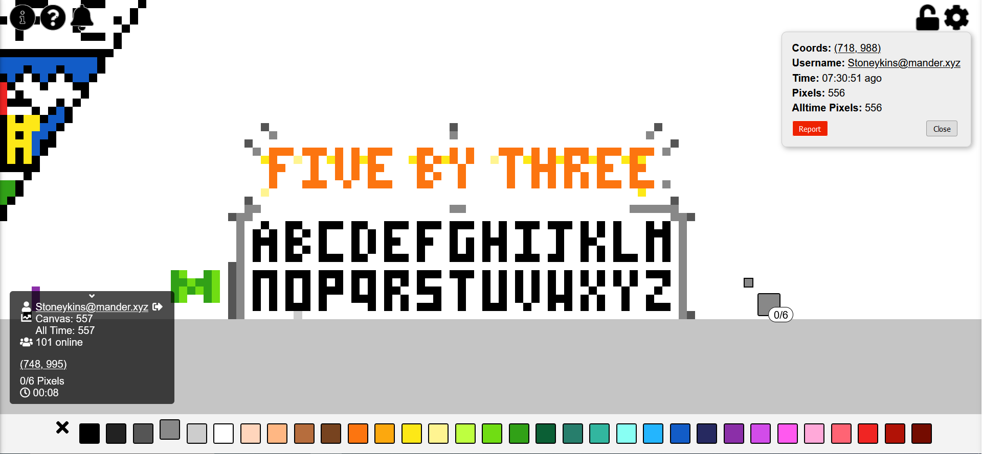
I don't like the J. It's too similar to the I.
⬜️⬜️🔳 ⬜️⬜️🔳 ⬜️⬜️🔳 🔳⬜️🔳 🔳🔳🔳
Better?