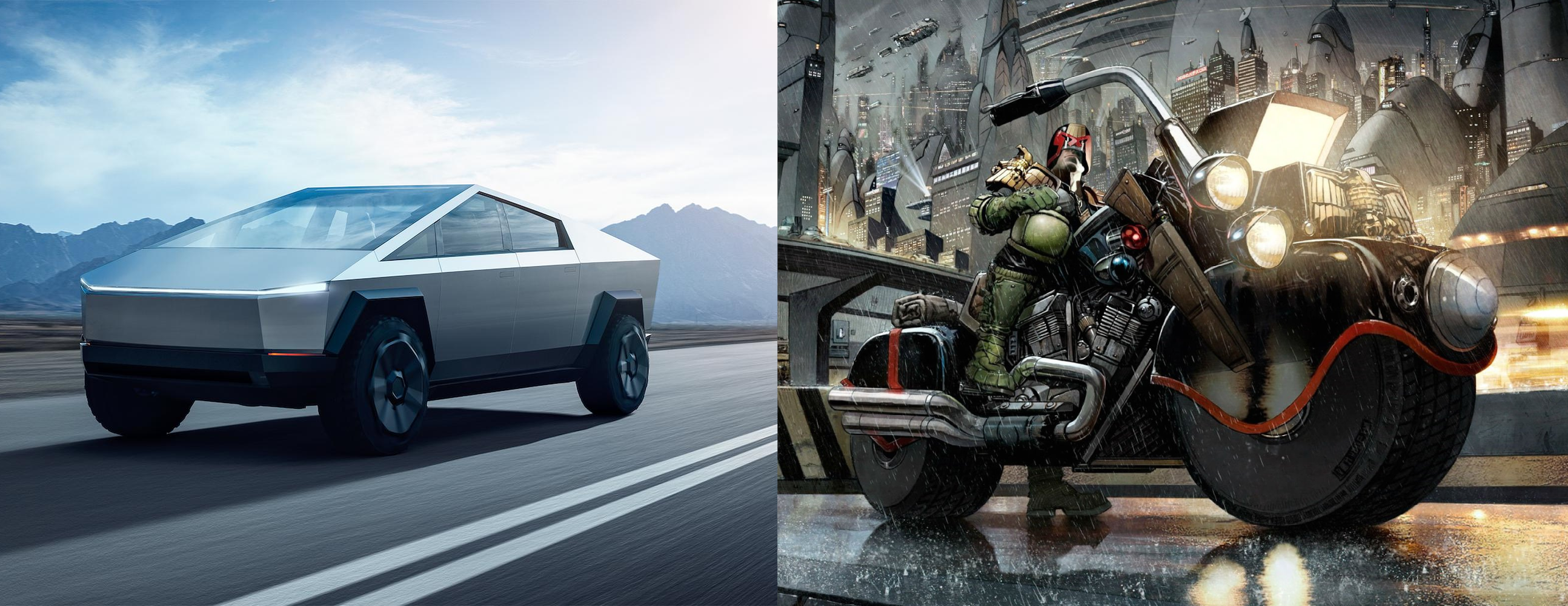
It... really does not. The cybertruck looks like the sad compromise of a too low polygon budget for a 80s game. The JD aesthetic is robust (*) and thick, sure, but not minimalistic.
(*) to which I mean the extent in that the Cybertruck looks robust.
Which is just a classic musky thing to do. Say some BS that barely passes the "as long as you don't know anything about what I'm talking about, then it might sound right!"-test, and simps abound to make the bullshit asymmetry even more asymmetric.
PS: I'm sorry. I have blocking filters for "Elon" and "Trump". Too many fucking morons with megaphones these days.
The cybertruck looks like the sad compromise of a too low polygon budget for a 80s game. The JD aesthetic is robust (*) and thick, sure, but not minimalistic.
And, like a lot of Carlos Ezquerra's designs, the early Mega-City One aesthetic was very rounded and organic ("bubbly" even).
It... really does not. The cybertruck looks like the sad compromise of a too low polygon budget for a 80s game. The JD aesthetic is robust (*) and thick, sure, but not minimalistic.
(*) to which I mean the extent in that the Cybertruck looks robust.
Which is just a classic musky thing to do. Say some BS that barely passes the "as long as you don't know anything about what I'm talking about, then it might sound right!"-test, and simps abound to make the bullshit asymmetry even more asymmetric.
PS: I'm sorry. I have blocking filters for "Elon" and "Trump". Too many fucking morons with megaphones these days.
And, like a lot of Carlos Ezquerra's designs, the early Mega-City One aesthetic was very rounded and organic ("bubbly" even).
I have those filters, plus a filter for "Cybertruck". So fed up of hearing about it.