187
Nights in Las Vegas Are Becoming Dangerously Hot
(www.nytimes.com)
Discussion of climate, how it is changing, activism around that, the politics, and the energy systems change we need in order to stabilize things.
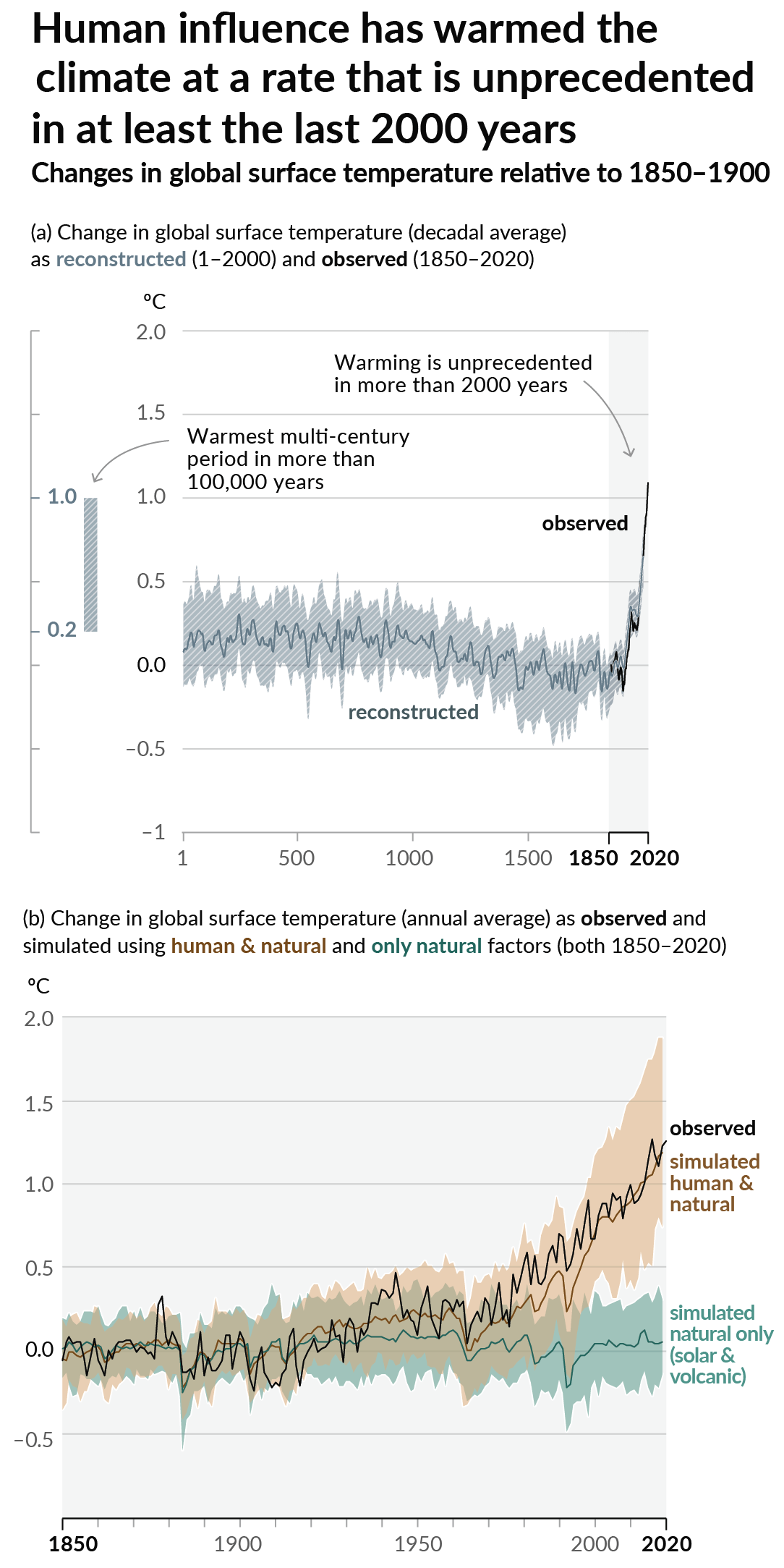
As a starting point, the burning of fossil fuels, and to a lesser extent deforestation and release of methane are responsible for the warming in recent decades:

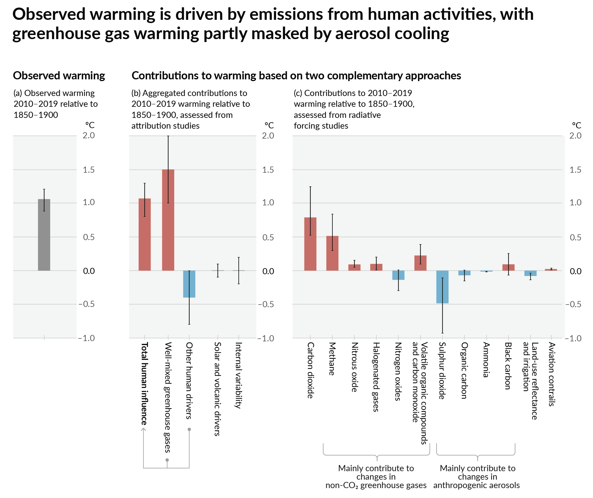
How much each change to the atmosphere has warmed the world:

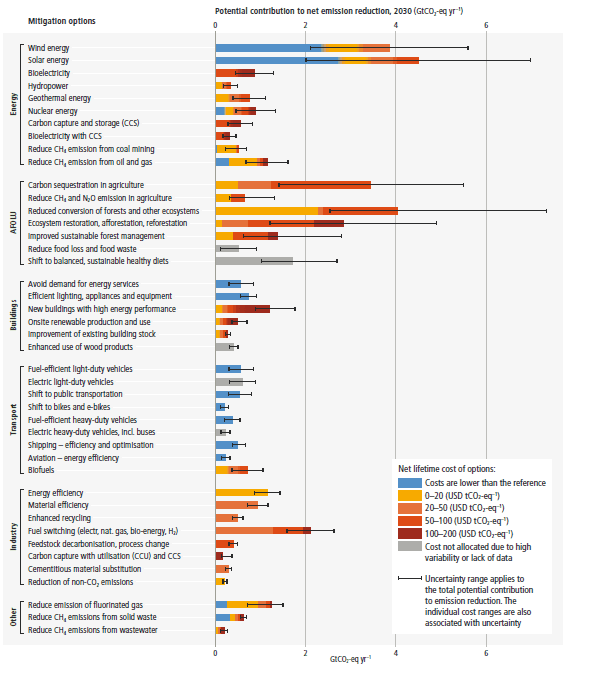
Recommended actions to cut greenhouse gas emissions in the near future:

Anti-science, inactivism, and unsupported conspiracy theories are not ok here.
Beside the point, but this data visualization is misleadingly bad.
Eyes first draw to the heading, which primes us to think temperature. Then we see the graph, where the unlabeled Y axis is assumed to be average night temperature. Finally, we read the subheading and it says that the Y axis is not temperature, but counts of days over a certain temperature.
I think that this metric is more useful than “avg. overnight temp.”, but please label axes.
Also, it would help to rephrase the subheading to use “80” since that’s obviously the cutoff. I spent a moment wondering what was special about 79F.
And now I see that this was made by the NYT. I guess they’re pumping out charts (maybe automatically) and thinking more about making them pretty than legible.
Are you looking at the same article as me? On both the NYT app and the website using this link, I see a heading that exactly matches the data displayed. It's a dynamic page that adjusts the figure as you scroll and the heading clearly matches the data. It says "abnormally hot nights" in every bar chart, and temperature for all of the line graphs. NYT has some really nice visualizations, with the notable exception of the potato graphic the other week with your states electric production sources - that was hot dog shit. There's a different baseline temp for the hot night graphs depending on the city - this clearly responds to a low level baseline pre-warming.
I showed this to my partner who isn't an engineer and she thought it made perfect sense too. Not that my anecdotes are special, but I truly don't understand the confusion.
They're technically labeled the same way an "exit" sign is labeled on the Walmart doors. There but shitty.