1511
you are viewing a single comment's thread
view the rest of the comments
view the rest of the comments
this post was submitted on 18 Aug 2024
1511 points (99.1% liked)
Technology
83221 readers
588 users here now
This is a most excellent place for technology news and articles.
Our Rules
- Follow the lemmy.world rules.
- Only tech related news or articles.
- Be excellent to each other!
- Mod approved content bots can post up to 10 articles per day.
- Threads asking for personal tech support may be deleted.
- Politics threads may be removed.
- No memes allowed as posts, OK to post as comments.
- Only approved bots from the list below, this includes using AI responses and summaries. To ask if your bot can be added please contact a mod.
- Check for duplicates before posting, duplicates may be removed
- Accounts 7 days and younger will have their posts automatically removed.
Approved Bots
founded 2 years ago
MODERATORS

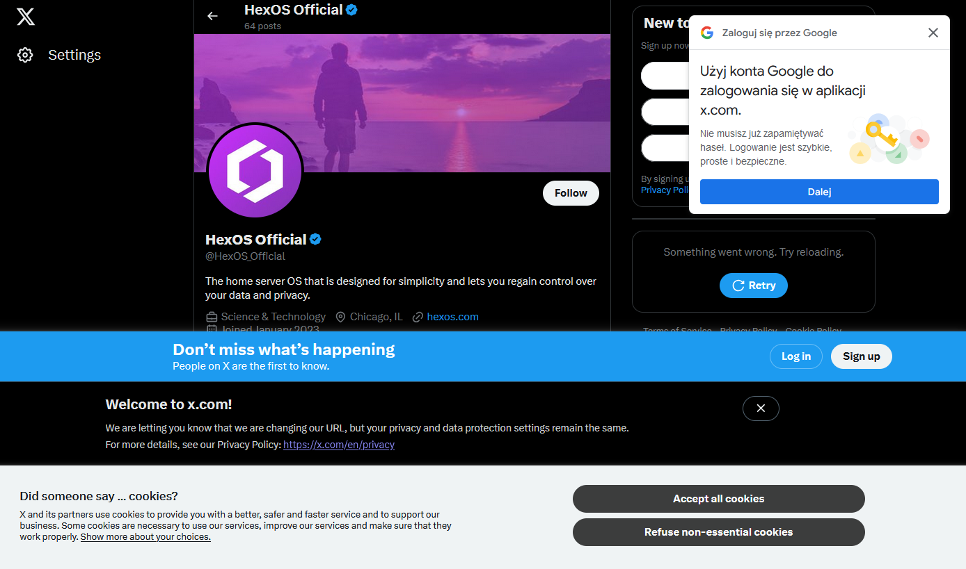
My guess is they're all built by different teams that didn't reuse any of the code written by the other teams. Ideally you're supposed to have a design system with standards for this, but I think all the good developers left (or were fired from) Twitter when Musk took over.
Yeah I agree