86
you are viewing a single comment's thread
view the rest of the comments
view the rest of the comments
this post was submitted on 06 Nov 2024
86 points (98.9% liked)
US News
2043 readers
49 users here now
News from within the empire - From a leftist perspective
founded 5 years ago
MODERATORS

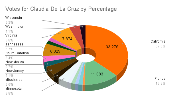
Commiefornia? Surprising that florida is that large.
Still the graph is a bit misleading, would be more interesting to show a different graph with the % of people in those states that voted for her.
I could do that but it seemed less interesting. They were all less than 1% so we already know most Americans won't vote communist.
But with this we can see who voted communist and where
It's ever so slightly more interesting imho
edit: wording
The bigger issue I see with this map is it is going to loosly corilate to the size of a state where even though we are dealing with less than a percentage per state, the map of votes cast as a percentage would give us a better understanding of where each state stands
For sure, without adjusting per-capita, this is just a pie chart of the most populous states.
I see what ya mean.
Let me try making a different one
edit: I got lazy and have school work so I doubt I'll make another