Proton is rebuilding their android app from the ground up. They're not going to fix something like this in the old app. You can join the beta here. https://proton.me/support/mail-android-beta
Thank you! The stupid thing is I'm literally enrolled in the beta program through the Google Play store... apparently that's the fake beta and you have to know this link for the real beta. I can confirm this issue does not exist on the "real" beta. You just saved me a lot of time.
The Google Play beta is the beta version for the existing app (aka edge version), not the rebuilt one (which isn't released yet, except as beta)
For context, this is the "feature":

🤮
This reminds me of text editor that leave half a screen of ‘wiggle room’ when scrolling down. Absolutely hate it, and if I can’t turn it off, I won’t use the text editor.
Do you mean at the end? I can't live without it, I feel kinda claustrophobic if I can't scroll below the actual text.
That's actually an accessibility feature intended to keep the eye level roughly at the same position; the person saying "I hate it when editors do it" is really not understanding why this is a feature and not a bug.
That's not fair. They're complaining that they don't like it, and that they want to be able to turn it off. They didn't say it shouldn't exist
Exactly!
In this case, if this is truly a feature and there are people with actual use cases for it (please let me know!) then make it an option, and not a default one.
I mean, I don't like it, and I'm kinda fine with it being the default if most of the people want it. I just think we should be able to turn it off.
the person saying “I hate it when editors do it” is really not understanding why this is a feature and not a bug.
No, I get that it's not a bug. I just don't like it, personally, and want to be able to turn it off. Don't know where read that I thought it was a bug.
One man's bug is another man's feature.
literally unusable
but if they ever change it, it'll break a number of fortune 500 companies who rely on this behaviour 🤣
Not the end of the world if they trim messages before sending them?
It means you can click a line and type there, no need to press enter a few times first.
Not email, but if I'm taking notes in a text editor I will hold down enter at the start to ensure I can just click and type anywhere.
Now, if that pointless whitespace is being sent, I can imagine it annoying people in long email chains.
I'm not sure why you would need to start an email from halfway down the page? I'm not sure I'm understanding you but I feel like I'm on the verge of having my mind blown about how the other half write emails 🤣 Please explain further, I'm genuinely curious!
For me, I write things from top to bottom. If I want to do a later paragraph then I will simply write it in, then go back to the top and hit enter to create a new line
Mostly top to bottom. But sometimes I write the body of the email, then add all the plesentarys after.
Or even write the email, then work out who it's 'to' on the huge cc list...
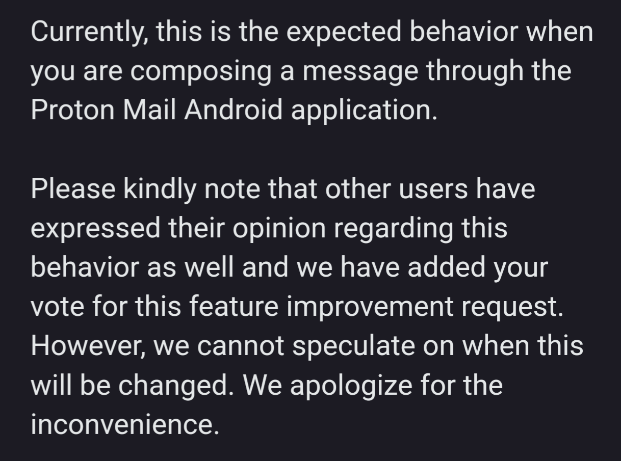
IMO, that's a clear acknowledgment that this is a specification bug.
And that it has a low priority.
IMO call a bug a bug. Even if they were to say "yes this is a known issue, we're aware of it but don't know when we will be able to work on it" would be 100x better. The client is open source and I wouldn't mind taking a look at it myself and potentially submitting a pull request.
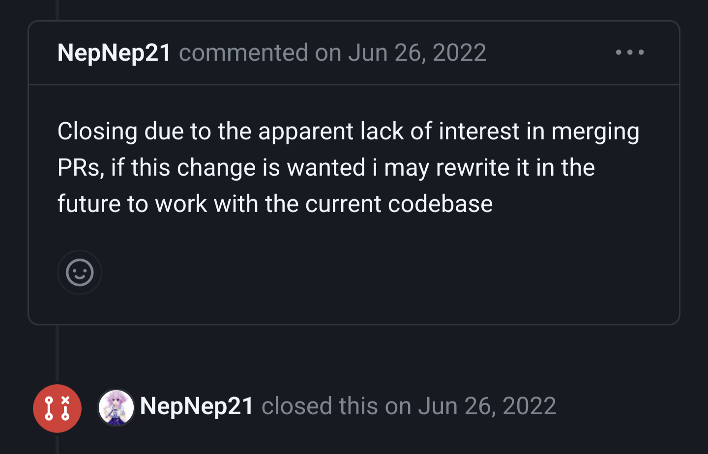
However, saying "yes this is the expected behaviour" coupled with one closed pull request where someone implemented a "mark all as read" button (clearly a non-trivial amount of work) but closed the request months later with this comment doesn't make me too eager:

There's another where someone literally took the vector image that they use for their icon and created a PR to support Android 13 themed icons. After half a year someone rejected it due to only the design team being allowed to make design changes.
Is it something actually open source if
-
It requires a proprietary backend, kept secret
-
Not a single pull request is approved, all contributions are ignored for years, then finally rejected
-
The issue tracker is kept secret
?
Is the source code released under a license that allows you to use, change and distribute it? Then yes, it's open source. Open collaboration is a separate thing.
[This comment has been deleted by an automated system]
As long as they can put on their website "We support open source!" who cares right?
"Expected behavior" doesn't mean "intended behavior." It just means that it's a bug they know how to fix but don't have the bandwidth to fix yet. So it's not a feature, it's just a defect that isn't important enough to remove yet.
Most likely, next time they have cause to open the file that's causing the bug, they'll fix this too. Fixing bugs by attrition is one of many ways to keep dev costs low. Well, lower.
Seems to readily impact 50% of the entire function of an email app (to write emails).
Seems like a weird hill for Proton to not want to climb down, considering their position within the email client marketplace. I would absolutely make UX a high priority.
This is how our company would word it. I see no problem with their response. Limited resources means focusing on top priority issues first.
Well, the humour behind "it's a feature, not a bug!" has to come from somewhere and it seems your company/the company you work for is one of the players contributing to it :P
Ha ha. And when we test, we do it in production baby. It's a wild ride
Of course you wouldn't see a problem with it.
Why would anyone want that?
I'd be surprised if anyone did! I have asked them what the use case for this is and will reply back if they answer.
Maybe it's a technical problem that they're not interested in fixing. It could be unnecessarily reserving space for a signature, for example
Yes I would say it's most likely just a technical problem, I just found it funny they didn't come right out and say that.
My first thought was along those same lines but I do have both my personal signature and the mobile signature disabled in the settings.
Doesn't seem like that would be described as "expected" though. Unless they mean "expected because we don't give a shit."
I suppose there is a difference between "expected" and "intended".
It means you can click a line and type there, no need to press enter a few times first.
Not email, but if I'm taking notes in a text editor I will hold down enter at the start to ensure I can just click and type anywhere.
Now, if that pointless whitespace is being sent, I can imagine it annoying people in long email chains.
Well, this screenshot is the mobile version. Tapping anywhere in a textbox should bring the focus and start typing. All having extra lines does is make it more likely that the starting insertion point is a line or two below the start.
Even on desktop, I'm not aware of any text box behavior where you need to click on the correct line to bring the focus to the box.
This seems like a quick temporary pseudo-solution that removed an obstacle towards implementing some behaviour. Being temporary, it’s likely to outlive the feature it unblocked.
I have a free account and can’t turn off the mobile signature, which has two blank lines before it. I wonder if turning that setting off just deletes that string, but not the lines.
I have both signature settings turned off and there's several blank lines.
It's not a bug just because the software doesn't conform to your personal preferences. You're asking for what would be considered an enhancement - not a bug fix.
But
why would several blank lines be the default behavior
I don't know the reason. I think not having the extra blank lines would be better, but it works just fine as is - even the post admits this much. That's why it's an enhancement. It's possible for software to be functional and consistent and still have room for improvement - that doesn't mean there is a bug.
It's not about preference. It's about what every single other email client does, including their own on different platforms, and this is even fixed in their upcoming beta of this same app.
My point is that someone made the decision for it to do that and that the software works just fine as is. It's not a bug, it's just a weird quirk. The fact that they made the enhancement you requested doesn't make the old behavior buggy. Your post title said "it's not a bug, it's a feature!", but the behavior you reported is not accurately classified as a bug.
Programmer Humor
Post funny things about programming here! (Or just rant about your favourite programming language.)
Rules:
- Posts must be relevant to programming, programmers, or computer science.
- No NSFW content.
- Jokes must be in good taste. No hate speech, bigotry, etc.
