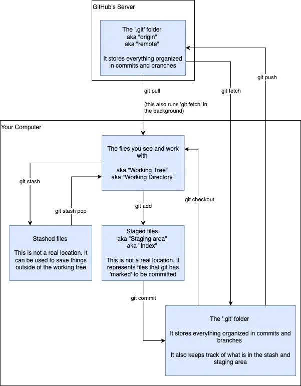
Don't know if this is just something that I'm seeing on my side, or maybe you did it intentionally, but most of the top portion is transparent, which makes it hard to parse when viewing in dark mode. Otherwise, pretty solid graphic 👍
Thanks for calling this out! Fixed, I hope. Wasn’t intentional.
Came here to say this. Never assume everyone uses your same configurations when sharing a document.
[YOINK!]
Definitely adding to my own cheatsheet that I manually created with info from the various git tutorials I've read/watched. Very nice to have a visual representation.
Thank you!
You’re welcome! Hope it’s useful :)
Very helpful graphic for newcomers to git and github. It took me a year of seriously using them to have a mental model of how they work. I wish I had this when I started using them.
The file has a transparent background, making some lines invisible
Thanks! You know you're looking at a great instructive diagram when you never again need to refer to it!
I've been having a tough time getting past the first chapter, so to speak, and I think this solves it for me.
Also, the dark mode fix seems to work.
Programming
Welcome to the main community in programming.dev! Feel free to post anything relating to programming here!
Cross posting is strongly encouraged in the instance. If you feel your post or another person's post makes sense in another community cross post into it.
Hope you enjoy the instance!
Rules
Rules
- Follow the programming.dev instance rules
- Keep content related to programming in some way
- If you're posting long videos try to add in some form of tldr for those who don't want to watch videos
Wormhole
Follow the wormhole through a path of communities !webdev@programming.dev

