60

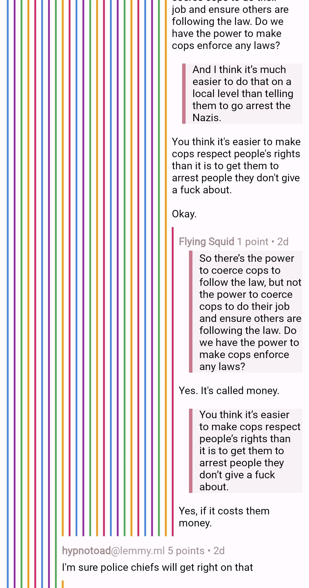
Is there a setting that might resolve the issue attached, where really long comment threads get squished into illegibility?

all 24 comments
sorted by: hot top controversial new old
[-] ptz@dubvee.org 13 points 3 months ago* (last edited 3 months ago)

Interested to see what solutions for this are proposed that don't involve re-rooting the comment tree from a lower depth. Tesseract is susceptible to this on mobile as well, and I've decreased the left padding as far as it'll go as a partial workaround.

I'm not crazy about having to re-root the comment tree like Reddit does (or at least used to do) beyond a certain depth, so hoping to hear some better suggestions I can borrow.

[-] Coelacanth@feddit.nu 4 points 3 months ago

I can't think of a solution that isn't re-rooting in one form or another. Do you know of any app that has done it differently?

[-] ptz@dubvee.org 2 points 3 months ago* (last edited 3 months ago)

Not off my head, no. Which is why I was asking if there were any other alternatives. I don't particularly like that solution.

Edit: Since I know the depth on a per-comment basis, maybe I could reverse it in CSS beyond a certain point and have them start going right to left? (spitballing here)

[-] over_clox@lemmy.world 4 points 3 months ago

We should start a ridiculously long comment thread here so people can see how the various Lemmy apps out there handle and render things...

[-] ptz@dubvee.org 3 points 3 months ago* (last edited 3 months ago)

Lol, well, I'll keep the ball rolling with this reply.

It took me a while to notice this behavior (on any client) because once a comment thread gets that deep, it's usually a slap fight I wouldn't bother reading anyway lol

[-] Xylight@lemm.ee 5 points 3 months ago

i'm tempted to make a stupid feature where it turns into an ace attorney fight after about 15 comments of depth.

[-] over_clox@lemmy.world 2 points 3 months ago

Pee is stored in the balls. Wanna fight about it?

[-] Xylight@lemm.ee 3 points 3 months ago* (last edited 3 months ago)

How could I fight with the truth? Gonna need a different argument.

[-] mryessir@lemmy.sdf.org 4 points 3 months ago

@!ptz@dubvee.org

After stopping the scroll, animate to minus padding on the left (move tree to the left in its entirety).

Or animate the margin between these comments to 0 until the end of the comments for the thread

Or just stop at some percentage of screen estate and work with differing colors.

Maybe you could use folds right above and below to indicate that the tree is rerooted?

Spittballing back. Learned a word today!

[-] Blisterexe@lemmy.zip 2 points 3 months ago

Yeah thatd work, but it would probably be pretty hard to do on mobile

[-] mryessir@lemmy.sdf.org 1 points 3 months ago

Nope. Way more hacky on the web.

On mobile it would be encapsulated and invoked on demand, easily supporting 300hz+ :).

At least I assume it; But I have my very limited experience on web development. Even if there would be an easy way due to javascript/browser compatibility it should be very cumberstone.

Though if we had a LISP-like language (Scheme) like initially intended we wouldn't have to worry. Idk who to blame.

Someone wanted restrictions and this may have been a valid point.

I can't judge but for mobile.

[-] Coelacanth@feddit.nu 4 points 3 months ago

How about this: as you scroll past an entire comment in the chain (the bottom of the comment leaves the top of the screen) the entire comment chain is shifted to the left?

[-] OccamsTeapot@lemmy.world 7 points 3 months ago
[-] 200ok@lemmy.world 3 points 3 months ago

There's a setting for everything! Amazing, thank you ๐Ÿ’ช

[-] ZombieMantis@lemmy.world 2 points 3 months ago

That helps a lot, thanks! ๐Ÿ‘

[-] ChaoticNeutralCzech@feddit.org 5 points 3 months ago
[-] numlok@lemmy.world 13 points 3 months ago

That did help, thanks.
But in another note, when I rotated back after finishing the thread, it was worse than before, with no comment hierarchy visible at all. I had to refresh to get it back.

[-] numlok@lemmy.world 3 points 3 months ago

Here's the last comment in the thread I was following, just in case it's helpful.

[-] Stovetop@lemmy.world 3 points 3 months ago* (last edited 3 months ago)

You can try adjusting the padding size; mine is on minimum and, while it still wasn't ideal and would have gotten cut off as well if it continued, I was able to read up to the end.

Settings shortcut: Comments > Padding style

[-] numlok@lemmy.world 1 points 3 months ago

That definitely helps, thanks

[-] ChaoticNeutralCzech@feddit.org 4 points 3 months ago

For the record, some clients (Voyager) use rainbow colors that allow the levels to be distinguished while taking up very little vertical space, or even no vertical space past level 10 or so (might get ambiguous since the colors loop every 7 or so but there are ways around that, such as rotating the hue 6 % evedy cycle)

[-] PrimarilyPrimate@lemmy.world 1 points 3 months ago

If you go to settings, comments then style... Could this be the thing?

this post was submitted on 05 Aug 2024
60 points (98.4% liked)

Sync for Lemmy

15088 readers
7 users here now

๐Ÿ‘€


Welcome to Sync for Lemmy!

Download Sync for Lemmy


Welcome to the official Sync for Lemmy community.

The rules for posting and commenting, besides the rules defined here for lemmy.world, are as follows:

Community Rules


1- No advertising or spam.

All types of advertising and spam are restricted in this community.


Community Credits

Artwork and community banner by: @MargotRobbie@lemmy.world


founded 1 year ago
MODERATORS