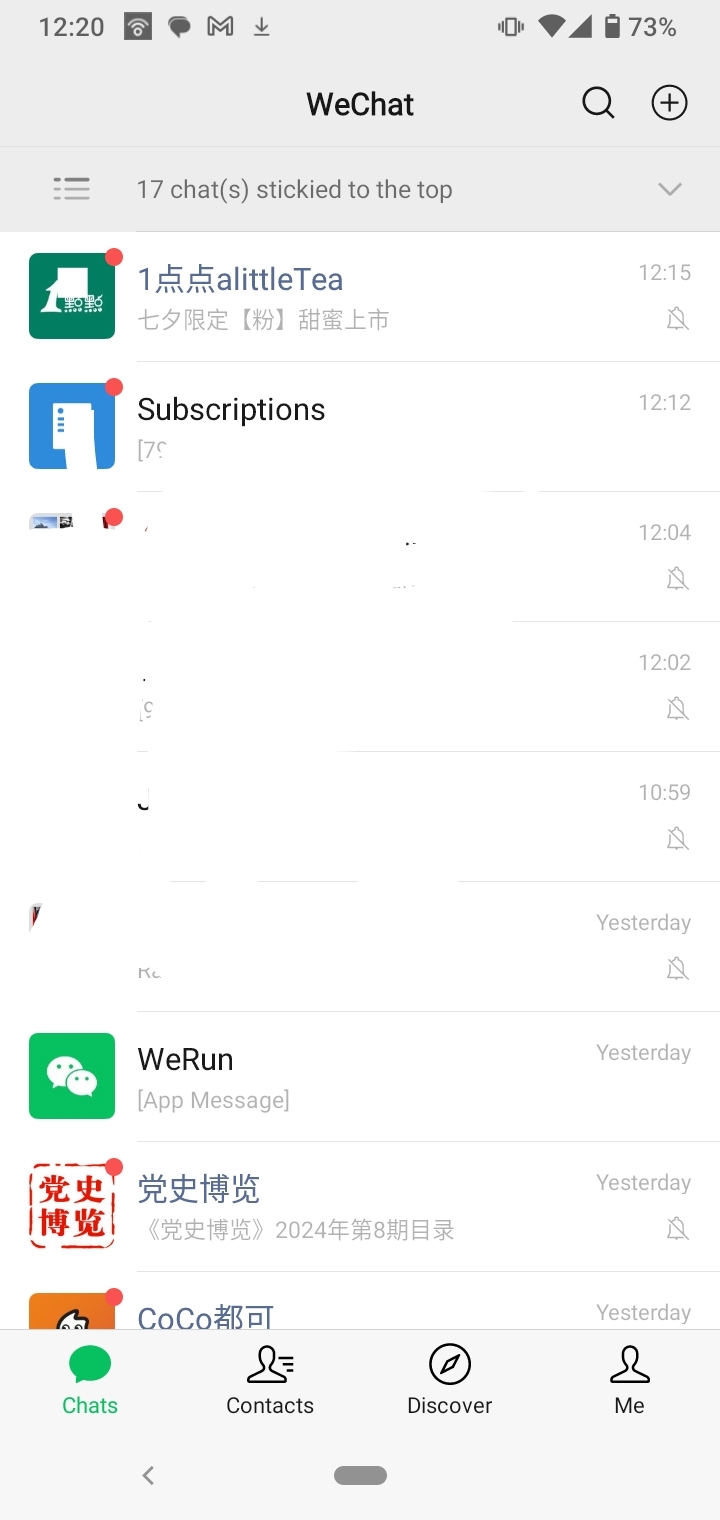
This is my WeChat home page
spoiler
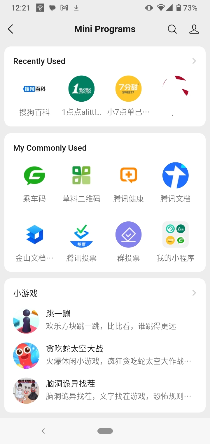
The mini-apps (third party) are under their own tab (Discover > Mini Programs)
spoiler
The first party functions are also under their own tab (Me > Services)
spoiler
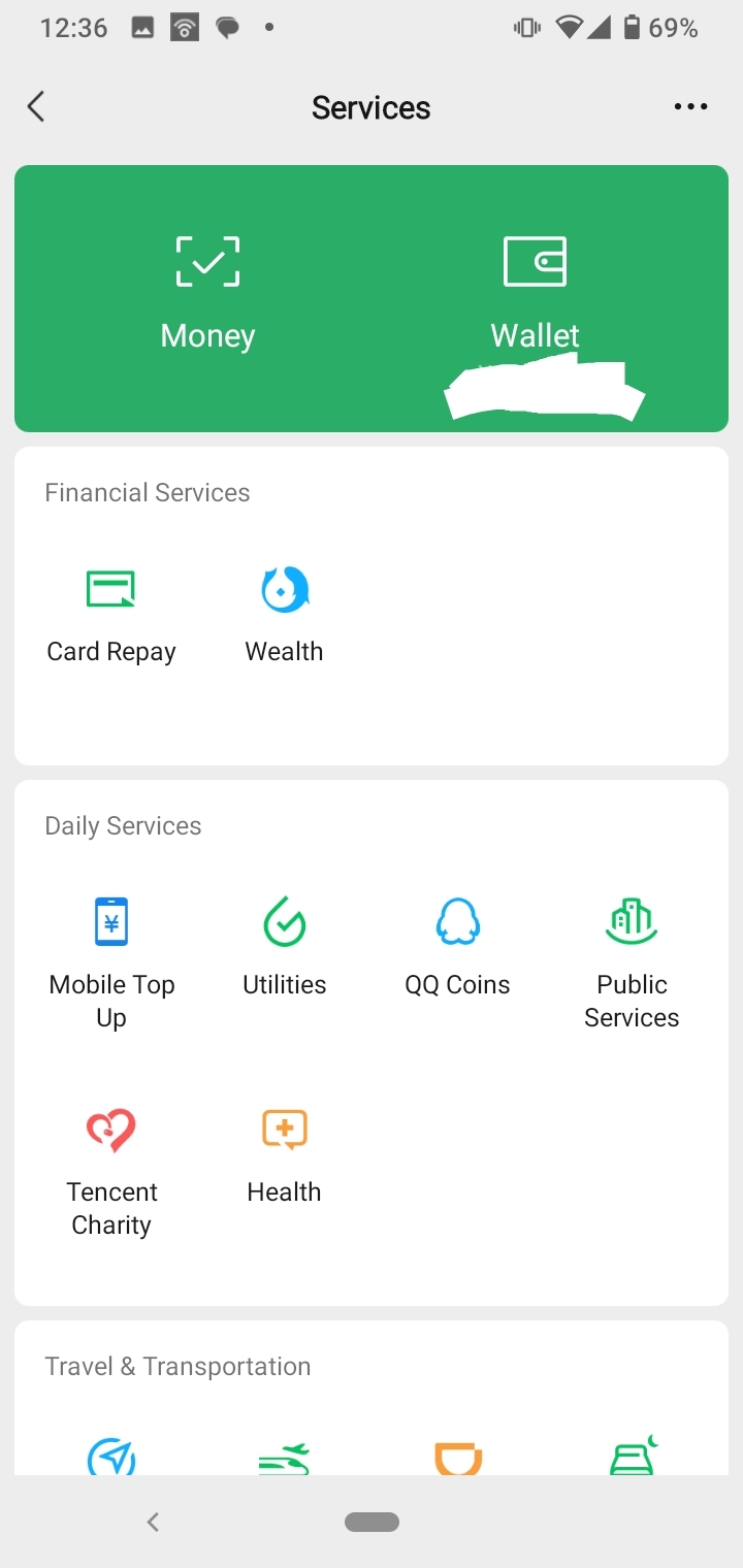
Each tab is clean, in my opinion, and most major daily-use functions are two, at most three, clicks away. Frequently used mini-programs can also be accessed by dragging down on the front page.
To say that Chinese app design as a rule is cluttered is false. Yes you can have multi-function apps but no it does not necessitate an overloaded landing page and 'clutter'.
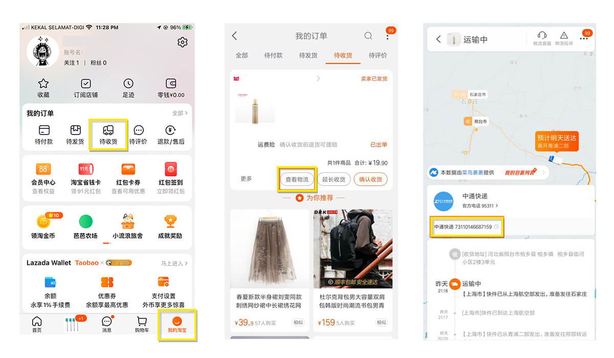
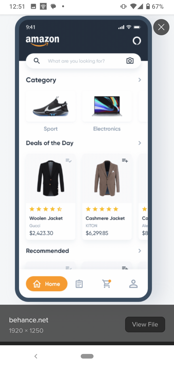
I think she is cherry picking somewhat with her selection of Zhifubao and I'd agree that it's overloaded, but not showing counterexamples makes it seem like zfb design is the desired, prevalent benchmark. Other apps like Taobao are deliberately filled with ads and promos (banner ads and popups), and the visual design is bright and eye-catching (to sell product...) but the navigation once in the app is pretty straightforward. Pretty much on par (if with a few more persistent menus/floating buttons) with western online stores once you're away from the landing page.
amazon v taobao
Idk, her explanations of 'high context communal' society determining the desired app UX/UI fell a bit flat to me, and don't allow for the instances of where Chinese users do make and use simpler application or simpler interfaces.
Then, we could find examples of western apps that are equally cluttered... like, I'm fucked if you asked me to navigate discord mobile.