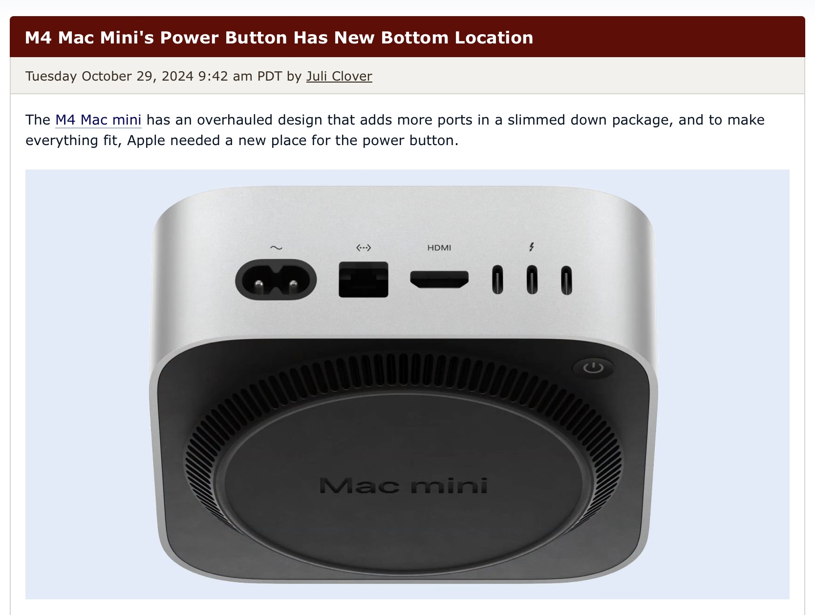
Apple is powered by the copium of their fanbase, so maybe the next model won't even need a power cable.
Please don't ever turn your computer off, it makes it really hard to spy on you. Thanks -Apple
I had to check if this was an Onion article...
At least it does mean your cat can never turn off your pc ever again with this
Computer so tiny cat knocks it off the desk instead
What is the <--> port for? HTML? I thought that was port 80 or 443...
It's an Ethernet port. For some reason Apple decided <···> is the glyph to use for that.
I hate their refusal to use standardized symbols
They’ve used that exact same symbol since they first added an Ethernet port to their computers in the early 1990’s. It was one of the first mass-market computers with integrated Ethernet. It literally defined the standard when there was no standards body for such a thing.
I’m not really trying to come to Apple’s defense here as they don’t need it, but everyone reacting as though this is as bad as or worse than the mouse charging port seems to be ignoring the fact that most computers nowadays don’t need to be manually turned off or on with any level of frequency. People will push this button like once or twice a month I imagine. I don’t see why that’s the end of the world.
I… uh… I know it’s going to be an unpopular opinion, but it makes sense. It’s not intended for daily usage - macs wake up on a keyboard or cursor movement. Sitting on the back increases the chance of accidental presses when you are trying to plug something in.
You have a very few specific incidents where you would need to press the power button. 80% of their user base will not use the power button after the first initial press.
Optional $200 dock with satisfyingly clicky lever mechanism that is activated from the front.
Technology
This is a most excellent place for technology news and articles.
Our Rules
- Follow the lemmy.world rules.
- Only tech related news or articles.
- Be excellent to each other!
- Mod approved content bots can post up to 10 articles per day.
- Threads asking for personal tech support may be deleted.
- Politics threads may be removed.
- No memes allowed as posts, OK to post as comments.
- Only approved bots from the list below, this includes using AI responses and summaries. To ask if your bot can be added please contact a mod.
- Check for duplicates before posting, duplicates may be removed
- Accounts 7 days and younger will have their posts automatically removed.
