23
submitted 1 year ago by kia@lemmy.ca to c/boostforlemmy@lemmy.world

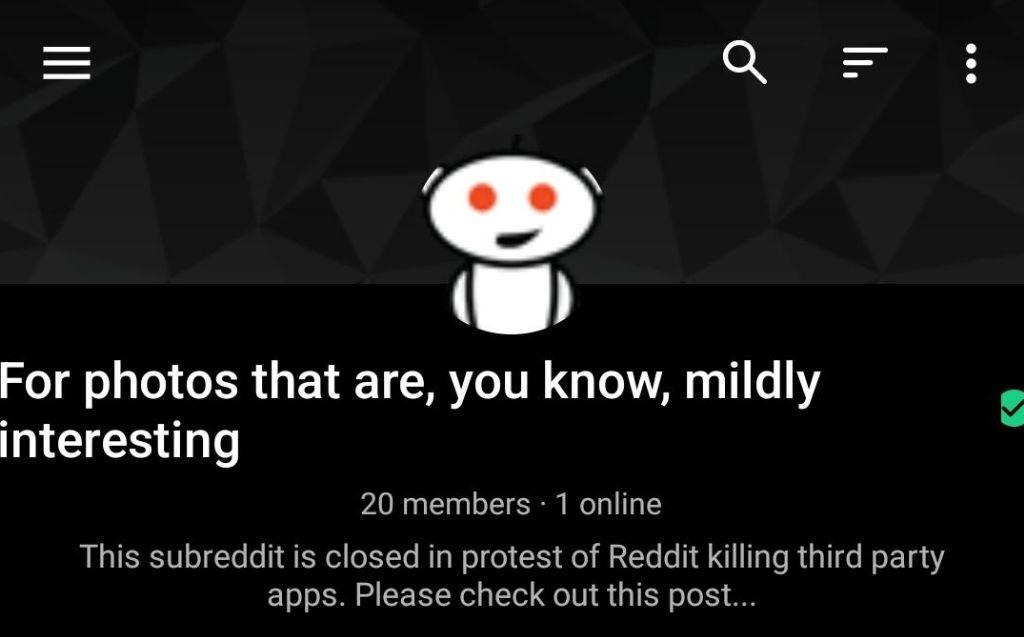
It looks like if a community name is on the longer side, it pushes some of the UI elements to the edge of the screen and makes them look strange. You can see it at this community:

!mildlyinteresting@lemmit.online

no comments (yet)
sorted by: hot top controversial new old
there doesn't seem to be anything here
this post was submitted on 26 Sep 2023
23 points (96.0% liked)

Boost For Lemmy

6775 readers
31 users here now

Community of the Android app Boost for Lemmy Play Store Link

founded 1 year ago
MODERATORS