317
Why do AI company logos look like buttholes?
(velvetshark.com)
I can't stop laughing.
No single person suggests making a logo that resembles an anus, but when everyone's feedback gets incorporated, that's what often emerges.
- 1990s-2000s: 3D and Glossy - Remember when every logo needed a drop shadow and a glassy shine? Apple's aqua interface set the standard.
- 2010-2013: Skeuomorphism - Digital designs mimicking physical objects, with stitched leather textures and realistic dials.
- 2013-2018: Flat Design - Reaction to skeuomorphism brought minimal, clean interfaces with bright colors and no shadows.
- 2018-2022: Neomorphism - Soft shadows and semi-flat design creating subtle, "touchable" interfaces.
- 2022-Present: The Butthole Era
Somehow Walmart is leading innovation, launching a butthole logo in '07. Truly ahead of their time.
I give this post 3.5 buttholes.

That's what I was thinking. Maybe they're just Community fans.
.. Should we be pinching our nipples at their AI?
I hope this doesn't awaken anything in me.
A company's logo should be evocative of their strengths. So suggesting they, principally, shit all over everything is apt.
e pluribus anus
This is one of the rare cases where reading the article would probably ruin a perfectly good headline. lol
I thought so too, but the article really delivered. I didn't know I was living in The Butthole Era. I suspected it, but I didn't know it.
Even before I saw another user pull out some hilarious excerpts, I was gonna read it later Now I'm definitely going to.
You’re missing out. 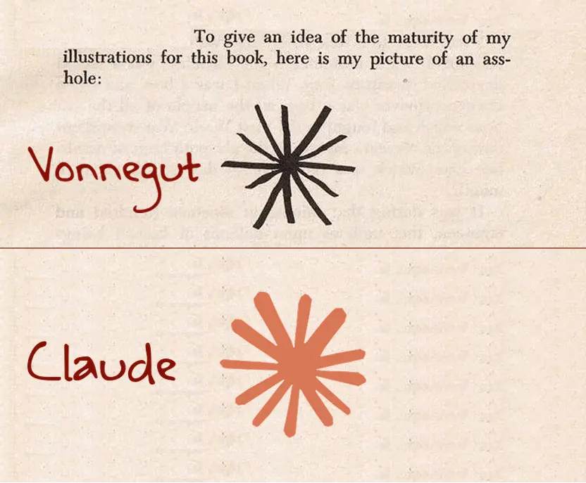
I just find it remarkable that not only the shape of Claude's logo is what it is, they also went with that particular color for it. Chef's kiss.
It’s a good article too :)
Because the only thing coming out of them is shit?
Only one of those looks like any butthole I've ever seen. Now I wanna see the buttholes whoever wrote this has seen.
because ai is the modern equivalent of goatse
The dark-mode switch at the top of the article:

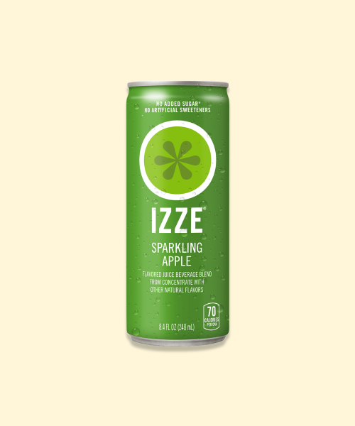
I'm surprised they didn't mention the Izze logo:
The guy who wrote the article watches too much porn. The more you watch and see and experience something, the more you will see it everywhere.
They all wish they were as clever, funny, and efficient as GLaDOS
Funny that they praise Slack’s “hashtag inspired logo” when they replaced the original angular one with circular symmetry that looks like a penis swastika.
"Penis swastika" is spot on.
Except only one does here.
You need to broaden your horizons. There's more to life than cute Hentai buttholes.
Althought, I guess I can see not wanting to acknowlege prolapse and so many other horrors some of these represent.
Because AI is going to fuck us in the ass with no protection.
Maybe they're all designed by Pootie Shoe
I think he just goes by Pootie now
Hmm. Reductionist design probably has gone too far if you start to require radial symmetry.
Subliminal messaging.
Because the people who own the company are buttholes.
Ich bin cornholio! I need TP for my bunghole!
What's the Walmart logo doing in there?
They all used ai to make their logos
Because they ran out of logos that look like all-seeing robotic eyes
Something something about showing connections between points in a circle... the chocolate starfish of life.
 Manus joined the room…
A nice place to discuss rumors, happenings, innovations, and challenges in the technology sphere. We also welcome discussions on the intersections of technology and society. If it’s technological news or discussion of technology, it probably belongs here.
Remember the overriding ethos on Beehaw: Be(e) Nice. Each user you encounter here is a person, and should be treated with kindness (even if they’re wrong, or use a Linux distro you don’t like). Personal attacks will not be tolerated.
Subcommunities on Beehaw:
This community's icon was made by Aaron Schneider, under the CC-BY-NC-SA 4.0 license.