319
you are viewing a single comment's thread
view the rest of the comments
view the rest of the comments
this post was submitted on 10 Dec 2024
319 points (97.3% liked)
Map Enthusiasts
6034 readers
37 users here now
For the map enthused!
Rules:
-
post relevant content: interesting, informative, and/or pretty maps
-
be nice
founded 2 years ago
MODERATORS

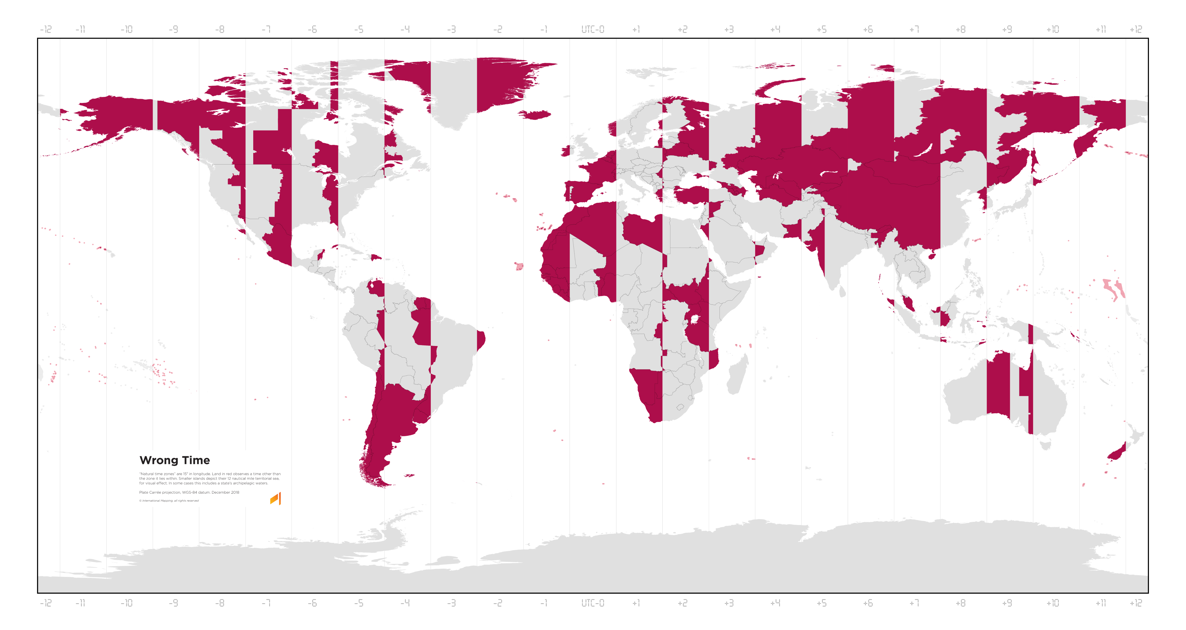
An item on my bucket list has been to create a map with "gradients" (really just 1-minute rectsngular bands) of what time the high noon is in that location. This map is just a subset of that, coloring red the areas with an over-30-minute offset. I'd make one for January and one for July to account for DST on both hemispheres.
I'll probably convert a publicly available timezone shapefile into a Plate Carée (or similar) projection SVG, create a "gradient" spanning the entire globe and then use it as texture for the SVG shapes, horizontally offset appropriately.
That would be really cool!