14
Why is gnome not so sharp like macOS?
(feddit.org)
From Wikipedia, the free encyclopedia
Linux is a family of open source Unix-like operating systems based on the Linux kernel, an operating system kernel first released on September 17, 1991 by Linus Torvalds. Linux is typically packaged in a Linux distribution (or distro for short).
Distributions include the Linux kernel and supporting system software and libraries, many of which are provided by the GNU Project. Many Linux distributions use the word "Linux" in their name, but the Free Software Foundation uses the name GNU/Linux to emphasize the importance of GNU software, causing some controversy.
Community icon by Alpár-Etele Méder, licensed under CC BY 3.0
Sharp as, it looks blurry or sharp as, its not polished?
Ahh good hint. Not polished. Windows could be more beautyful for example.
@Banthex@feddit.org i get what you saying. but as i lack experience with distros i find it interesting. can you add a few more examples of polished like how?
I'm still unsure if you mean sharp as in clear, crisp high resolution / not pixelated / not blurry or "better" design / ui(x).
If the first check (fractional) scaling settings / font anti aliasing / smoothing options (I don't use Gnome so don't know where), if the latter, one is a small team of probably underpaid devs (Gnome), the other one of the wealthiest companies in the world (Apple) so I'd sure hope Apple's UI is "better" than Gnome's (though looking at Windows it doesn't seem like having money equals good design, lol).
Yes also the gtk thing. Maybe what i search is that all software ui's should follow a better design template? But i understand the feedback for ui freedom.
Part of using GNOME (at least to me) is expanding on the interface and building a personal experience through extensions.
Cover-flow when and-tabbing? Extension. Dynamic opacity of top bar? Extension. Wiggly-wobbly effects when dragging or minimising/maximising windows? Extension. Installing custom themes? Guess what, that's an extension too!
I think you understand where this is going.
In terms of polish (looking sharp), GNOME is the best on linux, still it can look much better in terms of eye candy if you add extensions. I think I have like 50+ extensions myself.
Thanks good feedback
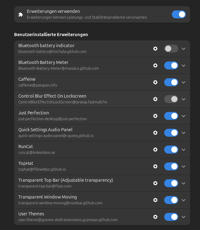
Alright. Let's have it. What's the extensions that enhance the look of Gnome, propelling it into eye-candy heaven?
Im using this but suggestions would be helpful:
yes, i get it. it's sort of a thing that my brain can't describe either, but want to hear someone go about it continuously to get it better.
It's transparency and blur, gnome favors performance over looks (not that it looks bad), you can get the same look on gnome if u theme it