114
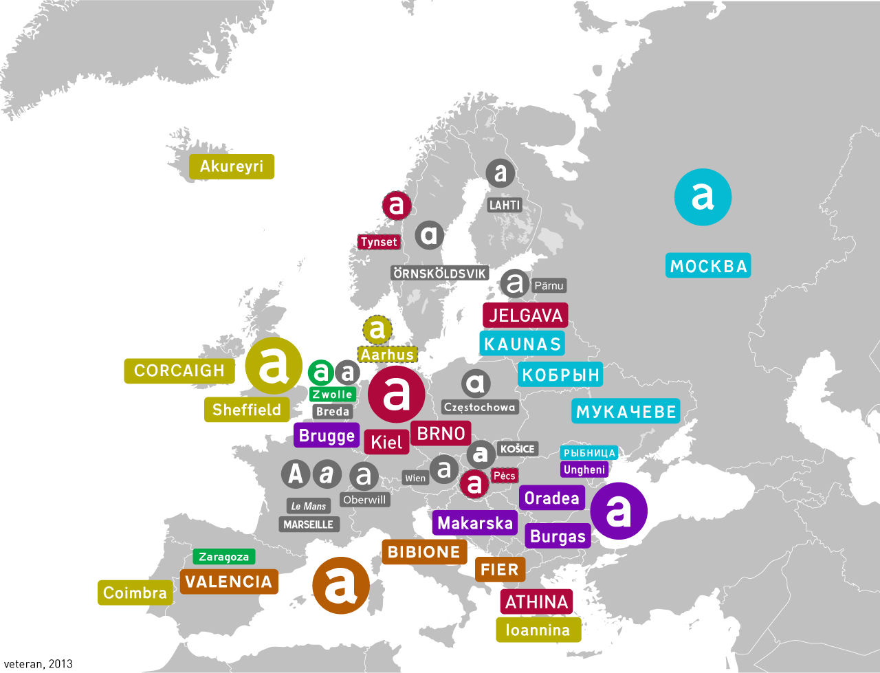
Highway fonts in different countries
(lemmy.ml)
For the map enthused!
Rules:
post relevant content: interesting, informative, and/or pretty maps
be nice
Also I don't really like Grotesk as a transport typeface, it's too bold+curvy...
The kerning on the "Od" there feels too loose to me.
I think it would be alright in uppercase. The problem is that lowercase height is barely above half of uppercase, as opposed to most display fonts.