18
you are viewing a single comment's thread
view the rest of the comments
view the rest of the comments
this post was submitted on 13 Feb 2025
18 points (100.0% liked)
Australia
4257 readers
128 users here now
A place to discuss Australia and important Australian issues.
Before you post:
If you're posting anything related to:
- The Environment, post it to Aussie Environment
- Politics, post it to Australian Politics
- World News/Events, post it to World News
- A question to Australians (from outside) post it to Ask an Australian
If you're posting Australian News (not opinion or discussion pieces) post it to Australian News
Rules
This community is run under the rules of aussie.zone. In addition to those rules:
- When posting news articles use the source headline and place your commentary in a separate comment
Banner Photo
Congratulations to @Tau@aussie.zone who had the most upvoted submission to our banner photo competition
Recommended and Related Communities
Be sure to check out and subscribe to our related communities on aussie.zone:
- Australian News
- World News (from an Australian Perspective)
- Australian Politics
- Aussie Environment
- Ask an Australian
- AusFinance
- Pictures
- AusLegal
- Aussie Frugal Living
- Cars (Australia)
- Coffee
- Chat
- Aussie Zone Meta
- bapcsalesaustralia
- Food Australia
- Aussie Memes
Plus other communities for sport and major cities.
https://aussie.zone/communities
Moderation
Since Kbin doesn't show Lemmy Moderators, I'll list them here. Also note that Kbin does not distinguish moderator comments.
Additionally, we have our instance admins: @lodion@aussie.zone and @Nath@aussie.zone
founded 2 years ago
MODERATORS
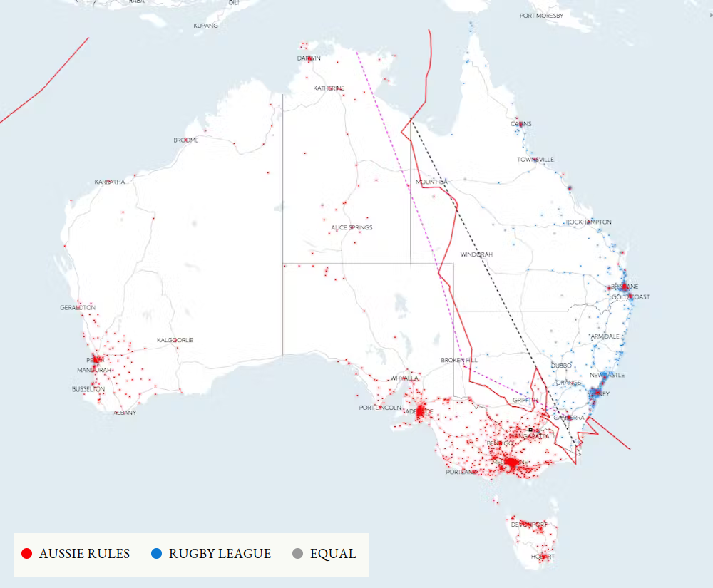
Because the image itself doesn't have an explanation of the lines, here it is from the article:
The plaque mentioned is the small black square on the border between Vic and NSW, quite a way south of any of the lines.
Also, that map of towns coloured by which is more popular seems to be seriously flawed. The colours and cells on the map may or may not be correct, but the labels it shows when you hover over it are hilariously wrong. I hovered over a cell that covers The Entrance at Tuggerah Lake on the NSW Central Coast. That cell was red, surrounded by a bunch of blue cells. It told me this was Julia Creek, Qld, and that rugby league was the more popular sport.
I saw blue way off in the northwest around Christmas Island, which it told me was Charlsetown, NSW. I'm actually in St Lucia, Qld, where both clubs are equal, but on that map it tells me I'm in blue Tocumwal, NSW, where Aussie rules is more popular.
This problem was introduced somehow between the map of The Regions and the map of The Regions (with towns where both codes were equal removed), because the former is correct in the few I checked.