318
you are viewing a single comment's thread
view the rest of the comments
view the rest of the comments
this post was submitted on 01 Nov 2024
318 points (97.9% liked)
Data Is Beautiful
9167 readers
1 users here now
A place to share and discuss data visualizations. #dataviz
founded 4 years ago
MODERATORS


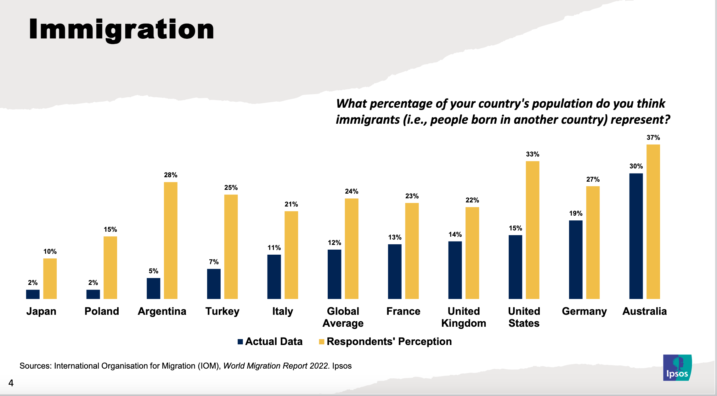
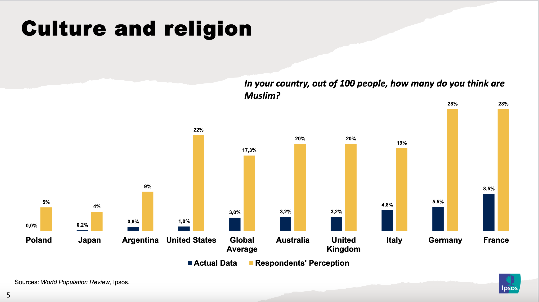
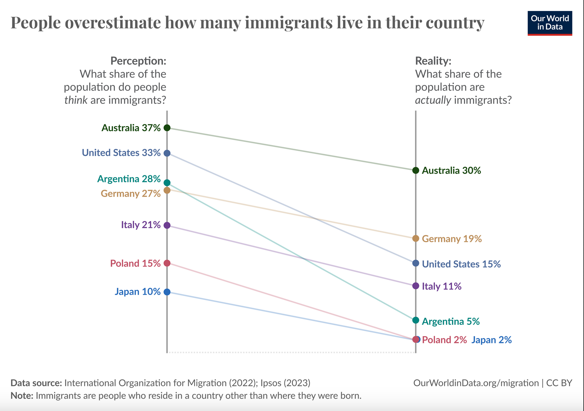
The "what percentage do you think" vs "what percentage are" would be much better either as a scatterplot with a y=x line, or as a ratio (think/are) vs actual percent
Here's a rough plot of the second thing. There's a number of issues with it but I think it more clearly conveys the crucial information
The first plot might arguably be better but you couldn't really see the way the ratio of overestimation decreased with more immigration as clearly as this one.
edit: Damn that came out way smaller than I expected. It's readable if you zoom in
Yep, looking at this again months later, I'd say this one's a lot easier on the eyes, nice one :)