322
Aluminium
(media.piefed.social)
Behavior rules:
Posting rules:
NSFW: NSFW content is permitted but it must be tagged and have content warnings. Anything that doesn't adhere to this will be removed. Content warnings should be added like: [penis], [explicit description of sex]. Non-sexualized breasts of any gender are not considered inappropriate and therefore do not need to be blurred/tagged.
If you have any questions, feel free to contact us on our matrix channel or email.
Other 196's:
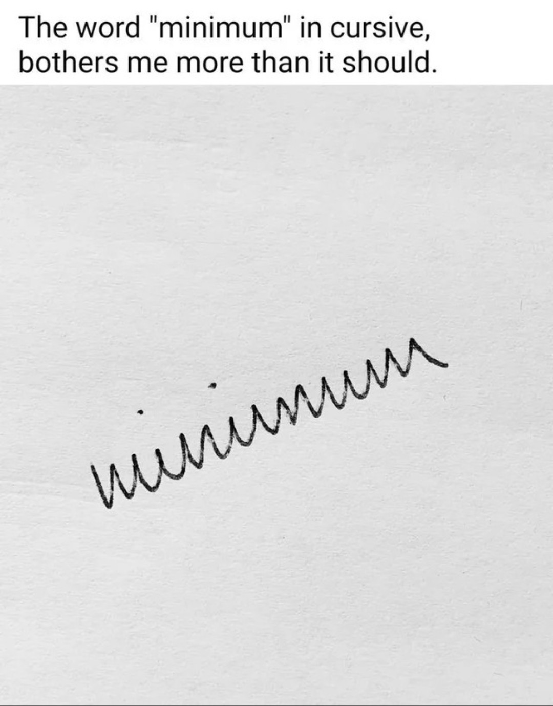
You can make it much more legible by just curving the parts that are susposed to be curved and not just doing jagged edges everywhere.
It's called writing garlands and is a mess for obvious reasons.
Yeah it makes it look like russian cyrilic cursive. That one actually is supposed to have more letters look that way.
Or the Serbian one.
Like this
Fortunately, my russian teacher wrote "normally", while I had to deal with basically this mess in German, where you only could separate the u from the n and the w from the m by the lines below the u and w.
That's a feature of a very old German hand writing style that hasn't been used much since WWII
Yet, Sütterlin looks different, as it often has vertical and diagonal straight lines where Latin script has round shapes. But likewise, it's difficult to read.