51
this moisturising cream
(discuss.tchncs.de)
This is a community for designs specifically crafted to make the experience worse for the user. This can be due to greed, apathy, laziness or just downright scumbaggery.
If this design really isn't asshole design, then why are they still doing it like this? It's pretty obviously supposed to look like it has more content than it does rn; and even if you do realize what's going on, this makes it way harder to guess the amount of the contents. A number for gram amount is ok, but your brain really guesses by looking at the content, not the number.
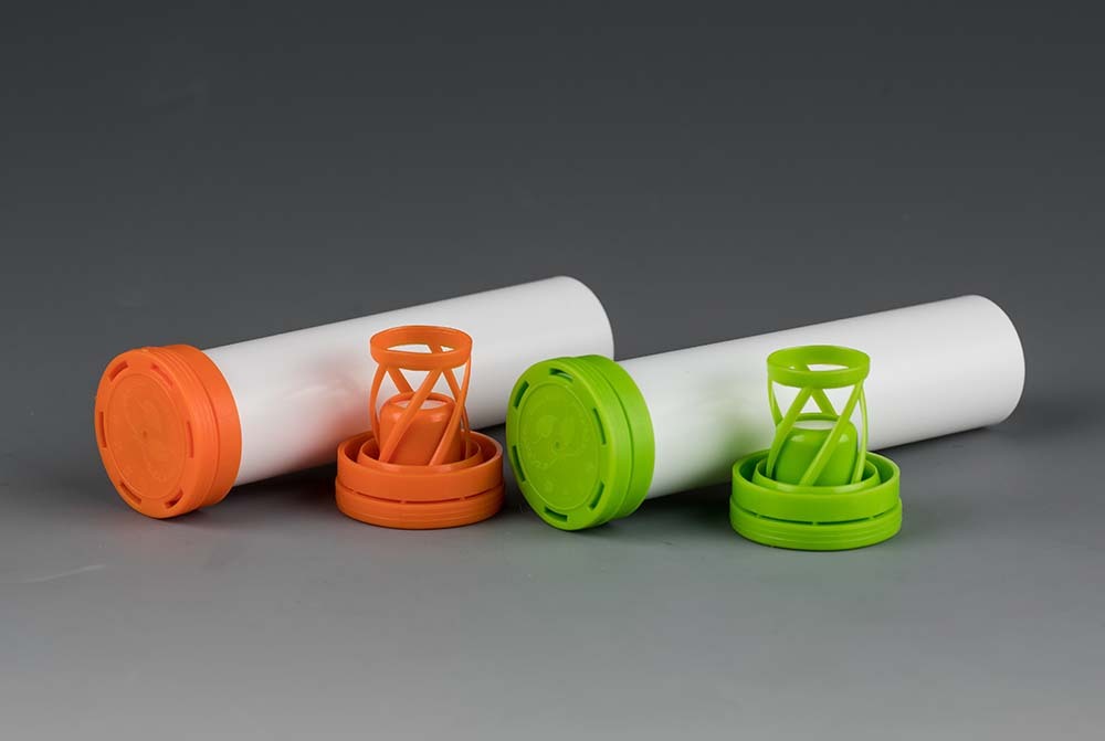
I once bought a tube of food grade sealant that looked like an effervescent aspirin/vitamin tube:
Turns out it was several times larger, that was even stated in the volume specs, but you're right, one does guesstimate based on a picture first.