316
you are viewing a single comment's thread
view the rest of the comments
view the rest of the comments
this post was submitted on 28 Aug 2023
316 points (97.9% liked)
Data Is Beautiful
10052 readers
1 users here now
A place to share and discuss data visualizations. #dataviz
founded 5 years ago
MODERATORS
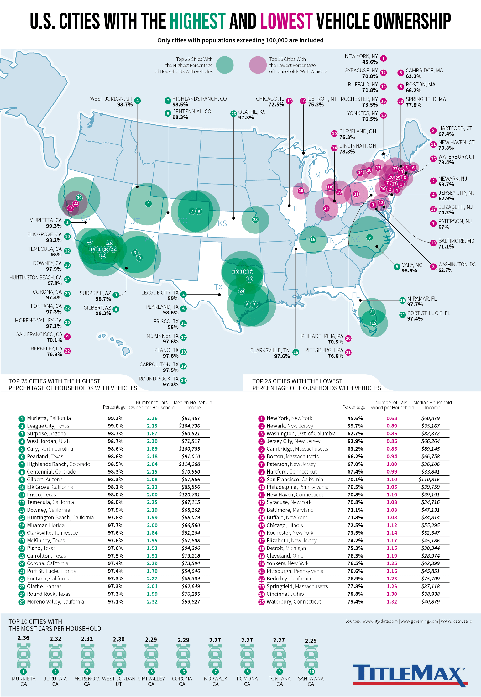
luv how high car ownership is in green while low car ownership is in red, implying that car ownership is an inherently good thing
It looks teal and purple to me, which is probably for color blindness accessibility, but I understand what you mean.