144
you are viewing a single comment's thread
view the rest of the comments
view the rest of the comments
this post was submitted on 14 Jan 2024
144 points (100.0% liked)
technology
24279 readers
206 users here now
On the road to fully automated luxury gay space communism.
Spreading Linux propaganda since 2020
- Ways to run Microsoft/Adobe and more on Linux
- The Ultimate FOSS Guide For Android
- Great libre software on Windows
- Hey you, the lib still using Chrome. Read this post!
Rules:
- 1. Obviously abide by the sitewide code of conduct. Bigotry will be met with an immediate ban
- 2. This community is about technology. Offtopic is permitted as long as it is kept in the comment sections
- 3. Although this is not /c/libre, FOSS related posting is tolerated, and even welcome in the case of effort posts
- 4. We believe technology should be liberating. As such, avoid promoting proprietary and/or bourgeois technology
- 5. Explanatory posts to correct the potential mistakes a comrade made in a post of their own are allowed, as long as they remain respectful
- 6. No crypto (Bitcoin, NFT, etc.) speculation, unless it is purely informative and not too cringe
- 7. Absolutely no tech bro shit. If you have a good opinion of Silicon Valley billionaires please manifest yourself so we can ban you.
founded 5 years ago
MODERATORS

the worst thing about windows 10 aside from pushing the store (which I have found mostly easy to turn off) is that you can open five different settings folders and encounter six different ui elements.
edit: opening a windows 10 system menu to then search for the screensaver function and get the same style of window you got in xp is wild lol. also its impossible to even get to the screensaver settings without searching because I guess they don't think you need it anymore, but its so weird to see menus and folders formatted however they were when the feature was first introduced lol.
No, the worst part is the damn ads,
Get windows LTSC and use MAS to activate it. It’s basically an enterprise version that strips the OS of ads, Cortana, store, etc as well as frivolous updates. But it’ll still push security updates.
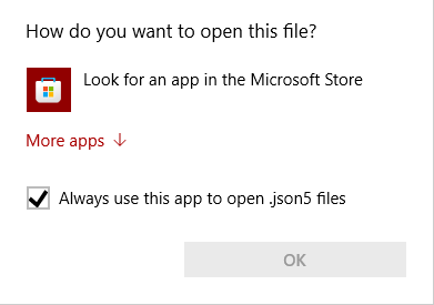
also this specific prompt absolutely filled me with rage for a long time. you can just click not on the window to cancel it but WHY is there no x in the corner to cancel out? disgusting design.