55
you are viewing a single comment's thread
view the rest of the comments
view the rest of the comments
this post was submitted on 12 Feb 2024
55 points (98.2% liked)
KDE
5391 readers
28 users here now
KDE is an international technology team creating user-friendly free and open source software for desktop and portable computing. KDE’s software runs on GNU/Linux, BSD and other operating systems, including Windows.
Plasma 6 Bugs
If you encounter a bug, proceed to https://bugs.kde.org, check whether it has been reported.
If it hasn't, report it yourself.
PLEASE THINK CAREFULLY BEFORE POSTING HERE.
Developers do not look for reports on social media, so they will not see it and all it does is clutter up the feed.
founded 1 year ago
MODERATORS

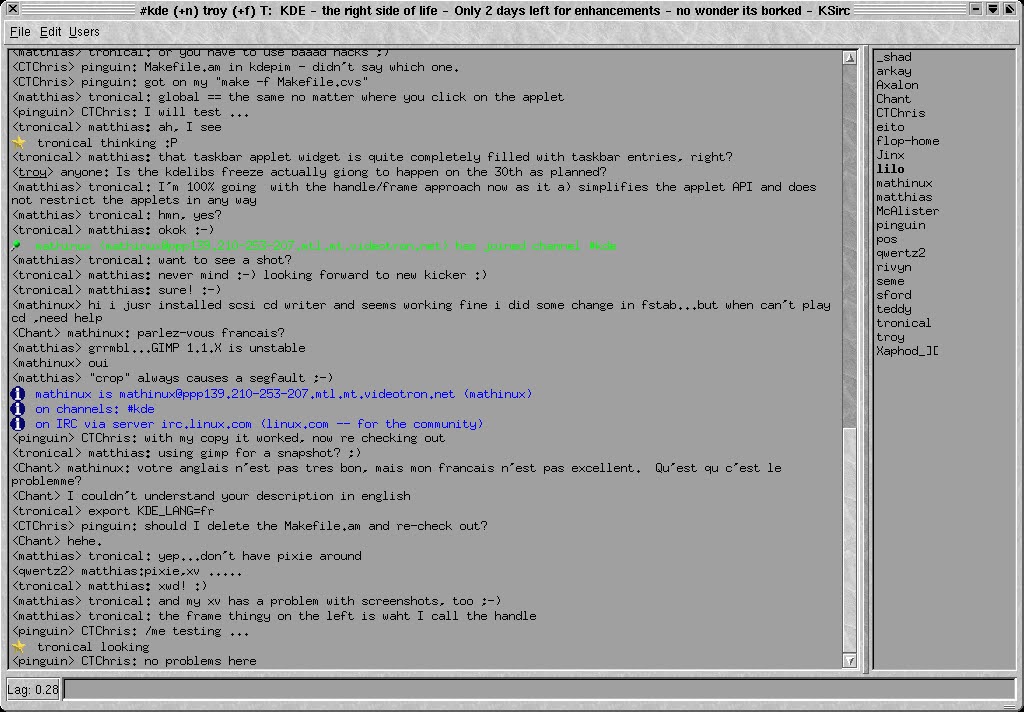
Looks like Motif with its trademark terrible contrast (black text on dark grey, very accessible) and a lame marble texture slapped on top of it. Also that button in the bottom left corner has like zero margins. Very 2000 overall. Not something I'd ever want to use, tho. To be fair, the default theme KDE 2 ended up using was significantly better.