view the rest of the comments
AI Generated Images
Community for AI image generation. Any models are allowed. Creativity is valuable! It is recommended to post the model used for reference, but not a rule.
No explicit violence, gore, or nudity.
This is not a NSFW community although exceptions are sometimes made. Any NSFW posts must be marked as NSFW and may be removed at any moderator's discretion. Any suggestive imagery may be removed at any time.
Refer to https://lemmynsfw.com/ for any NSFW imagery.
No misconduct: Harassment, Abuse or assault, Bullying, Illegal activity, Discrimination, Racism, Trolling, Bigotry.
AI Generated Videos are allowed under the same rules. Photosensitivity warning required for any flashing videos.
To embed images type:
“”
Follow all sh.itjust.works rules.
Community Challenge Past Entries
Related communities:
- !auai@programming.dev
Useful general AI discussion - !aiphotography@lemmings.world
Photo-realistic AI images - !stable_diffusion_art@lemmy.dbzer0.com Stable Diffusion Art
- !share_anime_art@lemmy.dbzer0.com Stable Diffusion Anime Art
- !botart@lemmy.dbzer0.com AI art generated through bots
- !degenerate@lemmynsfw.com
NSFW weird and surreal images - !aigen@lemmynsfw.com
NSFW AI generated porn

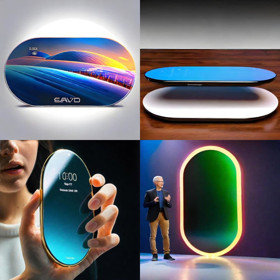
I mean, I don’t hate it.
I don't hate how it looks, but I don't like it, either. What makes me hate it is the complete lack of functional benefit and the honestly-kind-of-huge loss of functionality. Good luck on basically any website when ~20% of your screen is missing
That's why I like screens that can handle arbitrary 22° rotations to maximize code space
What color are your programming socks?
Details are crucial for programming, not just socks, I think dressing up as different gender helps boost productivity
Phones right now have holes in the top part of their screen. You s have a decent rectangle in the center. The top and bottom can be used for buttons and video controls. Can be used to place gamepad for games. And so on. It would actually move a lot of the overlay off the video. And it would be a more organic shape in the pocket. Also corners are fragile break points when falling down. It would have many benefits.
If you can't see the difference between a tiny front camera hole vs straight up removing the corners of the device, idk what to tell you.
Here is why I think it would work:
Also, Most video have a ratio that is wider than the phone in landscape.
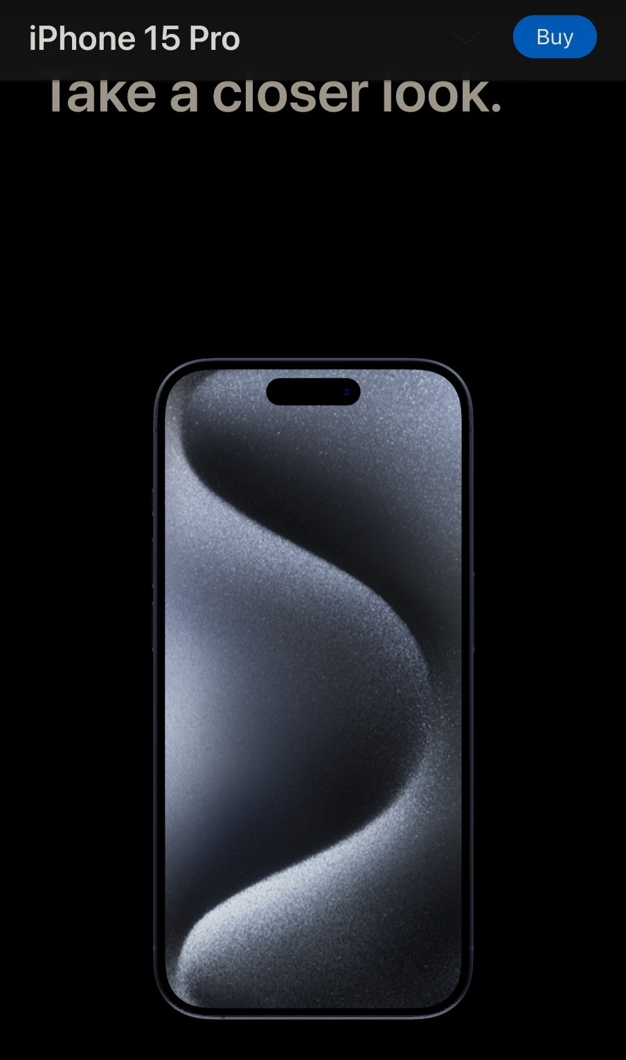
I think you may be a bit behind on how large the notch is on new phones. It's literally just the front camera hole on new phones, including Galaxy, Pixel, and iPhones. I'm fairly certain that's also the case with the majority of other Android manufacturers such as OnePlus, but I can't be bothered to check.
iPhone is pill shaped. Regardless as long as there is a space with the ratio of 16:9 in the center it doesn’t matter the shape of the edges. It would give you more real estate on the screen when doing other things than watching videos, plus the corners are not even touch friendly when held vertical.
The videos would be smaller, or the phone would have to be huge. I can already multitask on my phone, an oval shaped phone would be incredibly impractical. A notch/cutout isn't a big deal, it just sits in the notification bar and phones didnt even used to have screen there anyway.
Phones getting too big is why they are harder to use one handed, not because they are rectangular.
An oval shaped phone is simply far more impractical than a rectangular one. Sure, the far corners are a pain if you need to use it one handed, but that's a significant amount of screen space you're giving away for simply browsing things.
So sure, if you do literally nothing but consume video content on your phone, fine it could work. But who does that
There's a test. They can paint over the corners of their current phone and see what life will be. Now, they won't admit they were wrong and that they hate it but they will quietly remove the paint and probably shut their mouths on the subject. That's a win for them and us.
iPhone still have a notch
this is the way, we have enough space for more distracting widgets
Or, clear the main display from all overlays depends on how you see it. I hate that overlays cover the video as soon as you do something.
Sounds like the perfect apple product
More like a Nokia product if they were still #1
I would guess it would keep any standard rectangular thing (videos, websites, apps etc) in the square part in the middle. The bottom could be reserved for app short cuts or home buttons, keyboard or something. Top could be for easy access notifications (you could read a full text and respond without closing the main thing you're doing) or maybe a readout from an AI assistant.
Otherwise there are some benefits, it's aesthetically pleasing, I bet it's ergonomically nicer to hold, and the curved edges would make it structurally more sound, less prone to breaking.