811
xkcd #2912: Cursive Letters
(imgs.xkcd.com)
Alt text:
𝓘 𝓽𝓱𝓲𝓷𝓴 𝓬𝓪𝓹𝓲𝓽𝓪𝓵 𝓛 𝓲𝓼 𝓹𝓻𝓸𝓫𝓪𝓫𝓵𝔂 𝓽𝓱𝓮 𝓶𝓸𝓼𝓽 𝓯𝓾𝓷 𝓽𝓸 𝔀𝓻𝓲𝓽𝓮, 𝓽𝓱𝓸𝓾𝓰𝓱 𝓵𝓸𝔀𝓮𝓻𝓬𝓪𝓼𝓮 𝓺 𝓲𝓼 𝓪𝓵𝓼𝓸 𝓪 𝓼𝓽𝓻𝓸𝓷𝓰 𝓬𝓸𝓷𝓽𝓮𝓷𝓭𝓮𝓻.
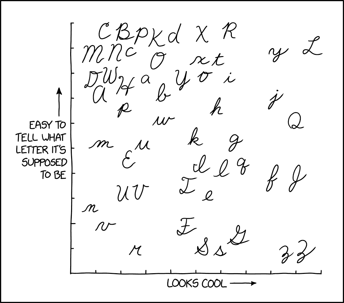
Hard disagree on this one, the lowercase k needs to be way more to the right, or at the very least should have h i and l to the left of it. k looks so kool.