290
Beef produces 85 kg CO2e per kg of food. Tofu produces 2.9 kg CO2e per kg of food.
(ourworldindata.org)
Discussion of climate, how it is changing, activism around that, the politics, and the energy systems change we need in order to stabilize things.
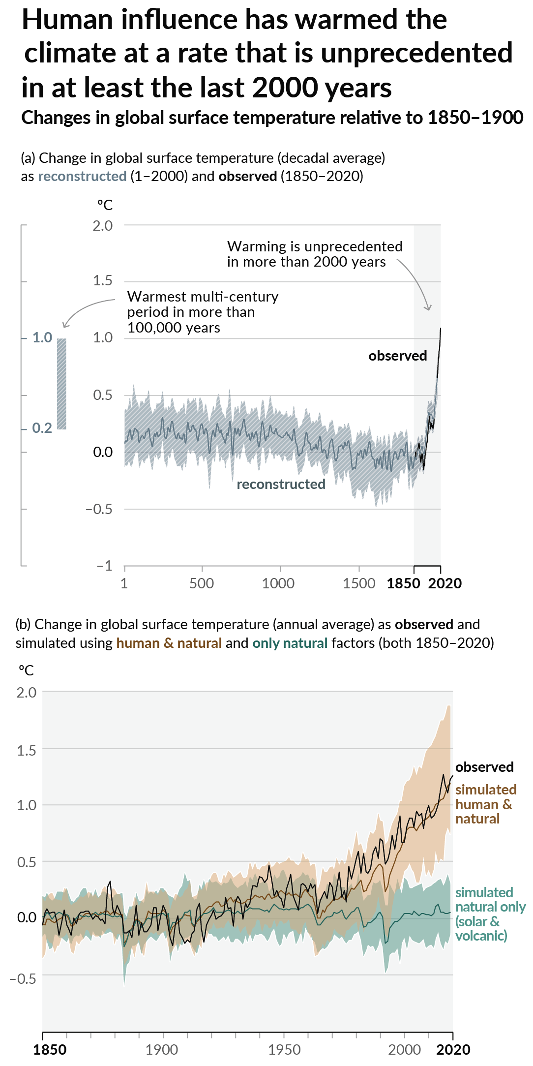
As a starting point, the burning of fossil fuels, and to a lesser extent deforestation and release of methane are responsible for the warming in recent decades:

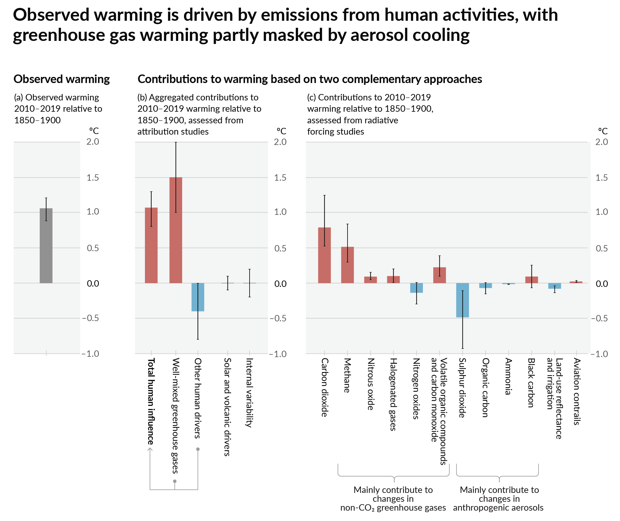
How much each change to the atmosphere has warmed the world:

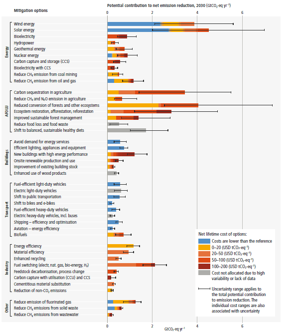
Recommended actions to cut greenhouse gas emissions in the near future:

Anti-science, inactivism, and unsupported conspiracy theories are not ok here.
Another "fun" chart on various food sources green house gas emissions adjusted per kilogram of food product.
Source
I love how the chart breaks cows into multiple categories making it look that much smaller even though it's still chart topping.
Edit: Oddly enough they're citing the same data in both the one I link and OP's link.
Why is Kilograms of food product the one axis? shouldn't it be kcals or something?
https://ourworldindata.org/grapher/ghg-kcal-poore
They have that too. Beef is still the worst by a huge margin
poore nemecek's methodology is flawed.
What's wrong with it?
the paper tries to quantify all the inputs and outputs for foods, but it fails to actually calculate either the actualy outputs (like non-food animal products), or the actual costs of the inputs (many of which would be waste products)
if you total all the inputs that go into a product (the water, the carbon emissions, the land use, etc), then you can see what it would cost to produce it if you made no other products. but that's not actually the environment in which meat dairy and eggs are produced.
the most illustrative example is cotton. cotton is not a food. it is grown for textiles. it wrecks the soil and it is THIRSTY. after you harvest the cotton and separate the fiber from the stalk and seed, you have seed left over. way more seed than you need to replant. cottonseed can be and is pressed for oil, but it takes much less processing to mix it into cattle fodder. why should the water used to grow cotton count against the water inputs for beef and milk? it's actually a conservation of resources. these industries are all interconnected, and trying to just put a singular value on every product in the absence of the context of its production is not actually useful in determining what would be ecologically responsible.
The paper is a meta-analysis, it's not trying to calculate those things at all. It's collating and standardising the results of other studies doing that. To take Ridoutt et al 2011 as an example because it's the first beef one that comes up in the dataset, regarding feedlots:
It's depending on the work of the 1,530 source papers to calculate the inputs appropriately. You would know this if you had looked at the paper, so where did you get the idea that it is as you described?
the conclusion is "beef produces 85kg co2e". it's calculating exactly what I said.
Emphasis mine, of course. The remaining four-fifths of your comment focussed entirely on inputs too. The paper does not do this and never intended or claimed to. It collates the work of other papers that did it. Why tell such an obvious lie? Your comment is literally right there
this is splitting hairs.
Is it fuck. You complained about their methodology and then went on to cite an example of a problematic methodology that they simply did not use. You have not read the paper.
I have and you are splitting hairs about this
Alright, point me to the page of the study or the line of the database that counts the full water usage of cottonseed in beef production. Should be easy for you.
you know as well as I do that the meta analysis is depending on studies that do exactly what I said, and relying on papers that employ a flawed methodology is, itself, a flawed methodology.
I already gave you an example of one of the papers it's relying on, and it clearly isn't doing that. Which ones are?
I'm on mobile rn. can you link the bibliography
That would also be a very nice comparison and honestly probably a better one given how different food have very different calorie densities.
Now I'm really curious about calorie density of the various categories listed in the chart, I'm probably going to have to do some napkin math to get a small ball park.
I know I won't be anywhere close to the actual figure but I may be close enough to satisfy my curiosity.
Edit: Thinking about it a bit though brings to mind that the calculations there would be incredibly difficult and would likely require a lot of averages.
You should probably take into account beneficial and harmful effects of each food type as well (including externalities such as healthcare costs), although that would be an even more difficult task.
Though this is a great chart, it isn't quite the whole picture either for climate impact. Almonds and almond milk get to be a lot worse alternative option if you consider the water consumption concerns where they are grown in California. They have many similar charts that attempt to quantify holistic carbon footprint.
Long story short, though not eating animal products is best for the environment, even just eating beef less often and not worrying about eggs and chickens can get you to over half the climate impact of full veganism and is a much easier transition for some.
poore nemecek had flawed methodology and should not be the basis of policy decisions.
Kindly explain where so we can make our own opinion.
as just one facet, they count everything fed to beef, including cottonseed, when calculating the inputs. but cotton isn't grown for cottonseed. if we didn't feed a large portion of our annual cottonseed to livestock, it would just be wasted. vegans will tell you that the return is only 1/10 of the input, but that's a lot better than 0/10.