931
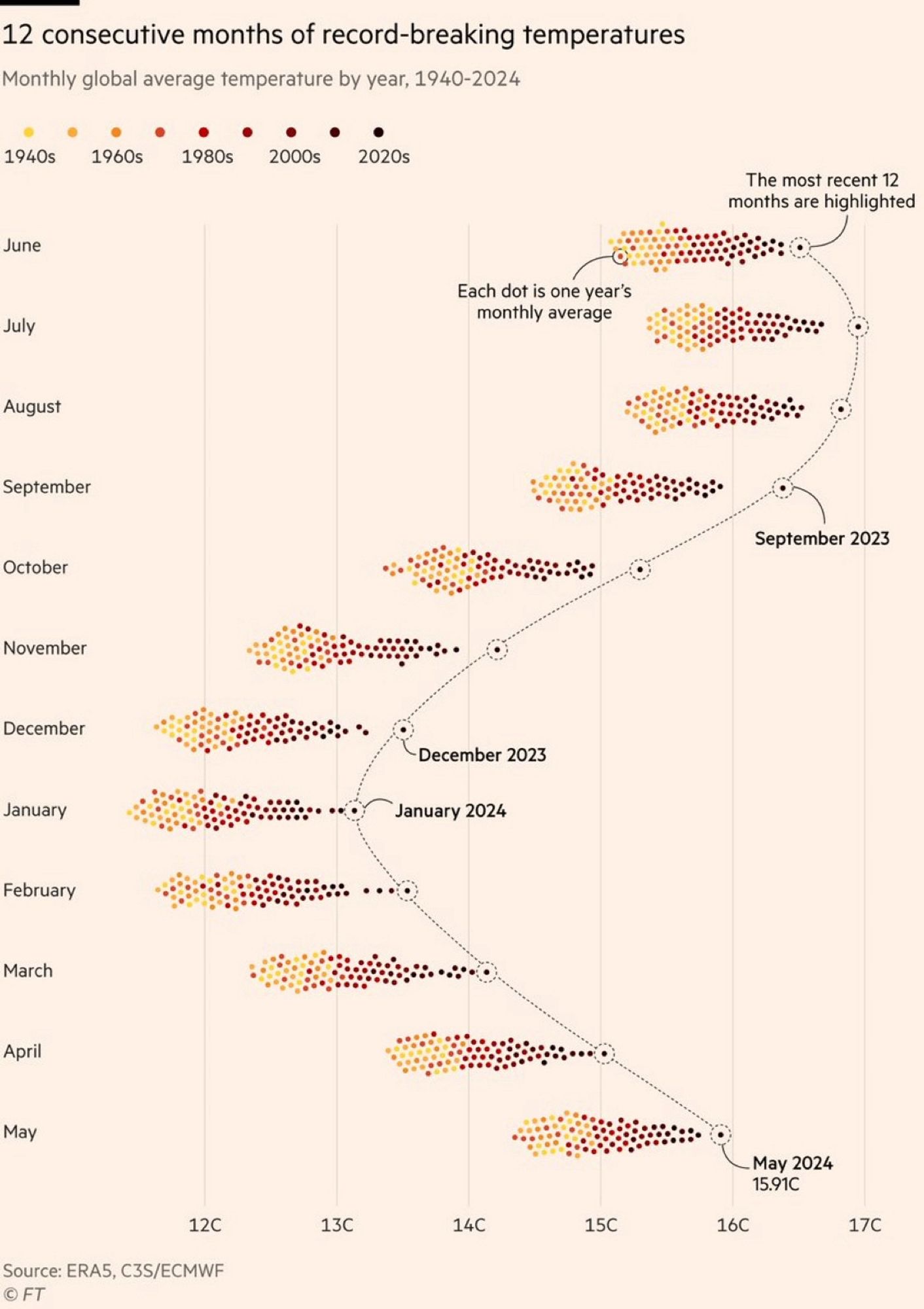
Beautiful but worrying 🌍
(jlai.lu)
A place to share and discuss data visualizations. #dataviz
The color grading of the years is really bad. The last 20/30 years are all very low in contrast compared to each other, while 1940s and 60s are easy to tell apart, where it is least important. There are so many more colors than yellow/orange/brown, we can use them to get more information density.
Quite the contrary. I have a red-green deficiency (and so do about 6% of men). Viridis Color scale is pretty nice but two much colors are hard to read for a lot of people
We need to invent an image format that let's chart colorw be tweaked after the fact lol
Actually, that's a feature that was common going all the way back to the very earliest image file formats: https://en.wikipedia.org/wiki/Indexed_color
It'd be easy enough to make the chart a plain old GIF or indexed PNG; the only non-trivial part is that you'd need add some code to the page it's embedded in to swap out the color palette. (You could also make it an SVG and manipulate it even more easily using the DOM.)
Well, the image format is based on indexed color for compression purposes ... But it's not like it calls out "these indexes should be customizable".