1286
See This Red Area? This Is Sand
(lemmy.world)
Welcome to politcal memes!
These are our rules:
1) Be civil
Jokes are okay, but don’t intentionally harass or disturb any member of our community. Sexism, racism and bigotry are not allowed. Good faith argumentation only. No posts discouraging people to vote or shaming people for voting.
2) No misinformation
Don’t post any intentional misinformation. When asked by mods, provide sources for any claims you make.
3) Posts should be memes
Random pictures do not qualify as memes. Relevance to politics is required.
4) No bots, spam or self-promotion
Follow instance rules, ask for your bot to be allowed on this community.
5) No AI generated content.
Content posted must not be created by AI with the intent to mimic the style of existing images
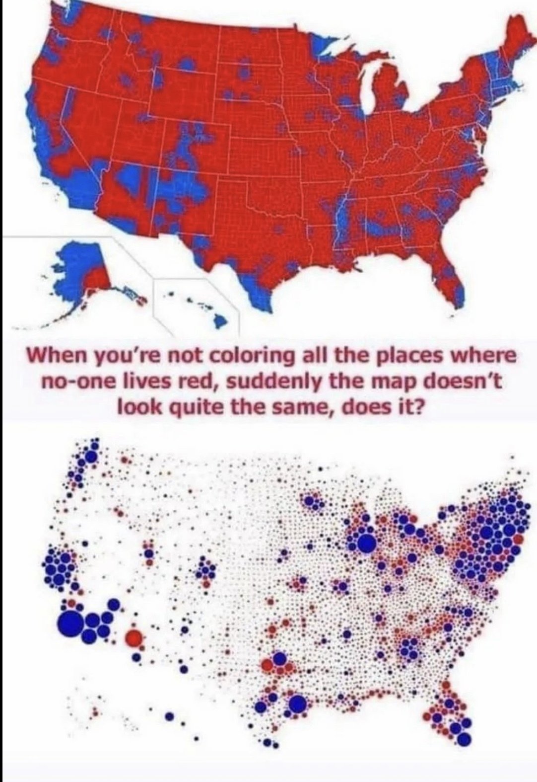
They are probably coloring whole counties, where the second map just makes a dot for each country proportional to population.
Thank you for actually understanding what the second map says. It's shocking how many people in these comments were so easily fooled into thinking that is where the people live in the second map.
The other complication is that the second map is so potato you can't see what color the smaller dots are and I think it gives overall a bluer impression than it would at higher quality.