view the rest of the comments
Fuck Cars
A place to discuss problems of car centric infrastructure or how it hurts us all. Let's explore the bad world of Cars!
Rules
1. Be Civil
You may not agree on ideas, but please do not be needlessly rude or insulting to other people in this community.
2. No hate speech
Don't discriminate or disparage people on the basis of sex, gender, race, ethnicity, nationality, religion, or sexuality.
3. Don't harass people
Don't follow people you disagree with into multiple threads or into PMs to insult, disparage, or otherwise attack them. And certainly don't doxx any non-public figures.
4. Stay on topic
This community is about cars, their externalities in society, car-dependency, and solutions to these.
5. No reposts
Do not repost content that has already been posted in this community.
Moderator discretion will be used to judge reports with regard to the above rules.
Posting Guidelines
In the absence of a flair system on lemmy yet, let’s try to make it easier to scan through posts by type in here by using tags:
- [meta] for discussions/suggestions about this community itself
- [article] for news articles
- [blog] for any blog-style content
- [video] for video resources
- [academic] for academic studies and sources
- [discussion] for text post questions, rants, and/or discussions
- [meme] for memes
- [image] for any non-meme images
- [misc] for anything that doesn’t fall cleanly into any of the other categories

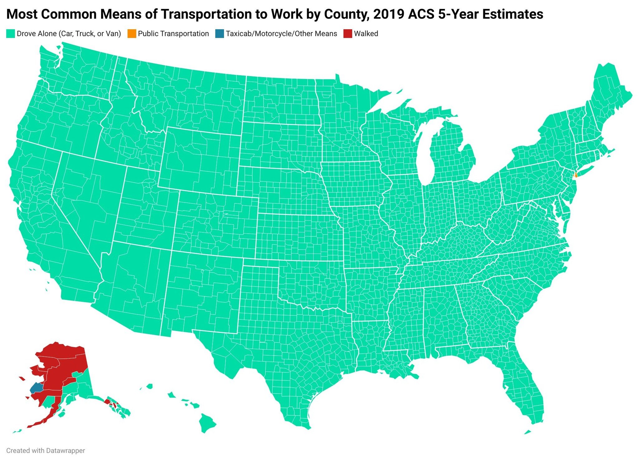
50% of Boston's workforce commutes using the T every day, but it doesn't show up on the map. I'm assuming because most of those stops are in outlying towns and, therefore, only make up a minority of the commuting workforce in each area. According to the federal government, the T is the third best public transit system in the US due to it being the fastest average commute out of any by at least half an hour, only outclassed by the quality of DC and Seattle (I believe, might be Portland that's #1? I'd have to look again).
That's just an example of how useless the map is. You can't look at it at this scale and only pay attention to the top most used transportation from a county level. New York City shows up because it literally is those counties, geographically, nearly edge to edge.