31
[Solved?] Weird Font problems in desktop icons
(lemmy.world)
Hello everyone.
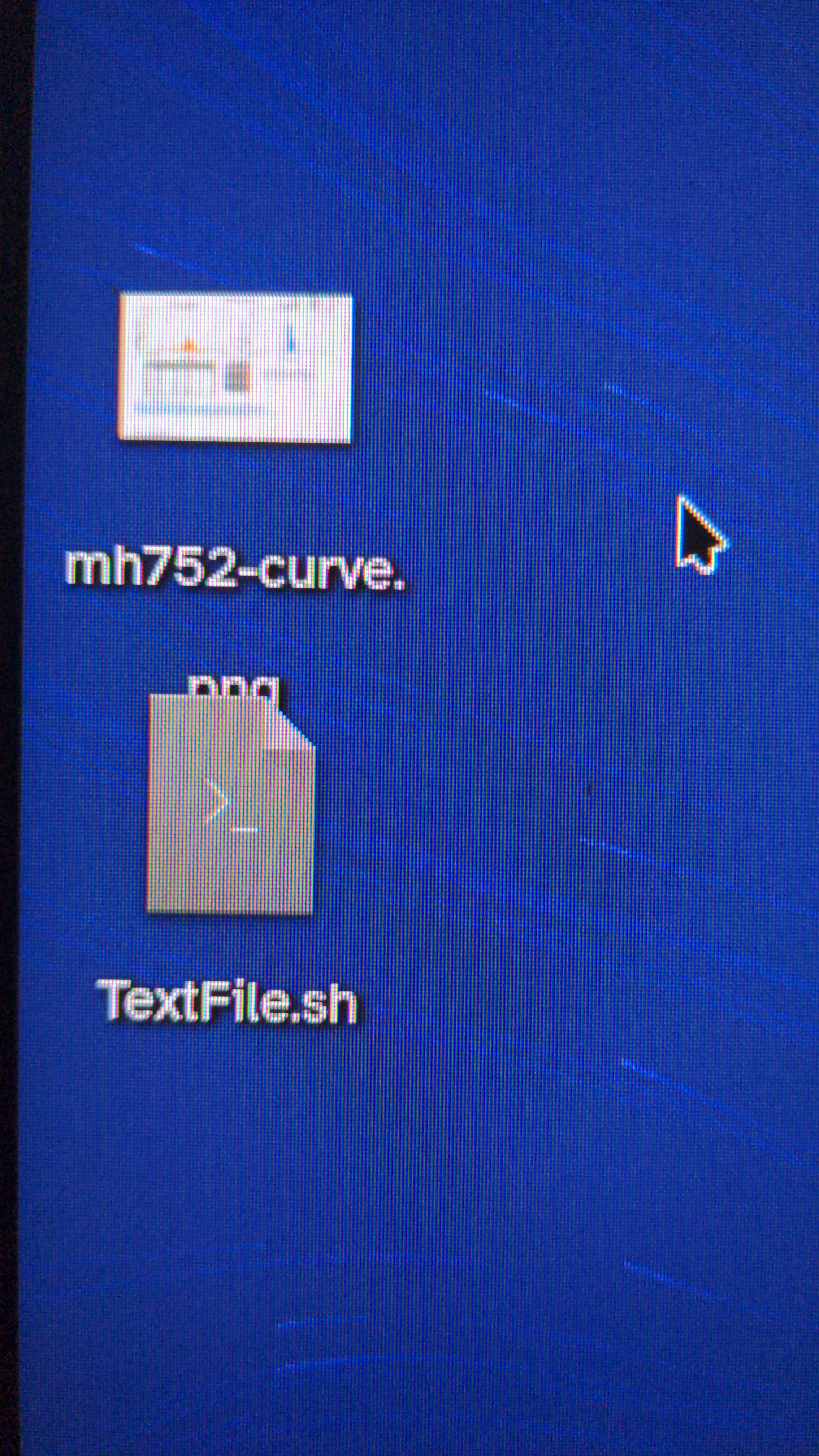
After I changed the default font in KDE Plasma 6.1.4 on Bazzite to Atkinson Hyperlegible, all desktop icons have weird line spacing in the name. Notice how .png is hanging behind tge icon for TextFile sh. Changing the font size does nothing. Only if I switch back to the defaults does it fix itself. Any idea how I can keep Atkinson as a font and fix this issue?
Edit: In edit mode (right click on desktop) I can set the Text lines to 1 which makes things bearable. Still no way to manage the weird spacing issue. Seems that not all icon are affected. Couldn't find a pattern.
If you open
/usr/share/plasma/plasmoids/org.kde.plasma.icon/main.qmland search forlinethere's a section calledPlasmaExtras.ShadowedLabelwhich seems to correspond with icon text and there's a linemaximumLineCount: 2you could try reducing that to 1 and it might fix your issue.It looks like KDE Plasma is based on QT6 and the icons I believe are a QT6 Label so you can also add some styling to it yourself. Here's the documentation for it: https://doc.qt.io/qt-6/qml-qtquick-controls-label-members.html
There is a property called
lineHeightso you could just add that to thePlasmaExtras.ShadowedLabeland see if that fixes it.