296
you are viewing a single comment's thread
view the rest of the comments
view the rest of the comments
this post was submitted on 30 Sep 2024
296 points (97.1% liked)
linuxmemes
26607 readers
216 users here now
Hint: :q!
Sister communities:
Community rules (click to expand)
1. Follow the site-wide rules
- Instance-wide TOS: https://legal.lemmy.world/tos/
- Lemmy code of conduct: https://join-lemmy.org/docs/code_of_conduct.html
2. Be civil
- Understand the difference between a joke and an insult.
- Do not harrass or attack users for any reason. This includes using blanket terms, like "every user of thing".
- Don't get baited into back-and-forth insults. We are not animals.
- Leave remarks of "peasantry" to the PCMR community. If you dislike an OS/service/application, attack the thing you dislike, not the individuals who use it. Some people may not have a choice.
- Bigotry will not be tolerated.
3. Post Linux-related content
- Including Unix and BSD.
- Non-Linux content is acceptable as long as it makes a reference to Linux. For example, the poorly made mockery of
sudoin Windows. - No porn, no politics, no trolling or ragebaiting.
4. No recent reposts
- Everybody uses Arch btw, can't quit Vim, <loves/tolerates/hates> systemd, and wants to interject for a moment. You can stop now.
5. 🇬🇧 Language/язык/Sprache
- This is primarily an English-speaking community. 🇬🇧🇦🇺🇺🇸
- Comments written in other languages are allowed.
- The substance of a post should be comprehensible for people who only speak English.
- Titles and post bodies written in other languages will be allowed, but only as long as the above rule is observed.
6. (NEW!) Regarding public figures
We all have our opinions, and certain public figures can be divisive. Keep in mind that this is a community for memes and light-hearted fun, not for airing grievances or leveling accusations. - Keep discussions polite and free of disparagement.
- We are never in possession of all of the facts. Defamatory comments will not be tolerated.
- Discussions that get too heated will be locked and offending comments removed.
Please report posts and comments that break these rules!
Important: never execute code or follow advice that you don't understand or can't verify, especially here. The word of the day is credibility. This is a meme community -- even the most helpful comments might just be shitposts that can damage your system. Be aware, be smart, don't remove France.
founded 2 years ago
MODERATORS

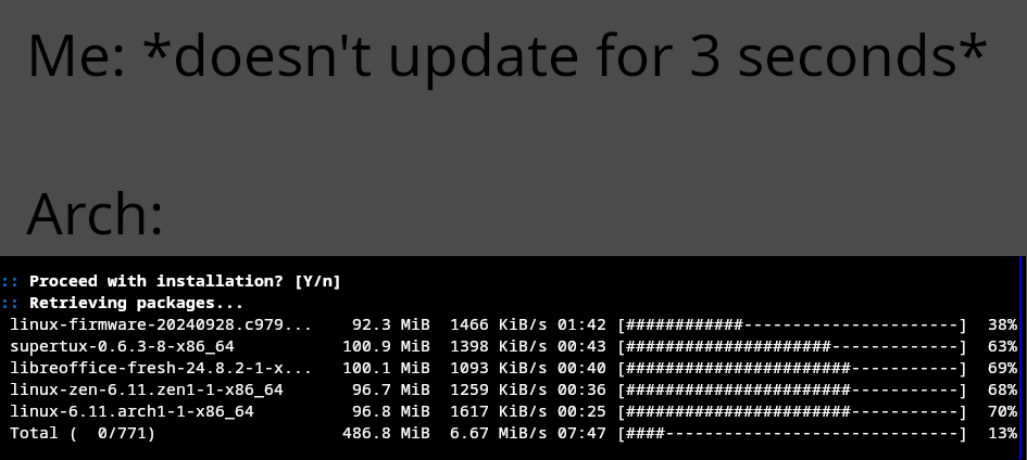
If you're trying to be darkmode friendly, you should try using something dark for the background with light text, because this only achieves a bad contrast ratio, and it is actually worse for most of the people looking at it.
https://developer.mozilla.org/en-US/docs/Web/Accessibility/Understanding_WCAG/Perceivable/Color_contrast
https://coolors.co/contrast-checker/222222-efefef
For a grey background, yellow text is usually preferred.
Usually, they use a light grey instead of white, so the text doesn't become overly bright, but not yellow, that's usually reserved for highlights or similiar effects, except when in „High contrast mode”, when they use yellow for text/outlines and black as a background
thanks. will consider this next time