268
you are viewing a single comment's thread
view the rest of the comments
view the rest of the comments
this post was submitted on 15 Oct 2024
268 points (95.9% liked)
Fediverse
42422 readers
15 users here now
A community to talk about the Fediverse and all it's related services using ActivityPub (Mastodon, Lemmy, Mbin, etc).
If you wanted to get help with moderating your own community then head over to !moderators@lemmy.world!
Rules
- Posts must be on topic.
- Be respectful of others.
- Cite the sources used for graphs and other statistics.
- Follow the general Lemmy.world rules.
Learn more at these websites: Join The Fediverse Wiki, Fediverse.info, Wikipedia Page, The Federation Info (Stats), FediDB (Stats), Sub Rehab (Reddit Migration)
founded 3 years ago
MODERATORS
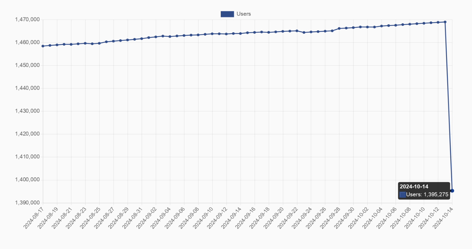
no it's not?
you can see the axes and op even mentions that it's a 5% drop
the graph is clearly just fitted to the data
I edited the title after their comment, it wasn't that clear at the beginning
In my classes on analytics, we were taught to prefer using normalised axes starting at 0 to more accurately put changes into perspective.
That's the problem. It's heavily skewed when compared to the greater overall engagement statistics.