112
Gas Stoves Linked to 40,000 Premature Deaths in Europe Annually
(www.bnnbloomberg.ca)
Discussion of climate, how it is changing, activism around that, the politics, and the energy systems change we need in order to stabilize things.
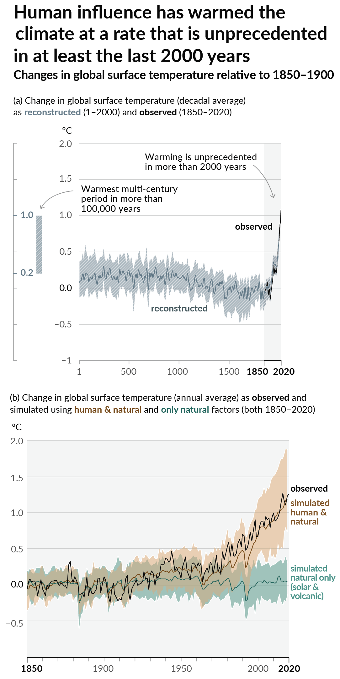
As a starting point, the burning of fossil fuels, and to a lesser extent deforestation and release of methane are responsible for the warming in recent decades:

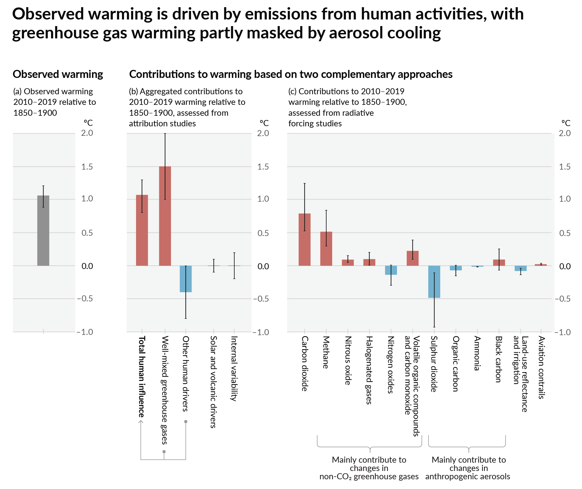
How much each change to the atmosphere has warmed the world:

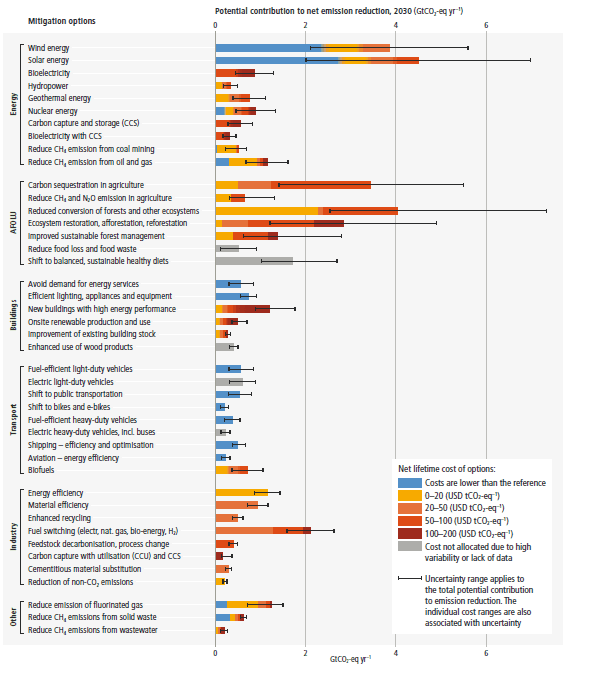
Recommended actions to cut greenhouse gas emissions in the near future:

Anti-science, inactivism, and unsupported conspiracy theories are not ok here.
So it's mainly asthma that people develop due to exposure to nitrogen oxide - and treating all the patients puts a considerable burden on society.
Unrelatedly, as a side note, I got curious about Portuguese cooking - for some reason the graphs show that cooking food in Portugal requires a three times higher percentage (30% as opposed to 10%) of overall energy consumption, implying either lower energy use for everything else, or higher energy use for cooking.
I wonder if there's some secret sauce that is only made in Portugal and which is extremely energy-intensive? Or just a case of broken statistics...
Portugal has very low energy consumption per household and it looks like most cooking is done on oil or gas stoves, which are relativly wastefull.
https://www.odyssee-mure.eu/publications/efficiency-by-sector/households/household-eu.pdf
https://ec.europa.eu/eurostat/statistics-explained/index.php?title=Energy_consumption_in_households